


Halfway through now, and today's task was to utilise police data, using Alteryx Apps to give a user the ability to select a date range, specific area and radius from that area that will update a Tableau dashboard showing Crime Statistics on Tableau.
Step 1
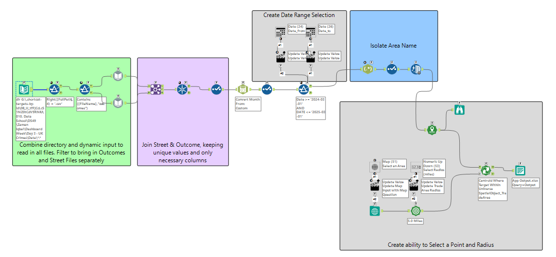
After connecting the data to Alteryx, I began by loading in all 1000+ (!) files. The reason for having so many was the fact that each area had two files - street.csv and outcome.csv for each month in the 1-year date range I downloaded. I used the directory tool combined with the dynamic input tool to load these in, ensuring I loaded in the street and outcome files separately before joining back together.
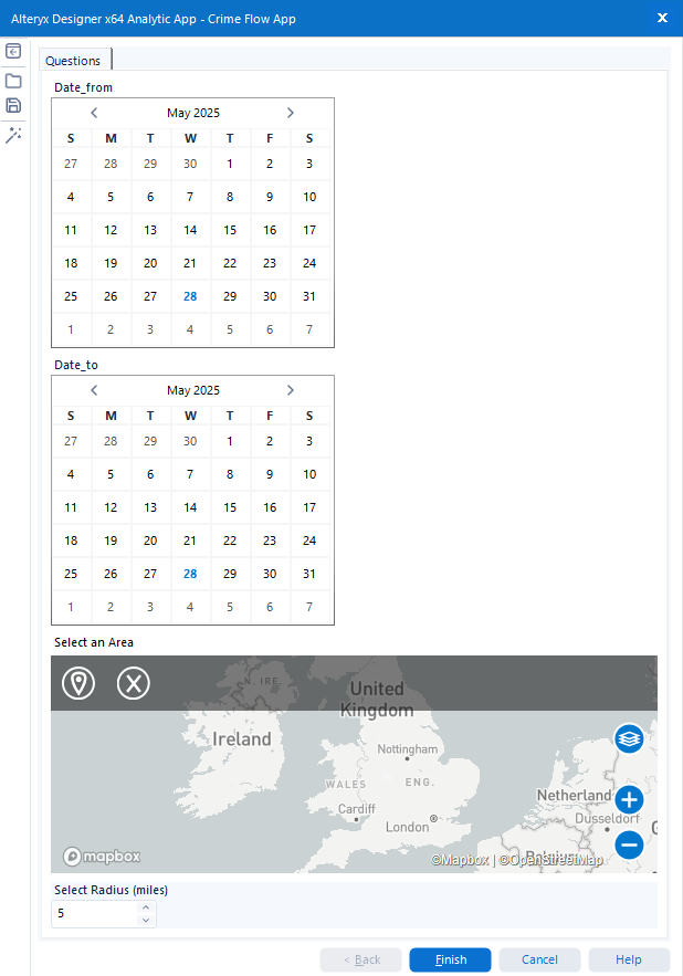
My first priority was to build the date range functionality. Leveraging the date interface tool, I was able to give the user the ability to select a date range, prompted by calendars.
I then combined the map input, map interface, spatial match, create points and trade area tools to present a map to the user, where they can select a specific point in the United Kingdom, and a particular radius to output the crime statistics for the chosen area. Here is what the workflow and app look like.
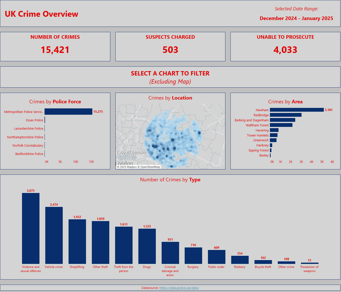
The Dashboard
Given the time spent building the app and functionality, I decided to keep the dashboard nice and basic, displaying a few KPI's and some key information in simple charts, giving users the ability to filter based on certain areas, police forces and crime types. The main priority (which was successful) of course was to have the data update when a user selects their chosen parameters on the app.
Final Thoughts
Overall I was happy with being able to get the functionality of the app working. I tested it by using it myself, and when refreshing my extract in Tableau after running the app, the data in the dashboard updated too. Next steps would be to download the Tableau connector for Alteryx, which would automatically update the dashboard if it were on Tableau Server/Public if configured correctly, but this was outside of today's project. I'd also explore adding some more dynamism to the dashboard & chart titles, with some more exploratory charts and further angles of analysis.