


For the final day of Dashboard Week, I chose to work with the NASA Natural Event Tracker (EONET) API, which provides data on natural events across the globe. After an initial exploration of the API’s offerings, it quickly became apparent that wildfires made up the overwhelming majority of recorded events. With that in mind, I decided to focus my analysis specifically on wildfires.
Exploring the Data
Using Alteryx, I pulled in the JSON data from the API and began to wrangle it into a more structured format. Each wildfire event includes metadata such as the date, location coordinates, and relevant categories. One of the early challenges was enriching the dataset with geographic context — specifically extracting country names from the coordinates and, for the United States, assigning states to each event. This additional detail opened up a more insightful analysis of geographic distribution.

Dashboard Design & Structure
I structured the dashboard to tell two complementary stories:
- Wildfires in the USA – A detailed view showing how wildfire events are distributed across US states and how they’ve changed month by month.
- Wildfires in the Rest of the World – Intended to mirror the structure of the USA view, showing country-level data and a temporal breakdown.
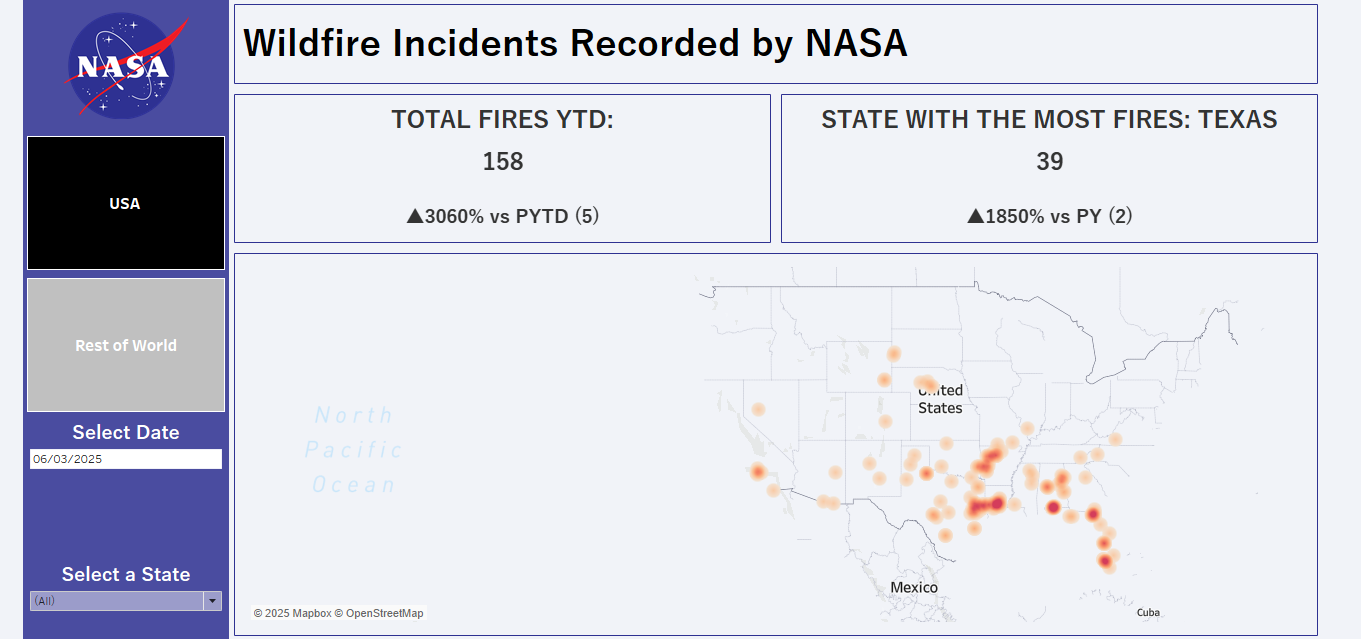
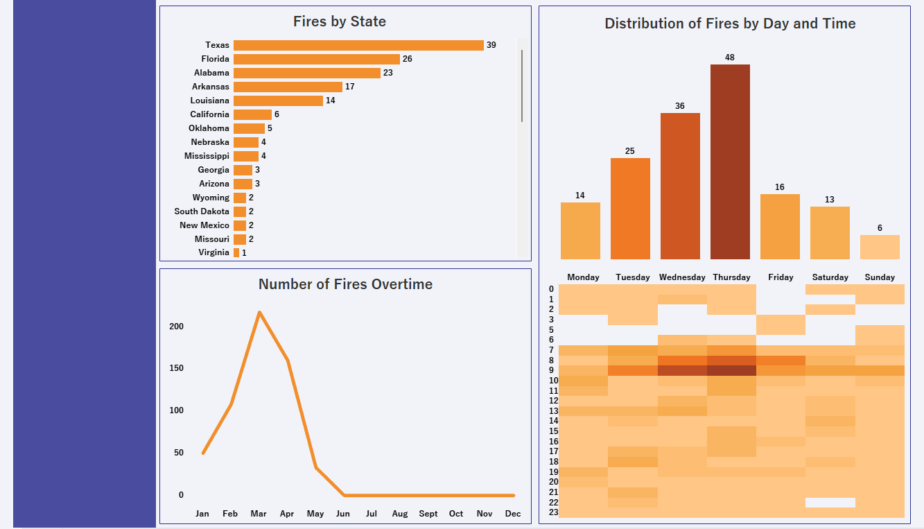
I completed the USA section, which includes:
- A map highlighting wildfire frequency by state
- A bar chart showing the monthly trend of wildfire events
- Interactivity allowing users to filter by state or time period
- A marginal histogram showing the distribution of fires by day of the week, and hour of the day
Unfortunately, I ran out of time to replicate these views for the rest of the world — though the structure is there, and the setup just needs the appropriate filters and minor tweaks applied.
Reflections & Next Steps
Despite time constraints, I was happy with the progress made. I managed to:
- Successfully call and structure the API data
- Build out an insightful visual narrative for the US
- Lay the foundation for global analysis
For future steps I would:
- Complete the "Rest of the World" section
- Refine the layout and improve colour consistency
- Possibly experiment with additional dimensions like severity, or cause (if available) and potentially bringing in weather data to supplement my analysis
This challenge reinforced the importance of quick data exploration, making clear analytical decisions early, and focusing on value within tight deadlines. It was a great way to wrap up Dashboard Week!