


The completion of my first month at The Data School has coincided nicely with the 4th week project; I was tasked with building on the work of my colleague, who had produced a design sketch for a dashboard showing the breakdown of revenues across three hotels. My job was to implement the feedback they received and update the sketch. I then produced the dashboard on Power BI and presented it, utilising the skills I learnt from my first week of Power BI training.
The Initial Sketch
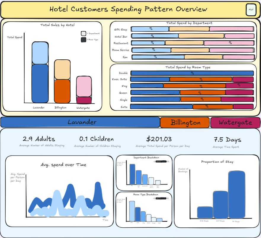
The feedback was:
• Include some KPI's at the top of the report, showing trends overtime and include some supplementary visuals such as a sparkline.
• Change the formatting of the KPI's on the bottom half of the report (round to whole numbers).
• Change the average number of adults & children to median number.
• Instead of having the department & room breakdowns at the bottom of the report coloured by total spend and sized by average spend per reservation, reverse this.
The Updated Sketch
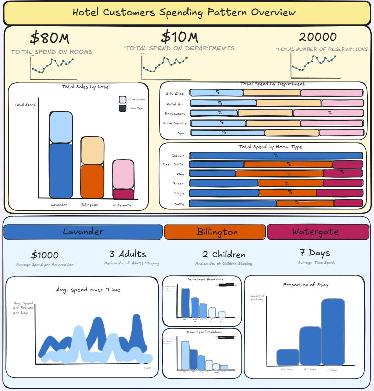
The above shows my updated sketch, with the feedback implemented. These were just minor tweaks so there is not much deviation.
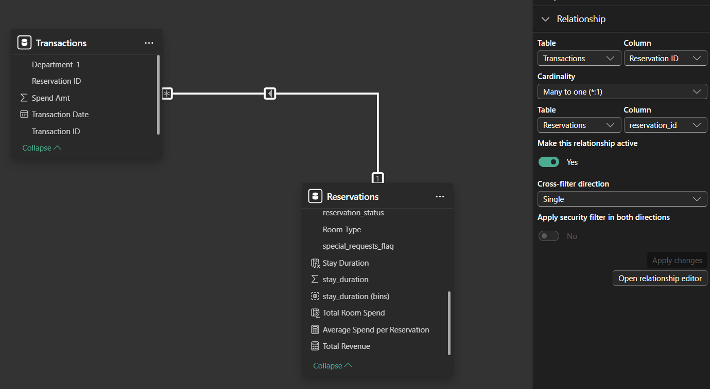
The Data Model
The data was split into two .csv files. One containing reservation details, one containing department spend details. They both had a common field of Reservation ID so it was very simple to create a relationship between the tables based on this field. This was more optimal than merging the two tables, as merging could have potentially excluded vital data, or duplicated information.
The Process
I will explain how I created some of these measures/columns, as they were not readily available in the data.
- Total Spend on Rooms - Given the dataset only included Average Room Rate (per night) & Duration of Stay (called stay_duration, in days), I created a calculated column that worked out the spend on room per reservation, that could later be aggregated into a total.

- Total Revenue - The company's revenue comes from Total Spend on rooms and Total spend on departments. I simply added these two together to created a calculated column "Total Revenue."
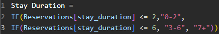
- Stay Duration Group - The sketch shows a graph indicating how many reservations the hotels had based on stay duration (days), but they were grouped. I had to use a logical DAX function shown below to create this column, a nested IF statement.
- Average Spend per Reservation - Another simple calculation, this time creating a measure, shown below to produce the KPI card.

The Dashboard
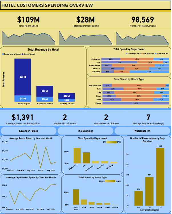
The final dashboard includes the majority of the plans of sketch. One omission was not colouring the breakdown of the revenue breakdown for the hotels. This was something I spent too much time trying to figure out but given time constraints, decided to focus on other things. I also separated the line chart from the sketch into two as the values had massive differences, which helped with clarity.
Final Thoughts
Overall, I was happy with how the dashboard closely resembled the initial sketch. The stakeholder was also happy with the detail they could go into when analysing their data. I would potentially edit the colours if I had the chance to do this again, and change a few things with regards to formatting.
I am looking forward to completing more projects using Power BI, and utilising some more advanced features in the future.