This article covers my investigations on how to create a heatmap in Microsoft Power BI. By heatmap I refer to a Table Heatmap and not to the geographical one. Heatmaps can be useful for exploring data with many values and/or feature and to display deviations or outliers. It can serve for a first overview before investigating further. Colored cells usually can be processed way quicker than a table full of values.
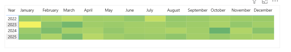
For this example I took the EU Sample of the Superstore dataset in version 2025.2. The goal of this practice is to quickly see which month of which year high good which had low profits on average.
A quick sidenote before we start building: You won’t find a visual called heatmap or table heatmap. You can install an addon via Microsoft’s AppSource marketplace. I tried this option and discarded it because the handling of the addon could not convince me so far.I will describe a different way of creating a table heatmap in this post.
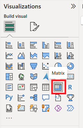
When we look an the Visualizations pane we don’t see an option for creating a heatmap. Instead we need to select “Matrix” as visual. So this is a bit counter-intuitive.
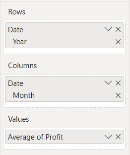
We are adding the Year feature of our date table on rows, the Months feature of the same table on columns and average Profits from the Orders table for values.
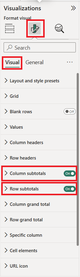
Before we apply colors we want to get rid of all totals since they are not the reason for creating a heatmap. With the highest values they would have the strongest colors and hence be a distraction.
To remove all row and column totals we navigate along the following path:
Visualization Pane > “Format Your Visual” Tab > Sub-Tab “Visual” .
There we switch the options “Column subtotals” and “Row subtotals” off.
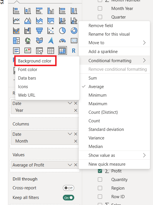
Having done that we are now at the key part of Table Heatmaps in Power BI: Transforming an ordinary table by applying conditional formatting. First we apply it to the background color by right-clicking onto Average of Profit, hovering on "Conditional formatting" and selecting the option "Background color".
A color configuration menu opens thereafter and we need to map colors in order to build a gradient. Heatmaps work with divergent color schemes so this what we are aiming for. Try to keep it simple!
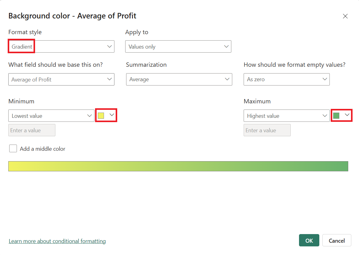
Sidenote: You might want to pick your color scheme and the associated color codes beforehand from sites like coolors.co or similar. It even has a dedicated gradient maker https://coolors.co/gradient-maker and a gradient galary there https://coolors.co/gradients.
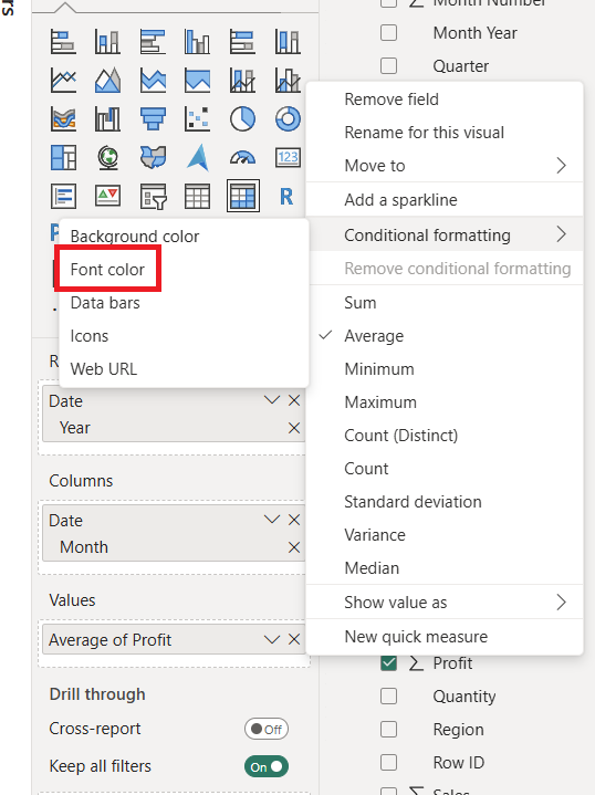
At this point we have successfully transformed values to color shades in each cell. But we still have text in the cell which stands out and does not help the visualisation. Hence we want to disable text since a heatmap generally serves for an overview. Unfortunetely Power BI doesn’t over a direct way to archive this outcome. But we can take an indirect route by applying the same conditional formatting as above again only this time to Font Color.
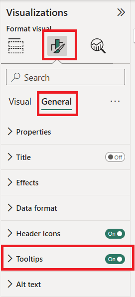
Now we have only colored cells remaining and no color legend yet. Accordingly a tooltip might he a good idea in this situation and in general. To enable it we navigate the following path:
Visualization Pane > “Format Your Visual” Tab > Sub-Tab “General”
and switch the option “Tooltips” on.
And there you have it, a simple Table Heatmap with tooltips to get an overview of you data and its patterns.