


At the beginning of this week, Andy informed us that an upcoming session was composed of over 200 slides. Due to this all I was expecting was a long theoretical session, instead, Andy gave us some crayons and large paper canvasses.
The session treated the topic of principles and best practices in data visualisation.I was already aware of some of these principles, since I read about it in two books, #MakeoverMonday and Storytelling with Data, before starting my DS experience. Despite that, it was really beneficial to discuss this topic in a classroom environment, especially for a person like me which learns in a better way by performing activities.
The first exercise we were assigned was to draw as many types of visualisation possible given only 2 numbers. This exercise was useful to recap all the type of visualisation we knew and to discuss their characteristics and utilisation.
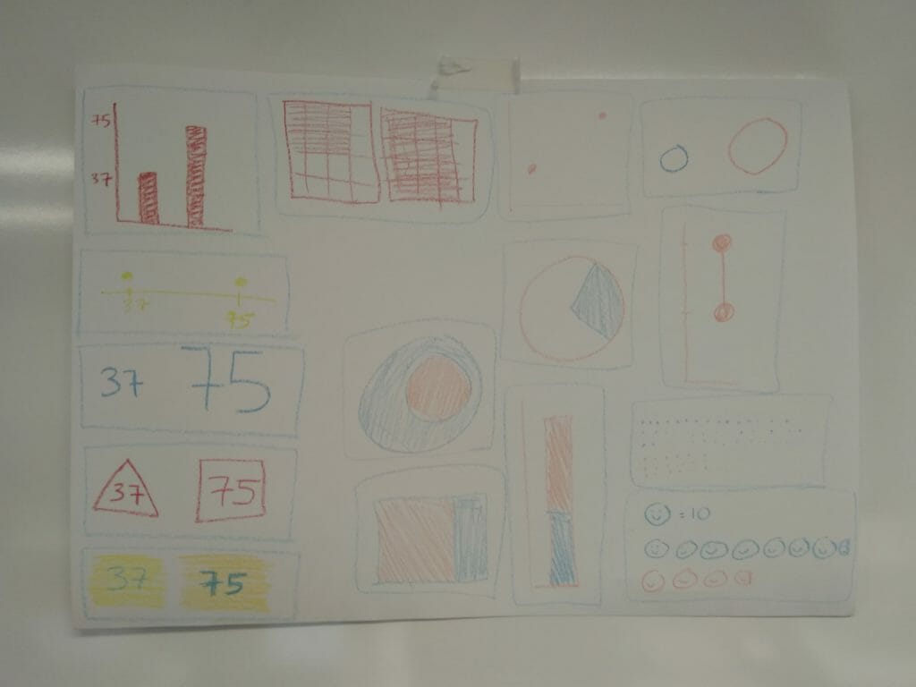
Photo: @kolsuma_aktar | @JonathanAllenby
Later on, we were given several visualisations coming from previous #MakeoverMonday and we were challenged to recreate the visualisation in a small time by drawing it. This exercise required us to think fast and come up with an idea of visualisation in a few minutes. It was good to have a brainstorming session with the other DSers and to build a “dashboard” merging our different ideas.
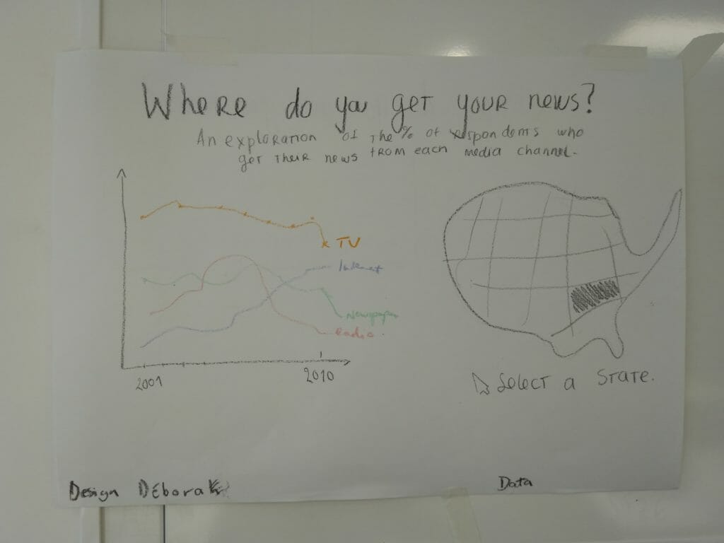
Photo: @DMContente | @Paulie
It may sound too abstract to convey a data analysis session with this kind of equipment, although it actually made us forget for a second about technicalities, while focussing on how to convey the right message with data.