


Last Thursday, Carl gave us a valuable lesson on the use of colour when displaying data in a hypothetical working environment.
In this example, created using the Sample-Superstore dataset, we compared the sales of 2 years, 2016 and 2017.
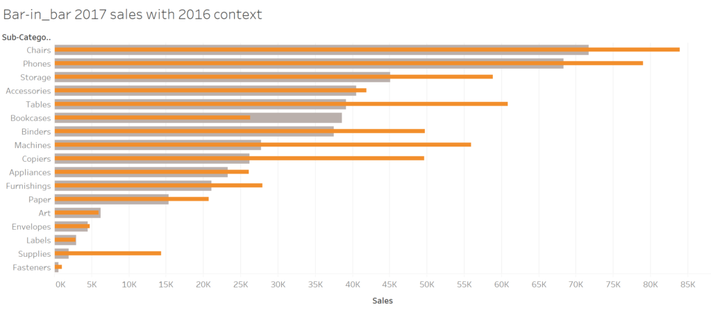
We created a bar-in-bar chart to be able to display the performances of those 2 years sales on the same axis. Here you can see the basic view, before the colour coding.
We created a bar-in-bar chart to be able to display the performances of those 2 years sales on the same axis. Here you can see the basic view, before the colour coding.
We then created a boolean calculated field, to display which sub-category have exceeded the sales for the previous year.
And here is where colour can really put the accent on your desired point of the story.
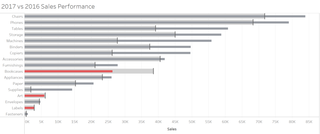
Colour coding a visualisation in this way place the focus on the bad results. This is the visual way to say “Bookcases, Art and labels have not achieved their target, the others have done ok.” This kind of statement, in a work environment, can make difficult to convey a constructive feedback.
Let’s imagine for a moment that those sub-categories would be actual salespersons by instance. Showing this type of chart may fell like a personal attack to those people which underperformed.
Colour coding highlighting the positive delivers a much different message.
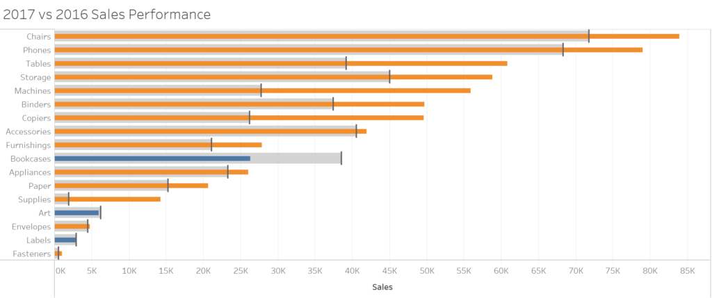
This is the visual way to say, “We increased our yearly sales in almost all sub-categories, what can we do to improve the performances of Bookcases, Art and Labels as well?”
This type of message sounds much more constructive, and not aimed at a particular person/department. Using the previous example of the salespersons, this type of chart may encourage the underperforming ones to increase their effort to reach the performances of their peers.
In conclusion, I think this was a very valuables lesson, which will become very handy when we will start consulting in a real working environment.