Last week I ran a teaching session with DS13 where I took them through my process for:
- Approaching an unfamiliar data set
- Choosing the most effective charts
- Understanding how to leverage layout containers
- Putting together the final dashboard
Last July, I demoed my approach for analyzing big data on this Exasol webinar. In that case, I already knew how I wanted to approach the data. The difference with the session at The Data School was that I didn’t know anything about the data ahead of time.
APPROACHING UNFAMILIAR DATA
I let DS13 pick a dataset for me to analyze. They chose a data set from Transport for London about road safety accidents, specifically casualties from accidents on London’s motorways.
I start with five worksheets as my outline before I even start looking at the data. I then rename each worksheet with the question it’s intended to answer:
- When
- Where
- What
- Who
- Why
As I go through the analysis, I may discover that some of these questions aren’t relevant. For example, if there isn’t any geographical data, then where might not make sense. Though you might have regions or plants that represent territories and don’t have to be mapped.
Next, I look at the sample data for each field. What is each field comprised of? Are they relevant? If they’re not, hide them. This helps focus the analysis on the necessary fields.
Now, start answering the questions. I create simple chart based on each question.
- When? Line charts, heatmaps
- Where? Maps, bar charts
- What? Bar charts
- Who? Bar charts, histograms
- Why? Scatterplots, bar charts, heatmaps
You should have created several charts by the time you get through these questions. You might have ten different ways of looking at time series (when). You might have 15 different bars charts for what. There’s no “right” number of charts to build; this is all about exploring ideas. Once you run out of ideas for a question, move to the next one.
CHOOSING THE MOST EFFECTIVE CHARTS
This is where the culling process begins. There will likely be a few charts you like from each of the questions. I flag these by coloring the tabs. This is a visual indicator for me that these might work in the final dashboard. I don’t delete the rest, just in case I need them later.
PLANNING THE LAYOUT
Let’s say we’re down to eight charts now. Go through a second culling and get rid of those that don’t flow well with the others. A dashboard needs to be cohesive; if there are charts that don’t relate to the other charts, get rid of them.
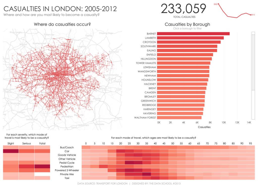
Grab a whiteboard or a big piece of paper and draw a big rectangle to represent your dashboard. We chatted through how we wanted to design the dashboard, what should be most prominent, and how should it flow. We decided that the map was the central piece so we placed that in the most prominent position on the upper-left (on our drawing).
We then drew other boxes for other charts we thought we wanted to keep. We erased and re-drew several times to get them in the position we thought was best.
We now have a general layout and we start the process of planning layout containers. I approach this by drawing from the inside out. Which objects need to be placed vertically or horizontally together? Place these in containers by drawing a blue border around them. Then create a container of containers. In other words, I might have two horizontal containers (the first has two sheets, the second has three) and I need those laid out vertically. Draw an blue box outside of those boxes.
Add the title. Add the footer. Add anything else you think you might need. Assign each of these sections to the sheets that work best. You’ll likely have a few sheets leftover. Cull them and remove the color from the worksheet tab.
PUTTING TOGETHER THE FINAL DASHBOARD
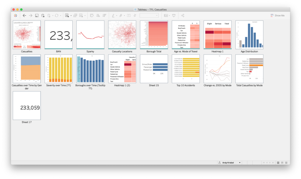
We have our structure drawn out. We know which sheets we need. Go into the slide sorter view and organize your worksheets.

In the image above, notice how I have my dashboard as the first object, then all of the sheets with a teal colored tab. I organize the sheets I’ve flagged in the order I want to place them on the dashboard based on the container layout I drew in the previous step.
I don’t care about the order of the sheets I’m not going to use because, well, I’m not going to use them. Notice that I don’t delete them. I may need one or two once I get to building my dashboard. Something might not flow the way I expected and could need to be replaced by another sheet I already created.
Based on the containers I drew on the whiteboard, I’ll drop containers into the dashboard. As I drop them in, I added two blank objects into each container to make them either vertical or horizontal containers.
I then add the sheets I need to each container and remove the blank placeholders. Once I have all of my sheets in the view, I create containers of containers as necessary.
Lastly, tidy up the dashboard. Make sure your colors and fonts are consistent. Make sure everything is sized as you’d expect. Put the dashboard in presentation mode and step back from the screen. How does it look? Continue to fiddle until your happy with the final product.
SUMMARY
This entire process took us about 2-3 hours. This included me showing them lots of tips and tricks and them following along as they wanted. They pitched lots of great ideas on how to look at the data based on the questions we were trying to answer. We discussed formatting, map backgrounds, text capitalization, etc. It was super fun for me as their coach to hear them really “getting” this analytical approach.
We’ll be scheduling a webinar soon for me to go through all of this again with a brand new dataset. Keep an eye on our meetup group for the latest webinars and to register once this one is scheduled.
So how did it work out for us? Here’s our final dashboard:

