If week 2 is a sign of things to come at the Data School, then we really are onto something special with a special group of talented individuals. There was so much learning and anticipation of what the students would create after just beginning to learn Alteryx.
The project this week focused on education data. The assignment was simple in concept, yet complex to carry out:
- Use Alteryx (and possibly some other tools) to scrape data from the web
- Clean and prepare the data in Alteryx
- Build a viz in Tableau
Monday and Tuesday were spent with Alteryx Ace Chris Love, learning the basics of scraping and data preparation with Alteryx. He covered topics like connecting to data, understanding how Alteryx interprets data, data set manipulation, data parsing and data blending. The examples he went through set them up perfectly for their projects and it was a treat watching Chris teach; he has a gift!
Wednesday was all about preparing for the Tableau Qualified Associate exam they scheduled to take at DATA15, which Robin Kennedy and Mike Lowe took them through while I moved into my new home. Laszlo Zsom trained them Thursday on joins in Alteryx, Tableau and SQL. This is foundational knowledge to get each tool to do what you want. I count myself as incredibly lucky to have a bench of coaches I can call on as talented as The Information Lab can provide. It’s great to a part of the School as a student myself!
Ok, so you might be thinking, how much can this gang really learn in a just a couple of days with Alteryx? I was thinking the same thing, yet after their presentations, I felt like a proud Dad.
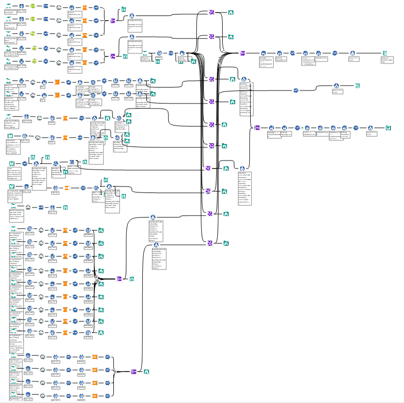
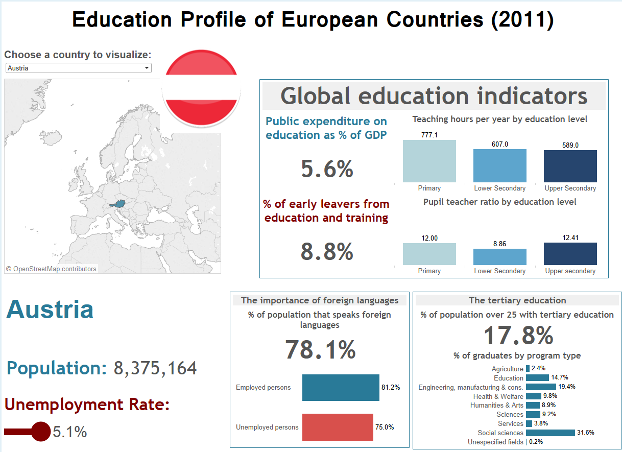
Pablo started the presentations off with this amazingly crazy workflow he created to understand education profiles in Europe.
Pablo had to collate many different webpages to get data for each year. He hasn’t learned about macro tools yet, so this is quite the amazing attempt. What was really interesting is that he did all of this work to get the yearly data, yet the yearly data didn’t provide any useful insight. This might seem like a waste of time, but what it actually did was allow him to eliminate data and disprove a hypothesis. Here’s the viz he created as his final output (click on any of the viz images to go to their interactive versions):
Wow! What a start! And this was only the beginning. Here’s a quick recap of the remaining presentations.
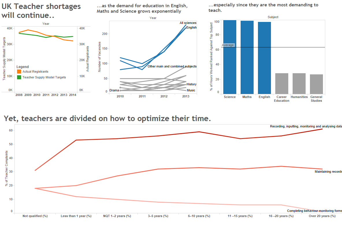
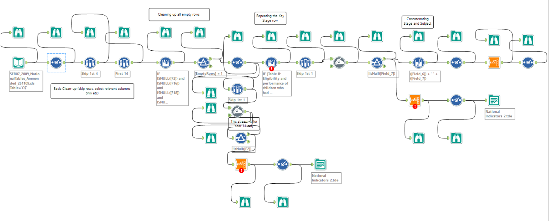
Emily looked at the UK teacher shortage with this workflow and viz:
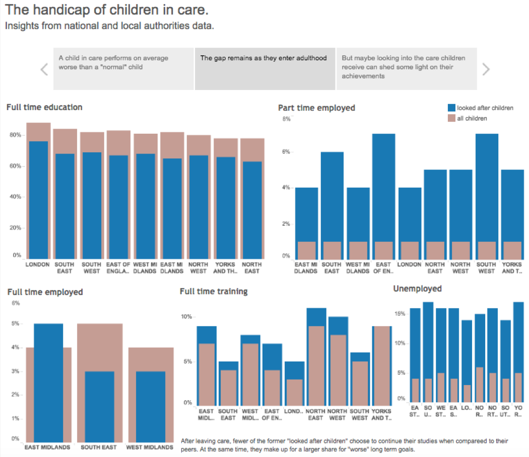
Damiana conducted an analysis of children in care to see why they are performing worse in school:
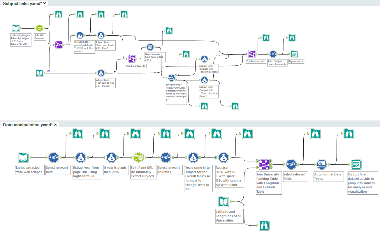
Hashu visualised a complete university guide:
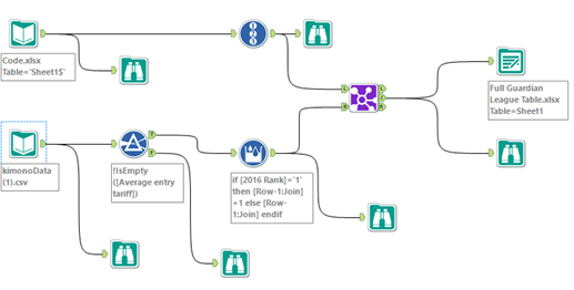
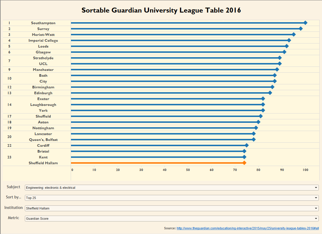
Ravi created a new version of the university league table:
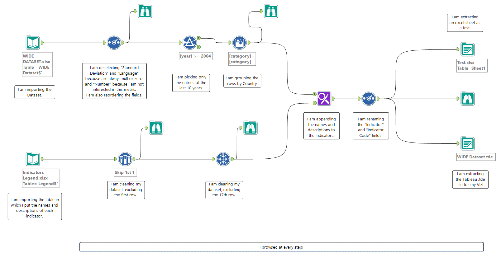
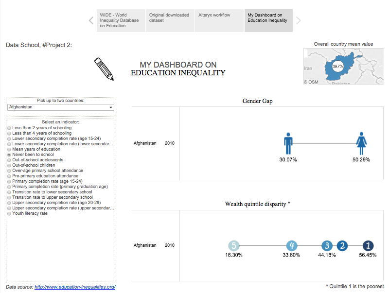
Niccolo, who seems to be quickly mastering the perfect story points use case, create this great education inequality story:
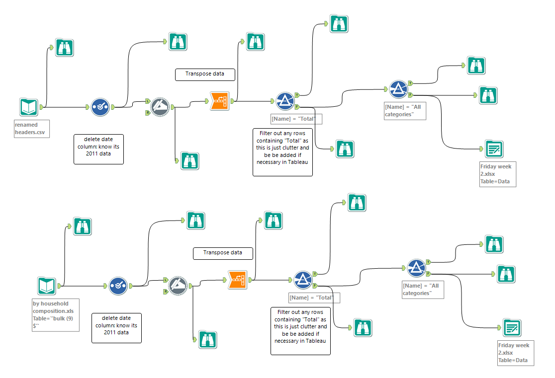
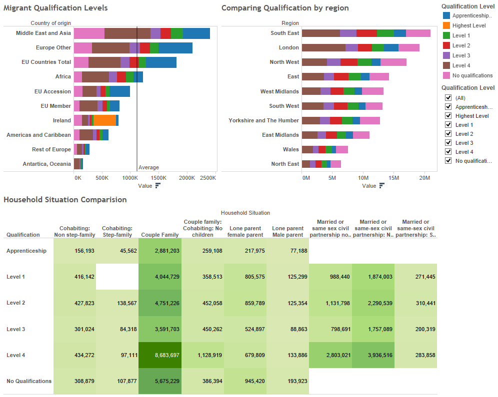
Alex looked at education qualification levels around the world:
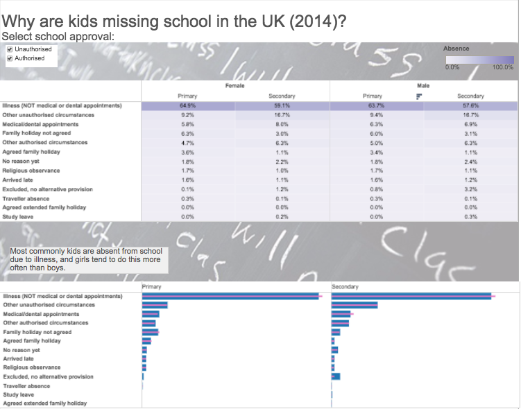
And Alexandra did a very interesting analysis on why kids are missing school:
You might be wondering why I showed you each and every project. Firstly, I did so to show you the variety of solutions that they created to solve the same problem. That’s the beauty of Alteryx; there’s really no one BEST solution. And secondly, this is proof that given the right environment, the right talent, the right coaching, and the right opportunity, complex data manipulation and ETL tools like Alteryx can be easily learned.

