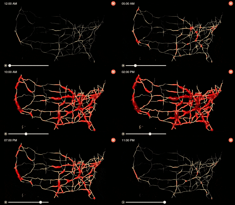
Metrocosm is a great resource for interesting data sets. For their final day of Dashboard Week, DS12 will need to visualize one month of hourly traffic counts at stations across the U.S.

There are two files they will need to join: (1) traffic stations, (2) hourly traffic counts. They can get the data here.
They’d be wise to read more about this project and the insights found on the Metrocosm page dedicated to this particular project. The visualization they created literally looks like heart arteries when you zoom in.
Requirements:
- Download both data sets.
- If data prep is required, they need to use Tableau Prep.
- They are more than welcome to supplement it with additional data.
- They can use any data visualization tool of their choice.
- Before 1pm, they must have their data prep complete, dashboards uploaded to Tableau Public, and blog posts written (because we have DS13 presentations starting at 1pm).
It’s been a great week! The team has really take on the challenges and realized they can do quite brilliant work in a very short amount of time. This is great preparation for life as a consultant.
