


People that know me in the Data School are aware that there is one thing I really find irresistible in visualisations. And that is…. maps! ❤
I don’t really know how or why I grew fond of maps. Genuinely, I consider them one of the best ways of visualise data. They can communicate information accurately, (almost) everybody can read and understand a map, and if you put the effort they can be a beautiful sight to behold. I knew that Tableau allowed for the creation of maps (of course I did, my DS application had not one but two maps), but I was looking for a similar feature in Alteryx. Thankfully, I bumped into it while trying to solve Alteryx Weekly Challenge #199 and I absolutely loved it.
The challenge
Coming across the report map tool was totally unexpected. It belongs to the reporting tools family and I found it in a spatial themed challenge, so kudos to the academy for mixing things up. The goal of this challenge was to determine the three movie theatres closest to the houses of a group of friends. Locations of major movie theatres and apartments was given as an input and we had to come up with the answer and plot it on a map.
Below you can find my solution for this challenge and I’m going to briefly talk you through it before giving you a glimpse of what the Report Map Tool can do.
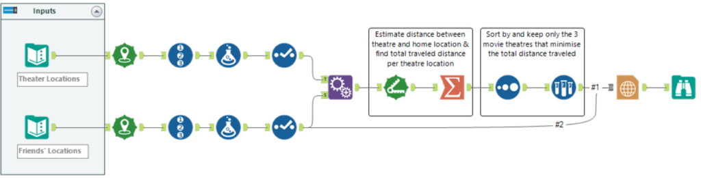
Figure 1 – My workflow solution for Alteryx challenge #199
The first part prior to the “Append Fields” Tool creates point-type spatial objects based on the apartment and movie theatres coordinates. Then, an ID is assigned to each cinema and each friend’s apartment, followed by the suffix “C” or “F” added via the Formula tools. That was done to enable us to distinguish between record IDs after the “Append Fields” tool, but it’s an optional step to the solution. The results have the format shown in Figure 2, where as we can see each movie theatre location is in the same row as the location of an apartment (along with the corresponding spatial objects).
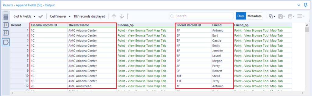
Figure 2 – Results window at the Append Fields Output
We can then go on and use the “Distance” tool to estimate the distance between the spatial objects and proceed with the steps described in the comment boxes shown in Figure 1.
The Report Map Tool | 
And here starts the beauty. The Report Map tool enables the user to create a map image from an Alteryx workflow. It may not be as configurable as maps in Tableau, but keep in mind that:
- Not everybody has access to/can use Tableau,
- The fact that the map image is created by a workflow means that your map will update every time you run it; this is an attractive feature when your priority is automation and speed over aesthetics,
- Maps in Alteryx have an amazing level of detail as they use TomTom mapping. Drive-time data and satellite imagery maps are also available features.
The tool accepts multiple spatial inputs (hence the grey input anchor) and allows for layering these inputs. Cartographic features such as legend and scale can also be included. In Figure 3 you can see three different map outputs using different base map selection. The points on the map are also customisable in terms of style, size and colour, whilst you can also import your own custom points.
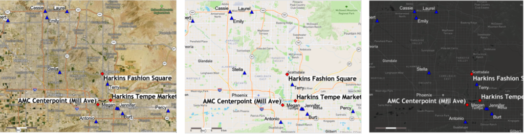
Figure 3 – Map previews from the Report Map Tool with different base layers
To better visualise the distance between origin and destination points, there is a very neat way to create lines connecting the blue/red points ‘as the crow flies’. But we’ll go through that and the configuration of the Report Map tool in the second part of this blog. Stay tuned for more spatial magic!