


Second day in our dashboard week and we were tasked to download data from Pinball Map’s API. We had to make a visualisation about the locations and location types of pinball machines, events, high scores, users’ favorite locations, etc.
I have achieved to address only the first couple of question. For the API to give you the right locations, you should first make a query about different regions. Then you should feed those regions IDs into the API making a second call to get the different locations.
This is where the fun part started, as data was structured in a very funny way. You could acquire information for locations in different cities, learn the number of machines each bar\restaurant had and also get a history of the comments made by users.
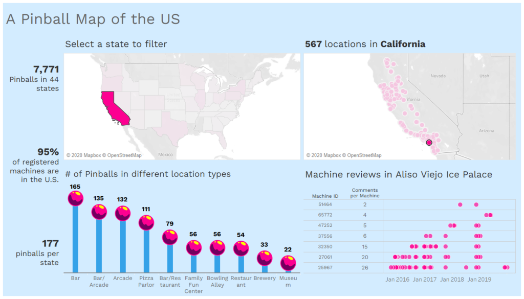
I focused in the U.S. since almost 95% of my data were for pinballs in that country. I wanted to create a dashboard that will allow you to click on a state and illustrate the different pinball locations within this state. Then you would be able to click on a particular location to see the number of comments made for the pinball machines. I also wanted to allow for some more freedom and allow the user to first select that locations category and filter down even further.
Link to the dashboard : https://public.tableau.com/shared/CMRPNHGXX?:display_count=y&:origin=viz_share_link