Rumour has it that there has been lots of complaining from DS18 about the first three days of our Dashboard Week. The reason? Those three days were more about data preparation in Alteryx than dashboarding. This is indeed very very true but, who cares?? Alteryx is great, Alteryx is fun and so is data prep.
And that is just me being biased. Spending something more than a month working on Alteryx on a daily-basis, I was aware that I have forgotten most of Tableau’s functionalities. Still, I’m probably better in Tableau than Power BI for those that read yesterday’s blog (or at least that’s what I think).
So today was meant to be a tough day for me. Little did I know that it was about get much much worse once Andy released the challenge. We had to make a Viz on a Guy’s and St. Thomas’ Charity project regarding Childhood Obesity in the UK. This project aired during early December and although the deadline to participate has passed, we could always provide some insight into the data.
That’s all great, apart from one thing. I had participated in that event during my first month in the DS and I’ve literally been traumatized by it. It was by far the hardest and largest dataset I have ever faced with 130 different fields and almost 32,000 rows at a time when I didn’t even know how LOD’s actually work.
Getting lost in Alteryx… again!
This time will be different. This time should be different! I’m armed with new weapons. I have Alteryx to explore the data and find correlations between the different fields. I will use the Association Analysis tool.
What the Association Analysis tool does is to look for relations between your fields and it returns the information in the form of a beautiful table. This table!
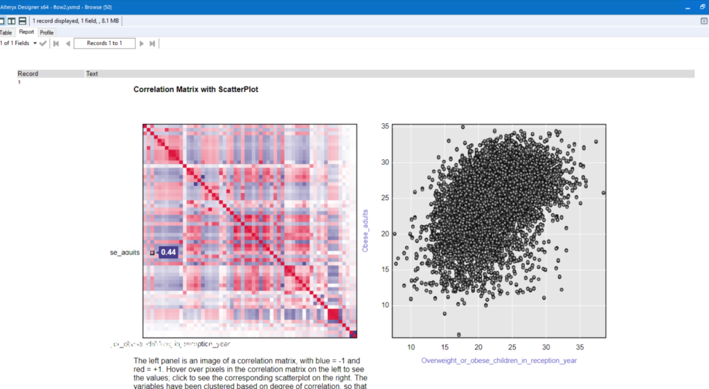
Of course it wasn’t at this form and it was clearer to read but you got the idea. Everything went great apart from one thing. I spent some much time having fun in Alteryx and taking notes about the different fields I can combine that I totally forgot about Tableau. And once again I had to rush through everything.
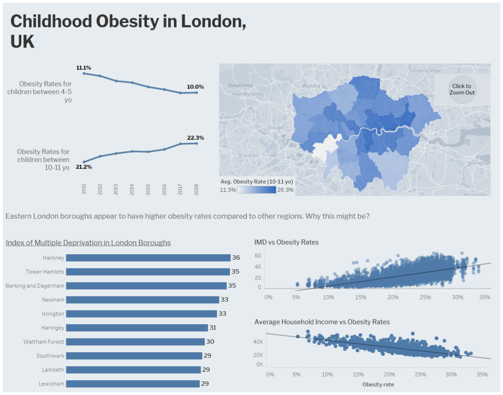
Maybe I should focus on obesity rates in London I thought. Then, I noticed that boroughs in East London have higher obesity rates. I knew from a previous projects that East London also has rather high deprivation indices. How those two relate? And how does that relate to the average income of each household? Are all these factors connected? Can I explore what’s going on?
Out of time. I just put everything in a dashboard and I’m hoping for the best. That’s something I should improve I guess. Don’t get drawn by things I find interesting. Stay one schedule and actually make one at the beginning of my day.