


I recently stumbled across an Idea post in the Tableau Community forums for a native 'Rounded Edge' feature in Tableau; the original post was created 11 years ago, yet the discussion thread is filled with comments left as recently as last month, and users linking to other posts proposing the same idea.
Clearly, this is a feature that many Tableau users would be keen to see implemented - but why is this?
Rounded edges in web design and beyond
Smoothed or rounded edges are not a new concept, but they have certainly become popular in the past decade among major websites, apps and browsers.
What is it about shapes with rounded edges that users might find appealing?
In this Medium article, UI designer Prince Mukherjee suggests that smoother shapes are more pleasing to the human eye because they are more organic, and less threatening. In the natural world, it is more common to see 'imperfect' shapes where sharp and straight edges might have been distorted or smoothed down (think of pebbles on a beach); at the same time, we are instinctively wired to perceive pointy and sharp things as more capable of harm.

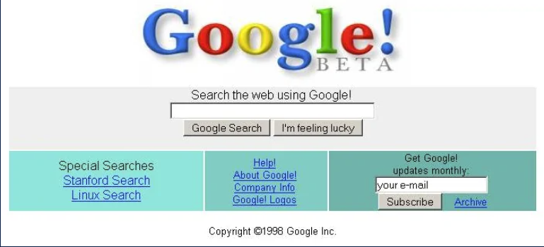
Looking to a major website as an example, there are many differences between the original Google homepage from 1998 and today's version, but it's hard to miss the complete removal of sharp rectangular shapes for the containers, buttons and the search bar:

For a nostalgia tour of sites like YouTube, Amazon, Facebook and more, I can highly recommend the Version Museum website; browsing some of these articles, it is interesting to see how this rounded edge design feature has been incorporated by each company over time.
If you've ever owned an iPhone or Apple device, rounded edges have also been a consistent and prominent part of their UI design since the first generation iPhone:

With this design feature becoming increasingly commonplace in web design, and the interfaces we see every day, it is not surprising that Tableau users are so keen to have the option to replicate this in their own work designing dashboards and reports.
Using rounded edges in Tableau
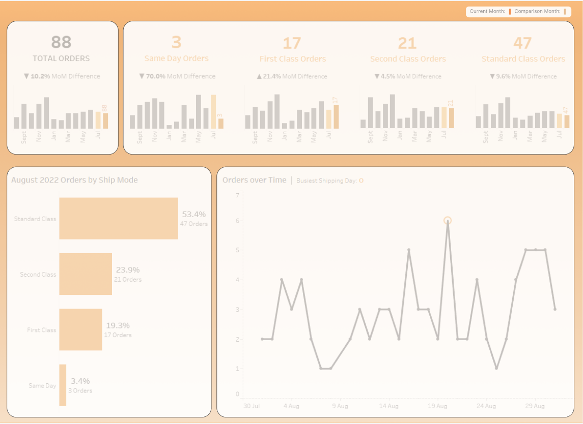
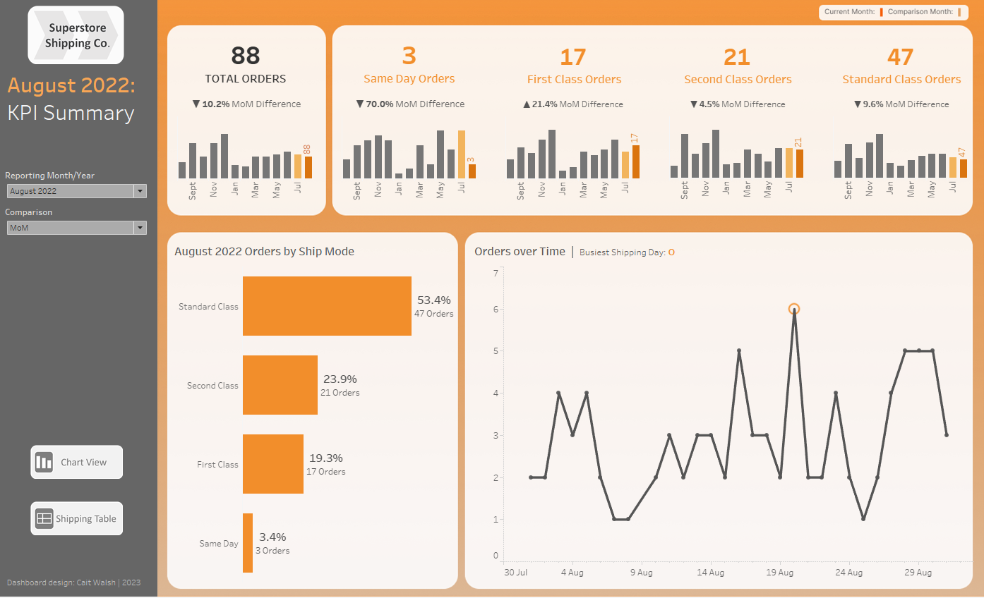
The post mentioned at the start of this blog specifically referred to containers, and at the time of writing this feature is not natively available in Tableau Desktop.
However, there are still several ways to give your Tableau dashboard the look and feel that you might want, and incorporate rounded edges:
- Make use of annotations to mimic containers
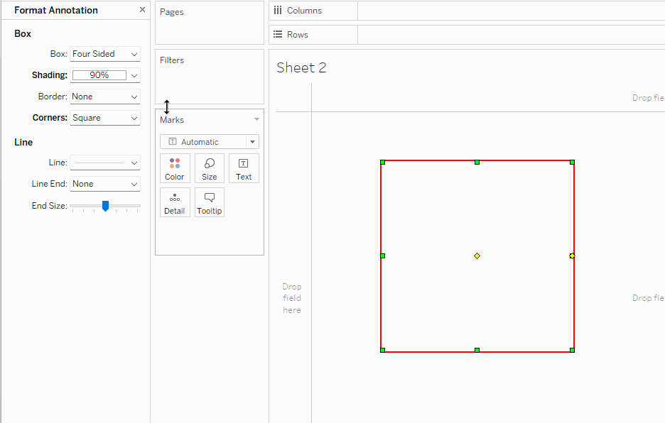
DS alum and Tableau Visionary Irene Diomi has innovated and shared an approach to help give the appearance of rounded edge containers; you can use annotations in Tableau to give the appearance of a container with a rounded edge.
You can view and download Irene's workbook here on Tableau Public, but the method involves creating a new Sheet that contains formatted annotation boxes.
The formatting options for an annotation include rounded edge settings, with three different options for the amount of rounding you can add:
You can then use your new Sheet as the background to a Dashboard, similarly to the Figma/background image method below.
2. Use Figma or another interface design app to create a background image
For even more design flexibility, many Tableau users have discovered that Figma and similar tools can provide a great starting point for creating a visually appealing dashboard.
Different users will take different approaches, but in my own work using Figma, I will typically have already got most of the way through planning and creating my dashboard, so I know what content I am including and where it should all fit:
Once I have a firm plan for the layout, content and colour scheme, I can take a screenshot of the dashboard and copy this into a new Figma design file. In Figma, I can then start adding shapes on top of my dashboard with their opacity lowered, allowing me to clearly see how they will line up with the objects and charts in the dashboard:
Once I am satisfied with this layout, I can delete or hide the Figma layer containing my dashboard screenshot, adjust opacity of my Figma shapes if needed, and make sure that all of my shapes are grouped; I can then Export the whole group as a single PNG file.
Back in Tableau, I will need to add an image object to the dashboard, and set it to be Floating. I will then need to set the size and position of this image in the Layout tab so that it takes up the entire area of the dashboard.
Once I am satisfied that the Figma image is the correct size and is positioned as I want it to be, I can now right click it in the Item Hierarchy and make sure it is sent to the back of the Floating Order.
Finally, I will need to remove the shading of any sheets that sit over the top of the image.
The beauty of this method is that it can be very adaptable - if you begin to make changes to your dashboard layout that no longer match your background containers, all you need to do is adjust your Figma file accordingly, export it, and then go to the original Figma image in your dashboard and right click to Edit Image and use the file browser to select the newest version.
3. Use rounded edges in your charts, not just your containers
We can give Tableau dashboards the impression of having that softer, rounded edge UI design without using containers and background images at all, by incorporating more charts that share this look and feel.
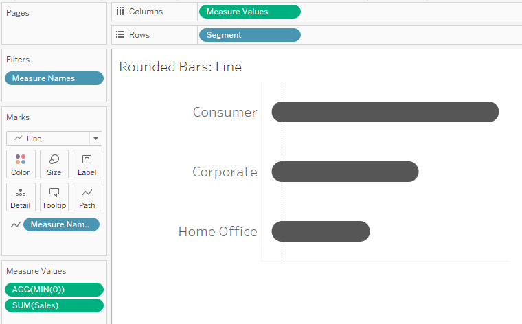
One example would be to use rounded bar charts, instead of the conventional rectangular bars:
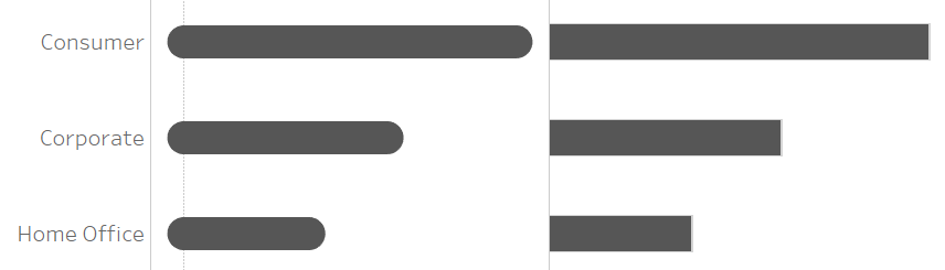
There are two methods for creating a rounded bar chart in Tableau.
The first, more robust method, is to create your chart using lines instead of bars.
In the example below, I created a standard bar chart showing SUM of Sales by Segment, and changed the Mark type to Line; I then created a dummy measure field MIN(0), and dropped that onto my chart axis to open the Measure Values shelf.
Finally, I added the Measure Names pill to the Path card, so that each line would go from 0 to the total Sales value for that Segment:
The second method might come in useful when you already have multiple measures being used in the chart, and cannot use MIN(0) to plot the path of your lines.
This method involves making your bar chart a Dual Axis chart, and setting the Mark type of the second SUM(Sales) measure to a circle:
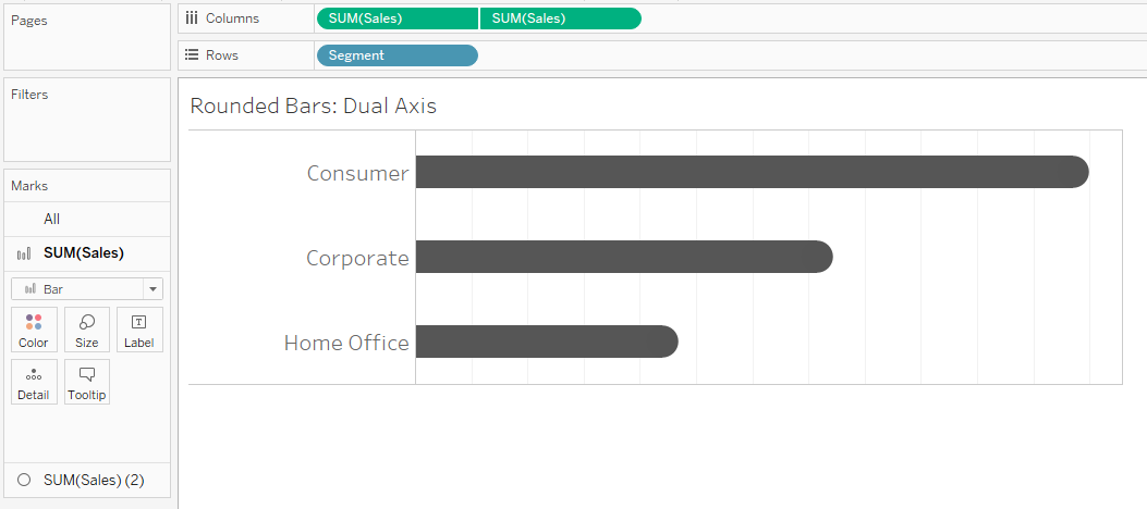
However, it should be noted that this option can look less neat on closer inspection, since you will need to adjust the size of your different mark types in order to create the illusion that users are seeing one rounded bar (instead of an overlapping rectangle and circle of slightly different resolutions!).
Not an all-rounder...
As with many design features, rounded edges are great in certain contexts, but not so helpful in others.
In this past Data School blog, Jonathan Allenby points out one of the flaws of rounded bar charts: you might sacrifice precision for the sake of aesthetics.
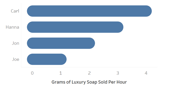
The rounded edge of the bar chart actually protrudes further than a rectangular bar would for the same value, and users might misinterpret values against an axis.
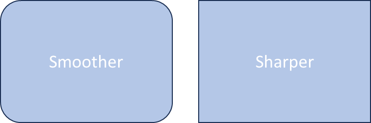
Looking back at rounded containers, there is also an argument that rounding edges might be less efficient in terms of space. The image below shows how - in a more extreme example - text that will fit within a rectangular container might be cut off when we introduce rounded edges to a container of the same size:
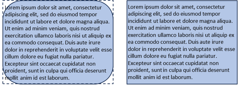
We can introduce heavy inner padding to combat this, but as a result we might not be making the most of the space on our dashboard.
Finally, rounded vs sharp edges in design can also be a matter of taste - they might not always be the most visually appealing option for your design.
While there is something sleek and modern-looking about Tableau dashboards that incorporate rounded edges, there are also plenty of examples of elegant design that do not use them at all.
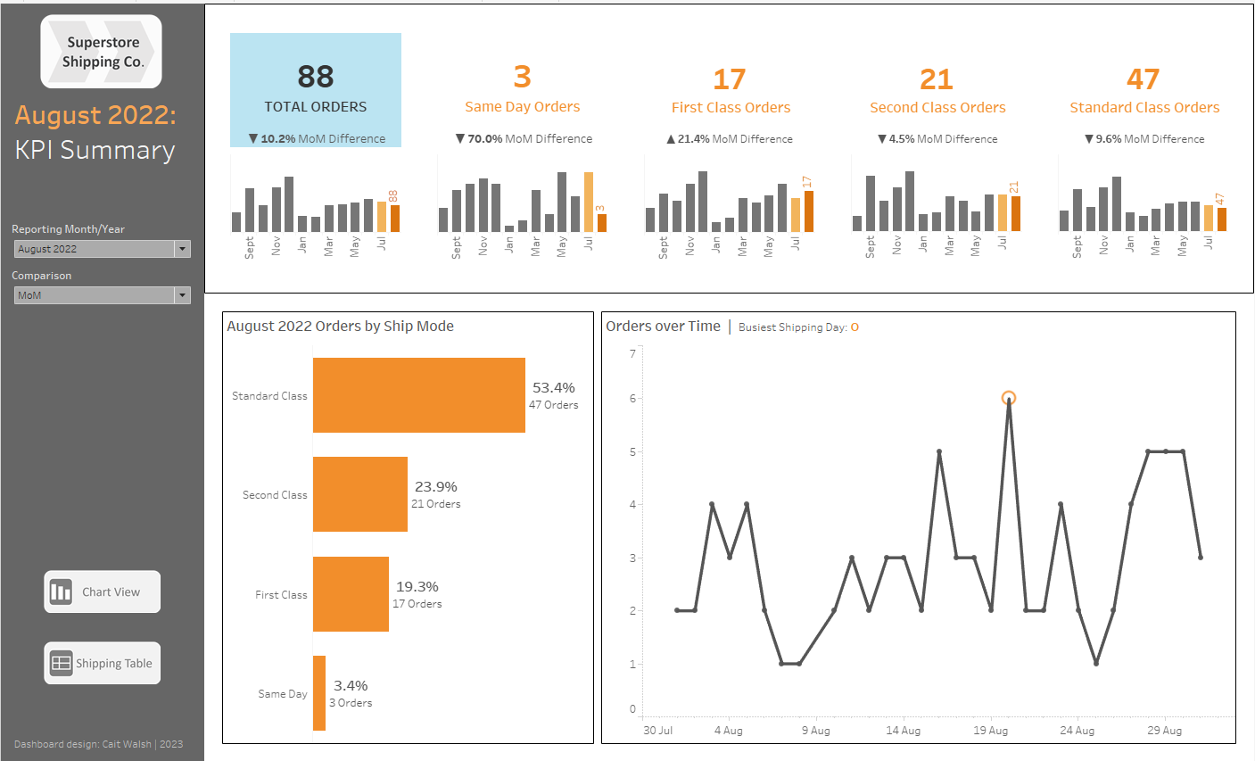
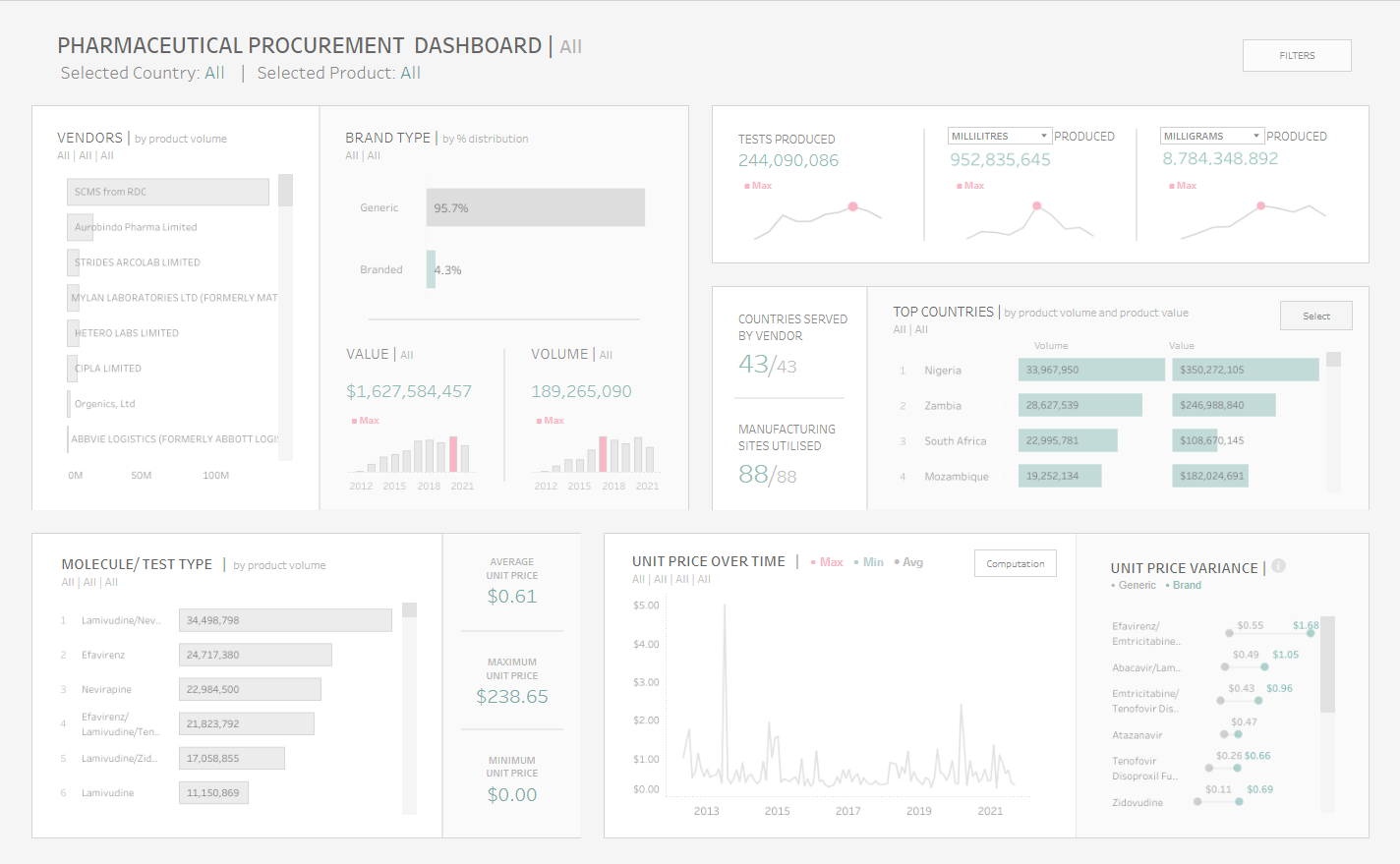
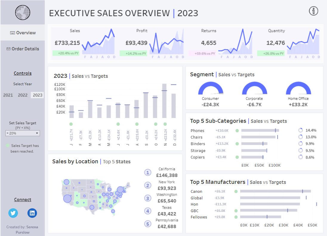
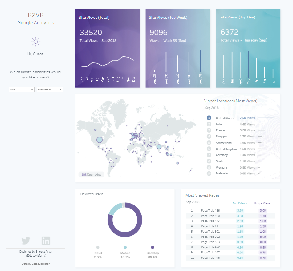
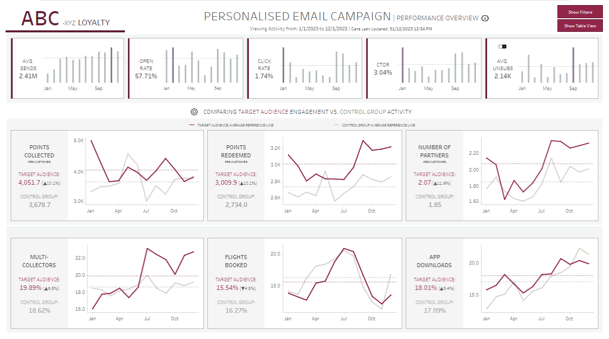
Below are some recent examples of excellent design from Data School consultants Megan Coutts, Shreya Arya, Muneeb Sajjad and Serena Purslow; each business analytics dashboard comes with its own distinct and modern style, yet there are hardly any rounded containers being used to achieve this effect.
Final thoughts
If you have read this far, I can safely say that looking further into this topic would be a very interesting tangent: 'smoothed' vs 'rounded' discourse turns out to be very subtle when you really get into the maths behind it all...
All in all, I think rounded edges do have their place in UI design; however, until this becomes a native Tableau feature, we have plenty of other options for designing visually interesting dashboards.