


11:03
Data preparation was a struggle. Andy has been kind enough to give us survey data for today (/andy-kriebel/dashboard-week-day2/). Although it’s taken considerably less time than yesterday, I have felt much more strongly stuck at moments this morning than I felt yesterday. ‘Where do I even start?’ Fortunately, Steph did a great job of helping me along the way – giving me guidance in how to think about the problems I was facing with the data without immediately giving me the full answer (though that sometimes came a little further along the line). Something that I sometimes struggle with at the DS is knowing when to ask questions. How long should I spend trying to work it out, before I ask for help? It’s difficult to know.
The one contribution that I had to the communal improvement of knowledge was a very satisfying piece of regex work. Having transformed the supplied pdf to an excel, we were left with Nationality and Gender in the same column (for example, British female and UAE male), and needed to split this out. Simple, you might think – just text-to-columns! However, the presence of ‘Hong Kong’ in the dataset meant that there was a viable-enough excuse for me to use regex – plus it’s fun so I want to practice it. Here’s what I came up with, using the parse method:
(.*)\s(\w+)$
The building blocks:
$ – anchors to the end of the string
\w+ – returns one or more word-type characters
() – marks the pattern within for extraction
Therefore: (\w+)$ – extracts all contiguous word characters attached to the end of the string (where contiguous means that they aren’t separated by a non-word character e.g. space, bracket, etc)
\s – a space
.* – return 0 or more characters of any type
Therefore: (.*)\s(\w+)$ – returns and extracts everything up to (but not including) the space that precedes the final word string, and also returns and extracts all contiguous word characters attached to the end of the string
11:32
Finished blog up to this point! Now to get cracking with the data in Tableau. What story would I like to tell?
13:05
Back from lunch. I managed to get some charts built in Tableau before breaking for lunch, including my first ever solo bump chart. I’m not always a huge fan of bump charts but it’s good to know that I can make them if I want to! All the table calc practice that we had during the Desktop 3 teaching has clearly paid off. What I’m still lacking is inspiration about how to visualize this data. Where’s my story? What’s my schtick?
14:03
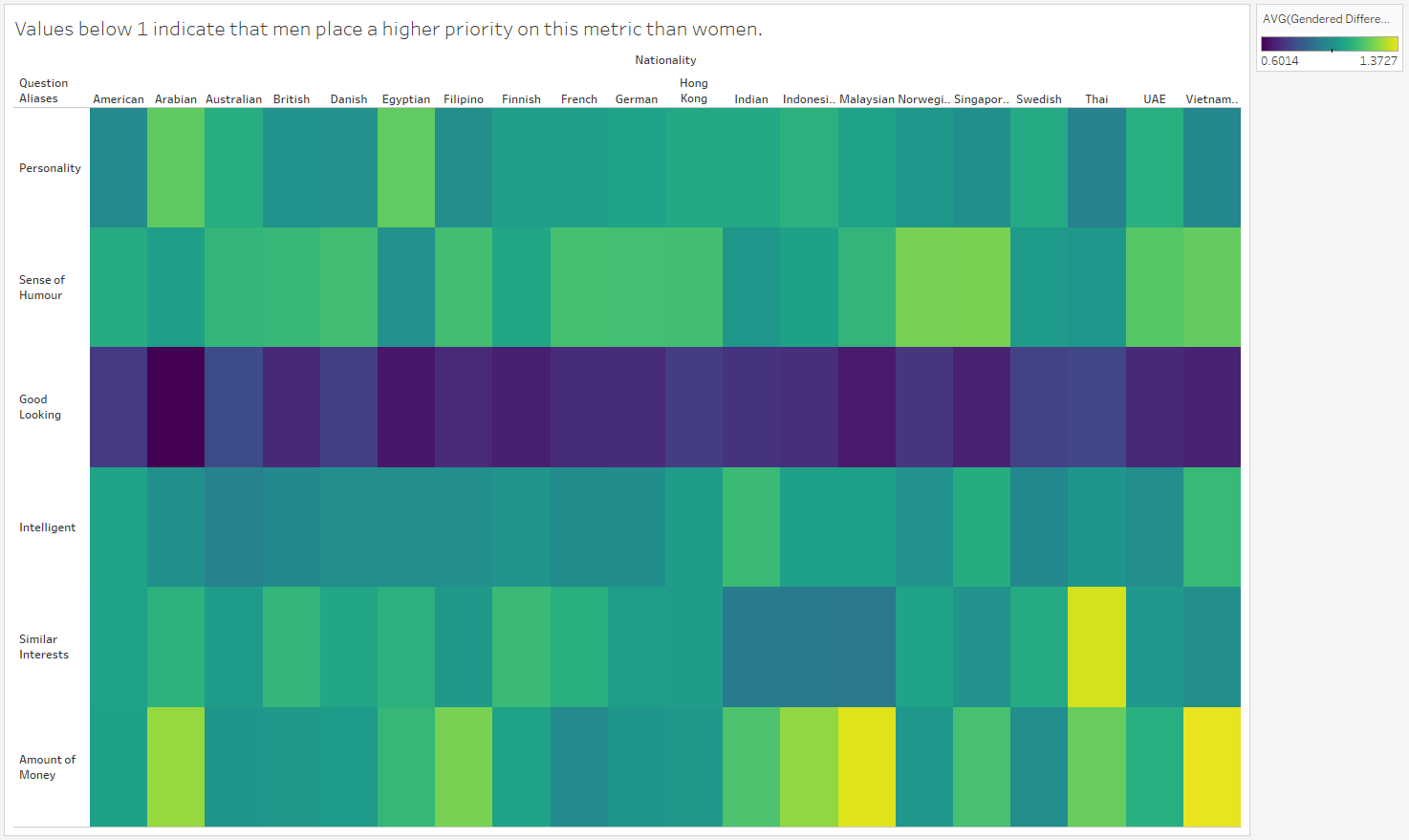
I’ve done some fun calculations and made some swanky heat maps!
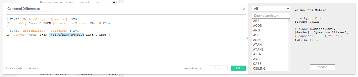
The [Value/Rank Metric] calculation takes the percentage of people of each gender from each country who gave a specific response to a specific question, and divides that by the numeric value of the rank of that response. For example, 18% of American men selected ‘Looking Good’ as the most important factor (Rank 1). Therefore this is assigned a calculated Value Metric of 18 (18/1). 13% of American men selected ‘Looking Good’ as the second most important factor (Rank 2), giving it a Value Metric of 6.5 (13/2).
This then feeds into the [Gendered Differences] calculation, where the female Value Metric is subtracted from the male Value Metric, resulting in a single value describing whether each factor is more important to men or women from each country. Values greater than 1 indicate that females place more value on that factor than males, and vice versa. Values close to 1 indicate parity in the responses of males and females. This very clearly shows the inflated importance that men place on good looks compared to women.
16:25
Progress has been made! I ran with my calculation looking at gendered differences in characteristic preferences. I’m now in the process of combining my charts together into a (hopefully) cohesive story, as per Andy’s demands. I haven’t used story points since my initial application, so this is a fun but challenging experience. I had a good week to put my application viz together, including lots of thinking time for finding stories in the data. I was also strongly helped in that case by the fact that there was a temporal aspect to the dataset I used in my initial application – it’s easy to tell stories through time, because that’s how we’re all used to hearing stories. This is harder, but I’m getting there. It’s also interesting to experience how putting things together into a story prompts me to think about different ways of wanting to illustrate my points. But now time’s almost up, so I need to make decisions, not just make another round of charts.
17:24
Whilst I’m not completely satisfied with my final output, this is it (click on the first image to go to Tableau Public):

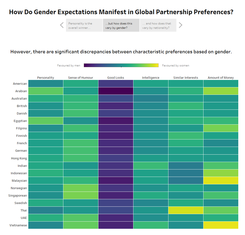
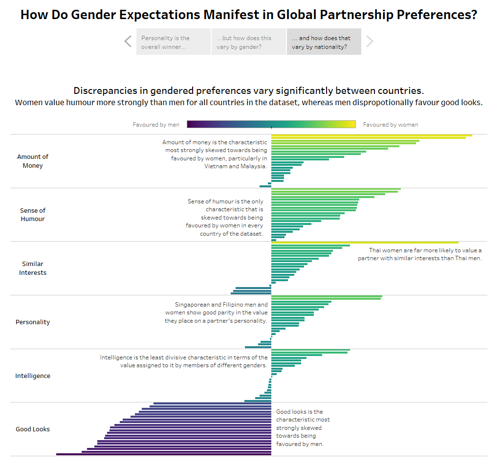
I edited the calculation that I previously explained so that it ramped around a zero centre-point (by just subtracting one from the final value). This allowed me to suitably apply a diverging colour palette, and to create the diverging bar chart that you see in the third story point. I also switched the axes on the heat maps, so that the nationalities wouldn’t get truncated across the top. I’m not sold on the purple colour palette that I used in the initial heat map, but nothing else I tried was preferable, so I stuck with it. I would have also liked to add an explanation page of sorts to explain the calculations that I used to build the charts, because it isn’t necessarily intuitive, but haven’t been able to get round to that in the time given. I’ve also literally just realised that I haven’t cleaned my tooltips, so I’ll quickly sort that out…
17:40
Tooltips done. It looks the same as in the previous screenshots – but now when people hover over things they might actually learn something!
17:49
Well, apart from the source that I just added. Finally actually done.
There it is folks – a glimpse into a day in the life of dashboard week! I’m away on a shadow day tomorrow so you won’t hear from me, but I’ll be back in force on Thursday.