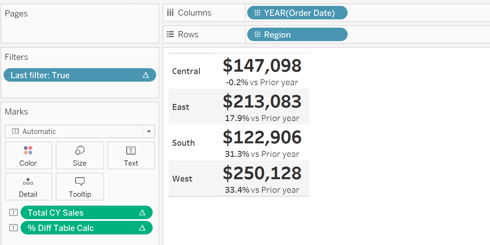
In my previous blog, I demonstrated how you can build a KPI chart of sales over region for the latest year, using table calculations. Here I will build the same chart but by creating dynamic fields for the current and prior year sales, using window functions.
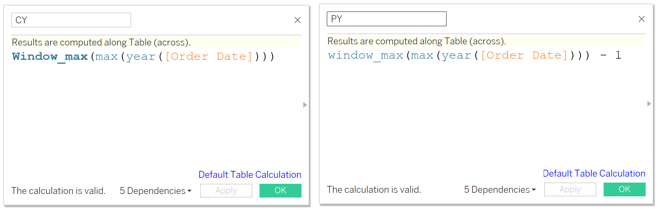
First, we create calculated fields that return the current and previous years.
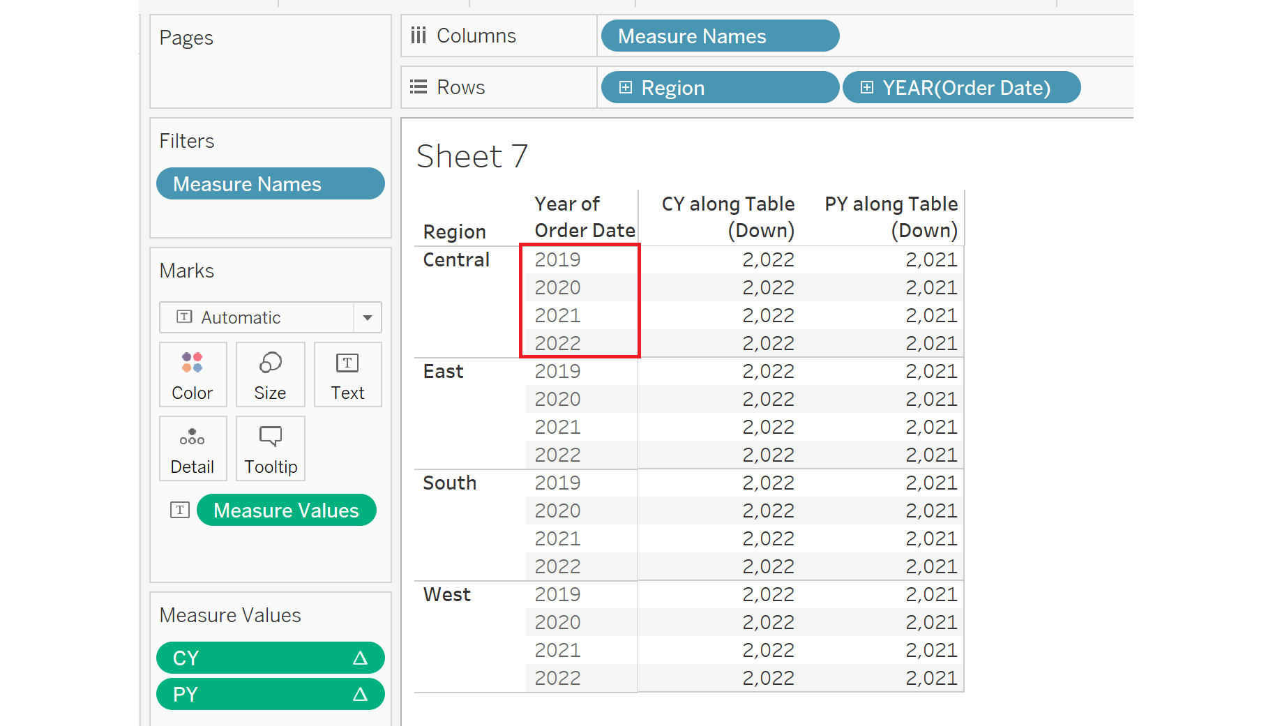
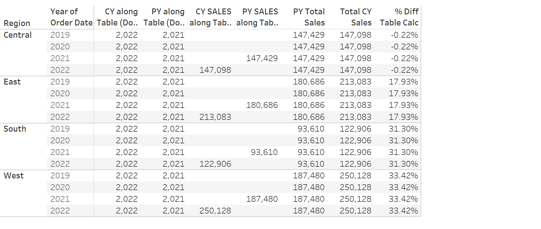
To demonstrate how they work, lets put them in the view along with our region and year of order date:
The window max calculation takes the maximum year number in the window / pane highlighted in red. The year of order date has been wrapped in a maximum function so that it is an aggregate. The previous year function finds the same year number and subtracts 1 to get year 2021. These year values are the same no matter how the view is broken up, but will update if new data is added.
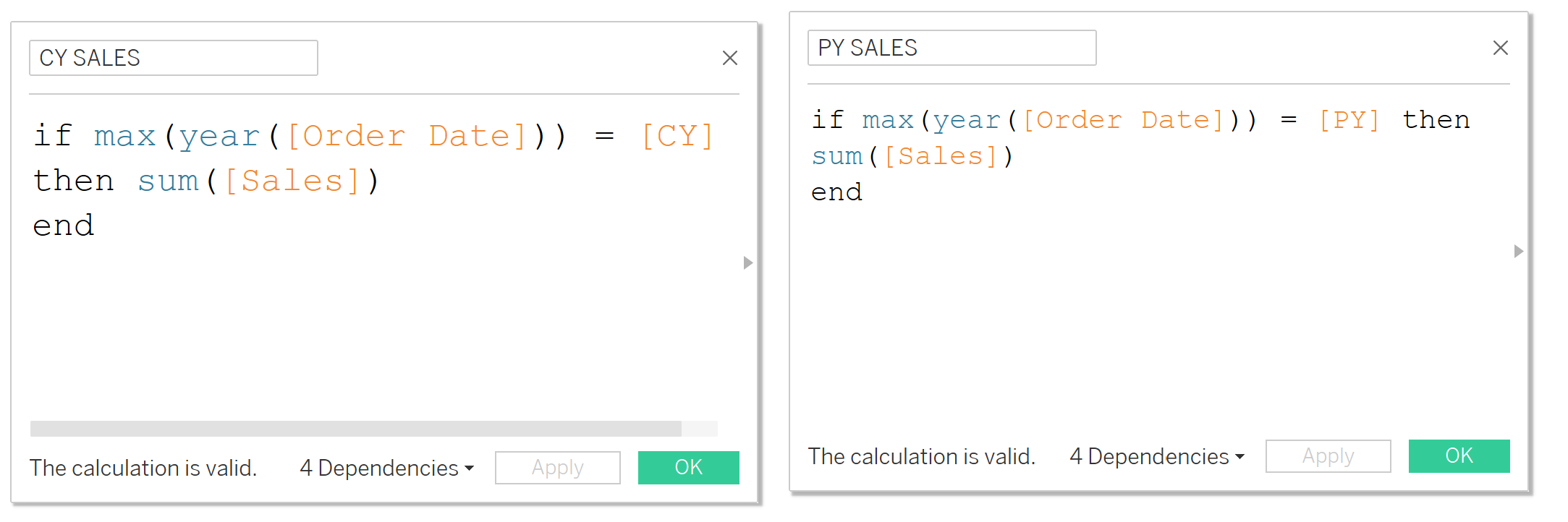
Now we create a calculated field for the sales of the current year and prior year – each function returns the sum of sales if the year is equal to the prior or current year.
If we put it in the view, we see that CY sales is only calculated for the year 2022, and PY Sales only appear when the year is 2021. However, this poses a problem for our percent difference calculation – in order to get the difference between the 2022 sales and the 2021 sales, we need the red highlighted cells to also contain the respective sales values. Otherwise, the calculation will be using an empty field.

This is where the window_max function comes in. We create a field for total PY and CY sales:
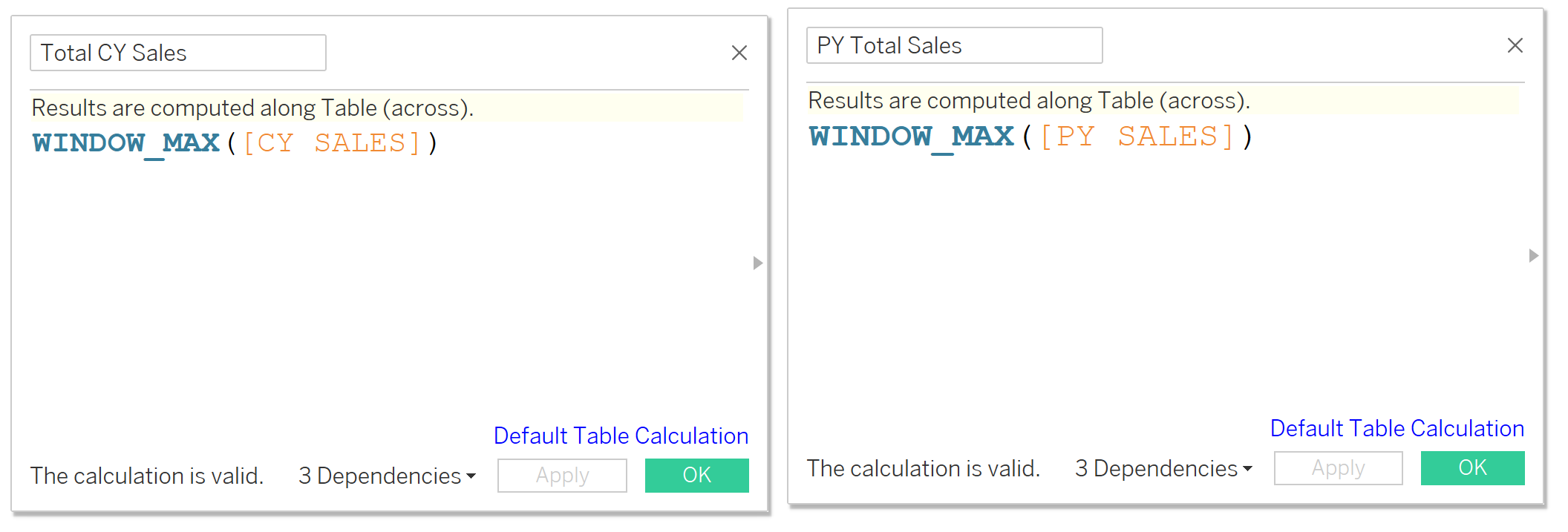
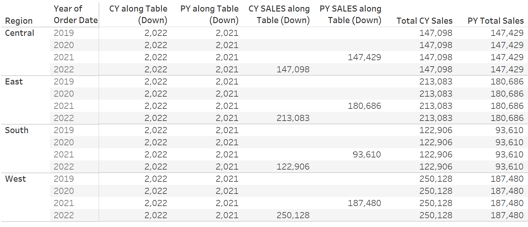
If we add the Total CY and PY Sales fields to the table and edit their calculations so they compute down each pane, we can see easier that the fields return the total CY and PY sales for each region, showing on every row. This is because for each cell, the window_max function returns the maximum value visible in the pane – namely the total sales as the rest of the rows are empty.
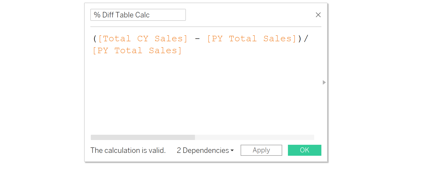
Now we can build our percentage difference calculation using these fields.
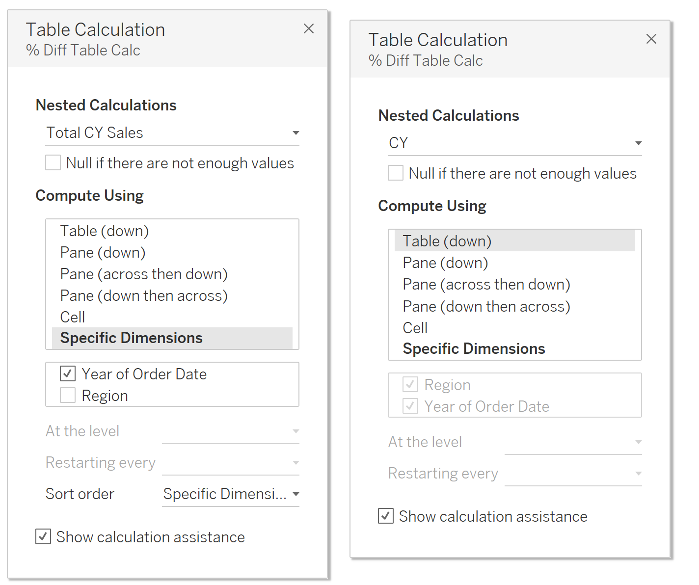
To test it, we add it to the table and edit its computation as below. Note that this calculation uses multiple calculated fields, so the edit table calculation window lets us switch between the fields CY, PY, CY Sales and PY Sales to configure their computations. Make sure CY Sales and PY Sales are calculated by year and resetting every region, while the CY and PY fields can be calculated down the table.
We can now see that all of our calculations work.
To build the KPI chart, it’s very similar to the one in part 1, except instead of a table calculation using sum of sales, we add the percent difference calculation we just created, making sure all the calculations are computed correctly. You can use the LAST() function as explained in the previous blog so that only one column is showing.