Today's challenge for Dashboard week was to try and test our creativity when it comes to making dashboards, typically we have been creating more professional and executive dashboards, so this was a nice opportunity to flex our creative minds.
We were given data from the FIFA World Cup since its inception in 1930, the datasets included all the head-to-head data, player stats, as well as manager and stadium information.
My initial ideas revolved around looking at teams and players statistics in a broad sense as there were not too many metrics to compare to e.g. goals, appearances and number of wins. In the end I decided to use these metrics but add a bit more of a user driven element, where the user would be able to select a lineup of players and see these metrics as a whole team.
For some more interactivity, I was also looking to add different dashboards which would represent different formation the user wanted to pick from.
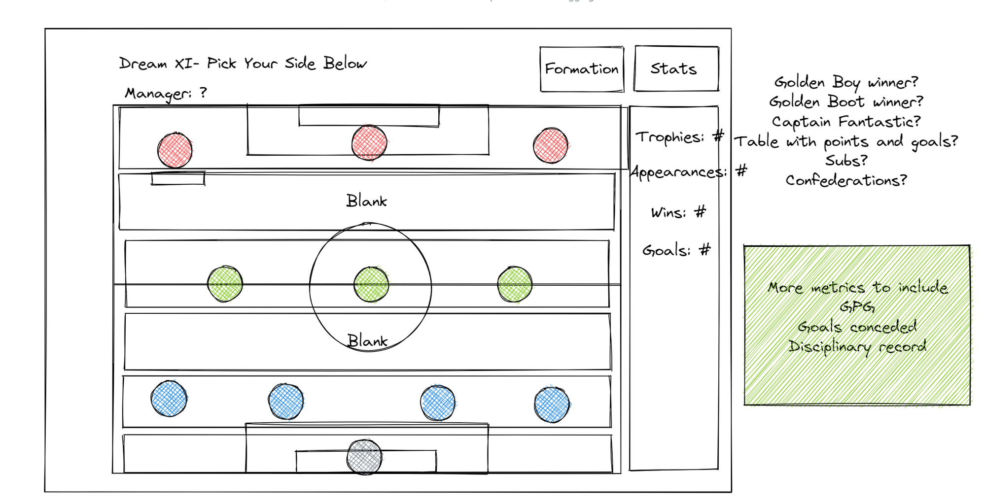
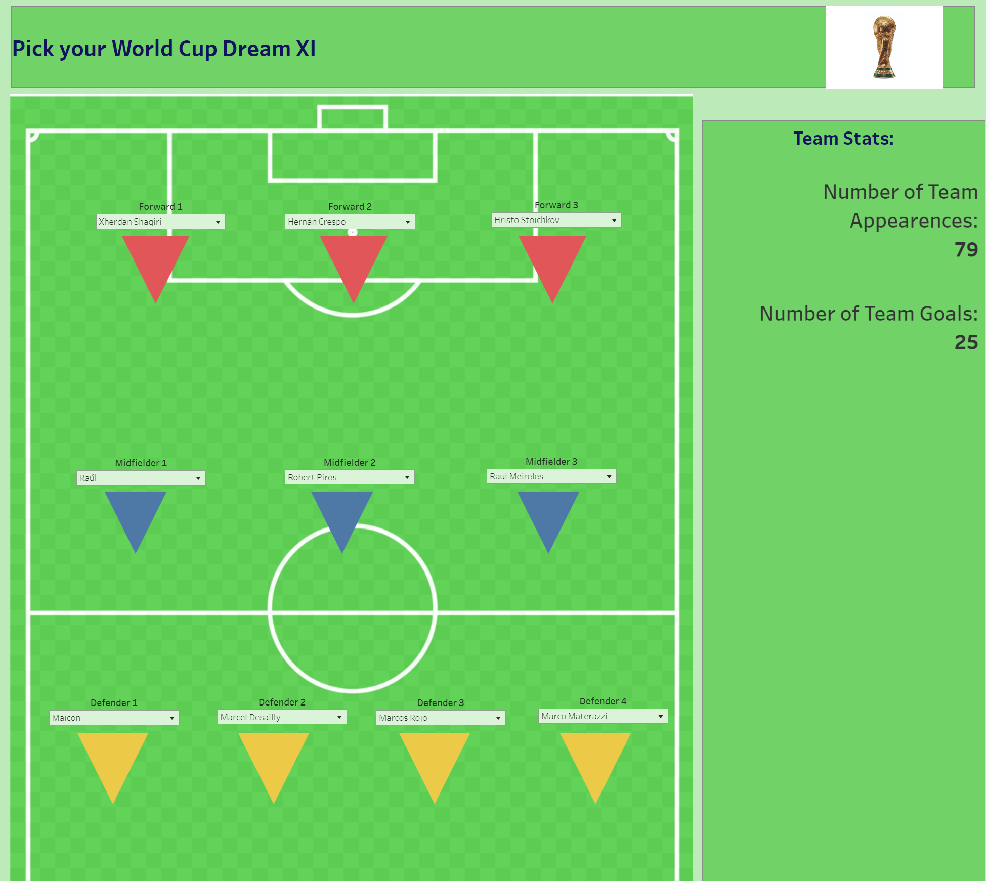
Based on the sketch I was able to create the dashboard below which will serve to be a template for my further iterations of it. I spent a large amount of time creating numerous calculations for each possible position as well as trying to format a pitch with players located in their correct places.
Positives of my dashboard:
I think I was able to lay down a lot of the groundwork for further iterations e.g. calculations.
I was able to capture the main elements of my initial plans and it works as intended.
Improvements for my dashboard:
Rather than making lots of containers, I could instead create a scatter plot with X,Y coordinates for the player positions so when they change from Left Winger to Striker, the player icon will move according to the position given to Left Winger.
Gathering or generating more metrics to measure the team against.