


Yum. 🍩
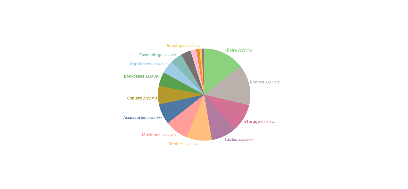
After Bianca Ng’s blog post about waffle charts, I wanted to introduce additional food-based visualizations: the pie chart and donut chart. However, these charts are somewhat controversial in the data viz world because they can be difficult to read, especially when used incorrectly, as seen in the image below.
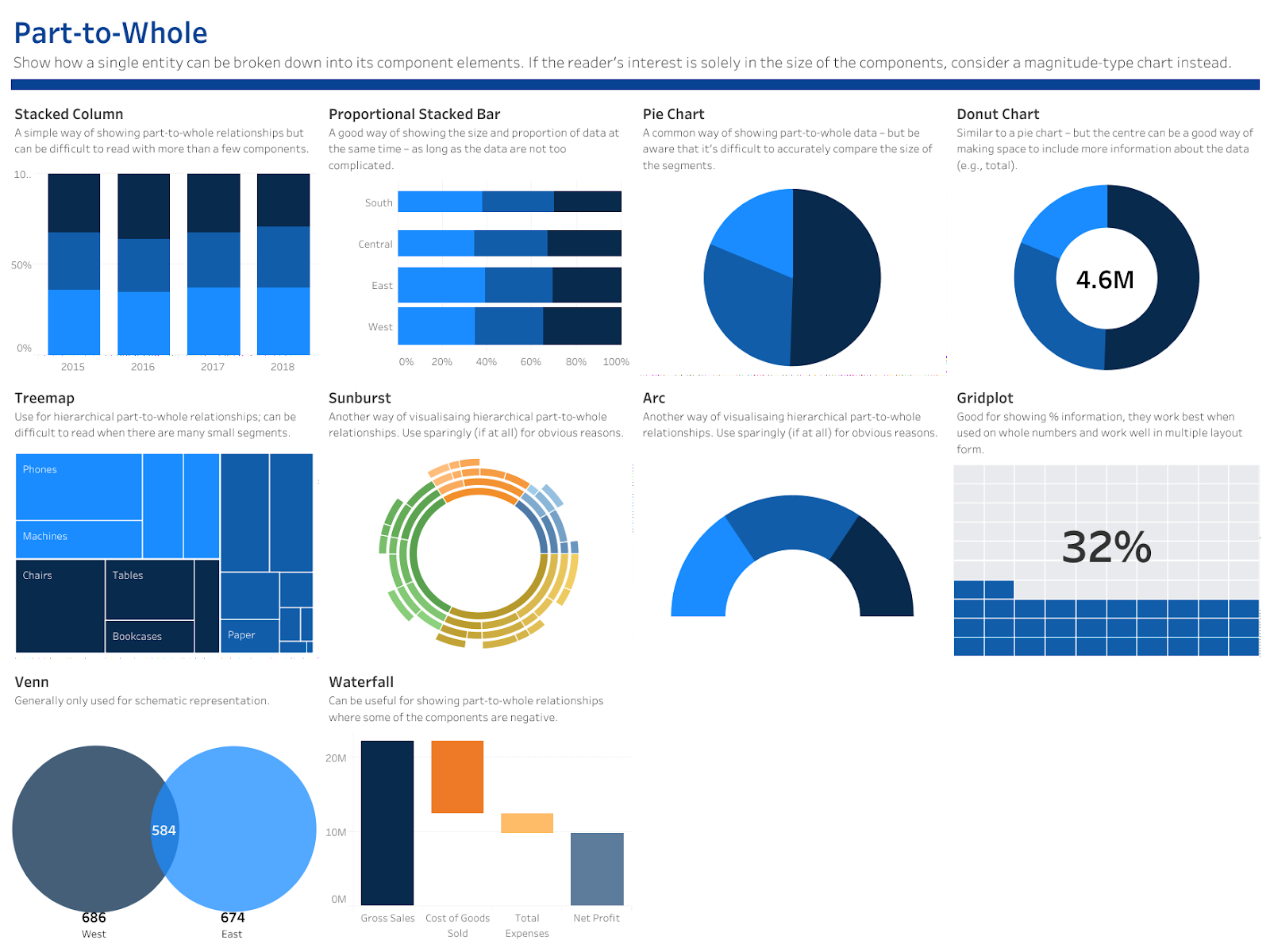
Pie and donut charts fall under the chart category of part-to-whole. (You can view other part-to-whole charts on Charts.Guide or in Andy Kriebel’s Visual Vocabulary.) As explained on Charts.Guide, part-to-whole charts show how A, B, and C add up to the total.
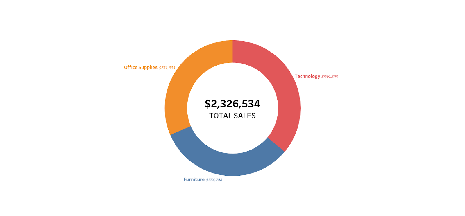
Pie and donut charts employ the pre-attentive attributes of size to represent values and color to differentiate values. These charts work best with fewer components – 2-4 parts are ideal, though a chart with 4 parts might be pushing the envelope. It’s also good practice to sort the components from greatest to least, like so:

A donut chart is a pie chart with a donut hole in the center of it. I prefer donut charts to pie charts because the donut hole allows for additional information.
While I do understand the limitations of pie and donut charts, I don’t understand all the hate. When these charts are used properly, they can be effective in displaying part-to-whole relationships among few components. What are your thoughts on pie and donut charts? 🥧