


Creating a dynamic map display / axis change using parameters:
I’m going to describe how to do it for 2 variables, but we can scale this to any number of variables which we would like to display on the Map. I have a map of all the bus routes in London, and I would like to show the average speed of the busses, but also offer the option for the reader to see the route completion in minutes (the time it takes the bus to do its route).
In order to do that, I need to create a parameter which I will call ‘Choose the metric’, make it an integer and under the ‘Allowable values’ section, select the list option.
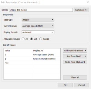
In the list option on the left column, put as many axis which you would want to rotate through on your display, and number them 1 through N, where N is the number of variables you want to rotate through.
In my case, I’m going to use two variables, the first being the Average speed, which I will call ‘Average Speed (Mph)’ (putting the value of the measure helps bring clarity). The second will be called ‘Route Completion (min). Then, we will create a new variable (I have named mine ‘Value’, but any clearer name more appropriate to your own metrics can be used.
Here is where the magic happens:
I will use a function called Case, which will do different things based on the parameter (‘Choose the Metric’) that we previously created.
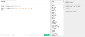
When it is equal to 1, we will return the average of the [Speed] variable, when it is equal to 2, we will return the average of the [Route completion] variable (these are the values you originally wanted to display, going from 1 to N). What the case function is doing is it is attributing an action to be taken when a number is selected. Since we’ve associated with a number the name of our variable, we need to make sure that the correct variable is associated with the correct Case. We remember to END the statement.
Now, we simply drag this new measure (‘Value’ for me) on the colour shelf, we remember to show the parameter controls, and we can now flick between our measures!
I’ve made a video to show these last few steps: https://youtu.be/oXc45bP_BMs
You can find my project on Tableau Public Week 2 project.