


Part 1 detailed how to make a simple Pareto chart. Part 2 will show you how to add two dynamic reference lines and colour the area at which these lines diverge; a rubric that can be applied to other chart types.
- Firstly, start with a “typical” Pareto chart (see Part 1 on an explanation of how to build them).
- Make some modifications:
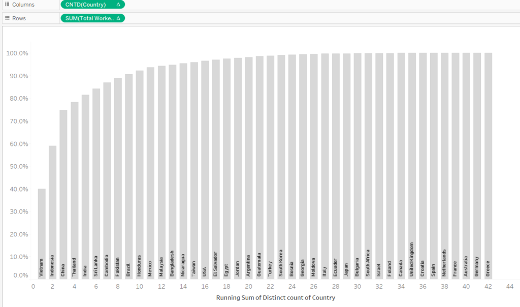
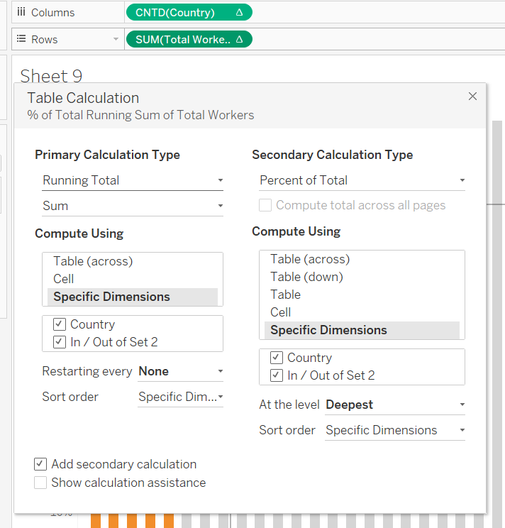
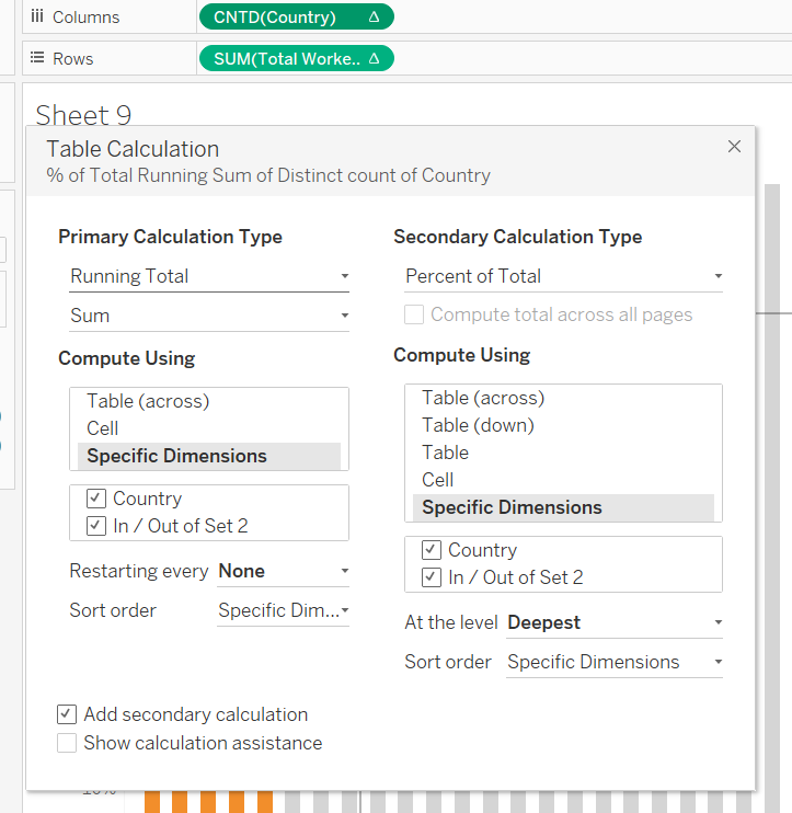
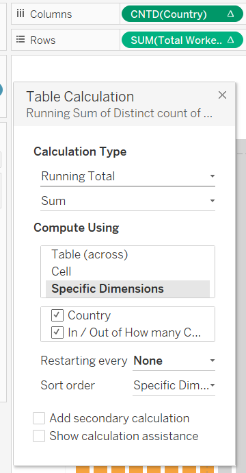
A “typical” Pareto chart (like the one shown in Part 1) has a primary running total calculation and a secondary % of total calculation for both the measure (Total Workers, b.) and dimension (Country, c.). However, in this instance we want to maintain the same table calculations for our measure (b.), yet, only add the primary calculation of running sum to our dimension field (Country, d.). Therefore, configure your calculations in accordance with c. and d. below.
The resulting format can be seen within a.
It is important to ensure our dimension only has this primary running total calculation, as this step will later allow us to utilise an integer parameter to select the number of countries we wish to look at. Adding a secondary % of total calculation would yield a decimal and not a whole number, thus, this would be incompatible with an integer parameter.
a.
b. c.
d.
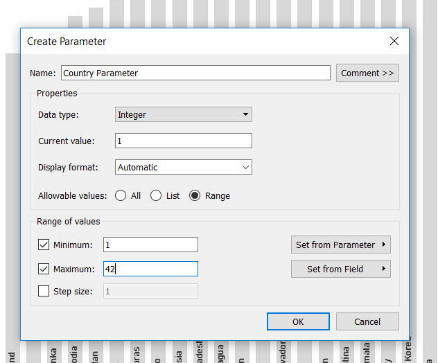
3. The next step is to create the parameter. As aforementioned, we want this to be an integer parameter, ranging from 1-42 (representing the 42 countries in our data). This will allow us to dynamically select the number of countries we wish to look at.
Configure the parameter like this:
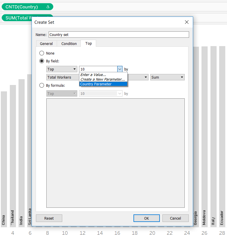
4. Next we want to create a conditional set that is based upon this parameter. The creation of this set will provide the action of grouping together a number of countries, dictated by the number chosen within the parameter. For example, if we set the parameter to 7, this will group together countries 1-7 and show us the running % of total for this set.
Thus, right-click on the dimension (Country), and select ‘Create’…’Set’
Secondly, navigate to the ‘Top’ tab, and select the parameter created earlier. Thirdly, ensure the correct measure is selected below, in this case, we are looking at the Sum of Total Workers.
5. Show your parameter control, and drag your set to colour.
Whilst you’ll have a working dynamic set, you’ll immediately notice a horrible view like this:
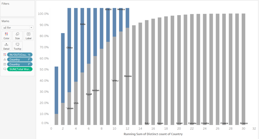
Why has this happened? By adding something new (our set) to the view, our table calculations have been altered.
By editing your table calculations, you’ll be able to see the set has been added to the measure and dimension, and by default, they remain unticked, meaning each table calculations is computing the running sum and % of total separately for the IN and OUT set, resulting in this strange view.
6. Simply go back into the table calculations, and tick the box next to your set.
Before:
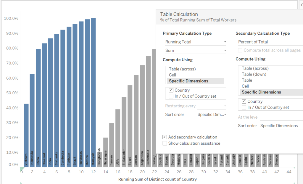
After:
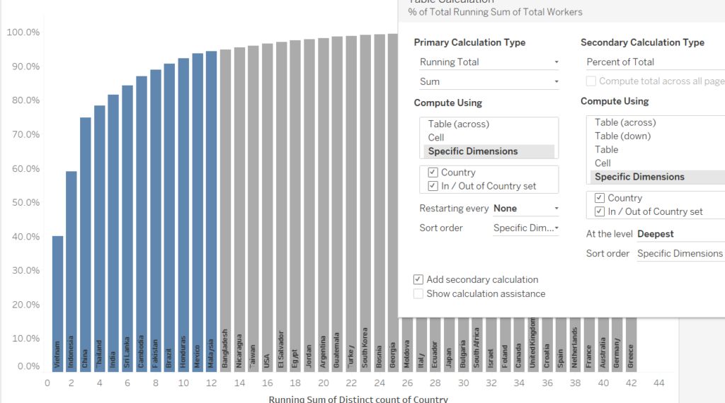
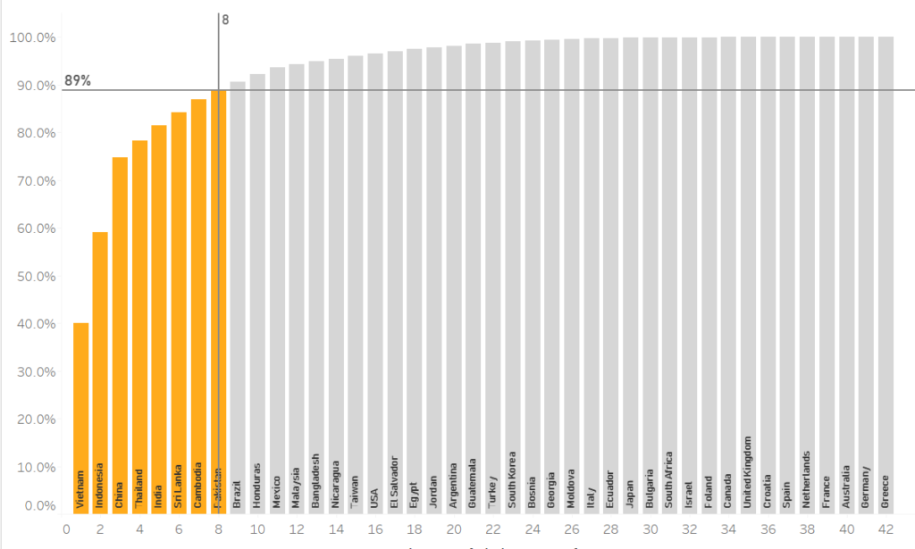
7. The next step is creating our first dynamic reference line. This line will intercept the X-axis at the number we select within our parameter.
Drag on a reference line for the CNTD of Country, and select the parameter for the value.
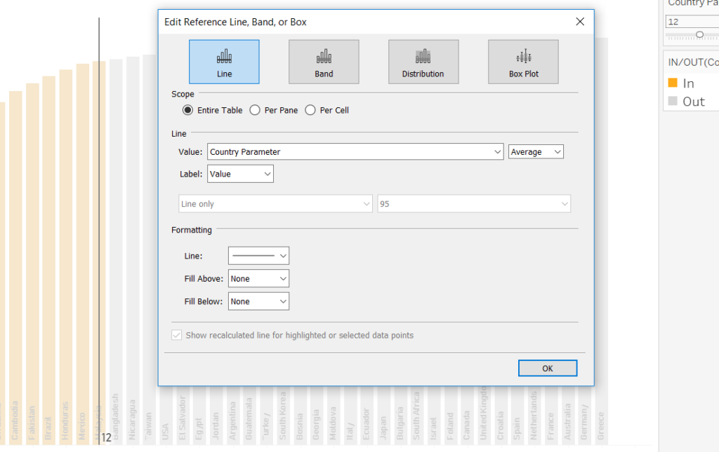
8. The next step is creating a reference which tells us the value upon the y-axis, dependent upon the number of countries selected. This one is a bit trickier and requires a calculation. Accordingly, create a calculated field and modify the calculation below based upon your dataset.
The requirement:
We want to know the running % of total of the workforce, based upon the number of countries selected in our parameter, and the point at which the parameter intersects the X-axis.
Thus, the calculation reads as follows:
IF the COUNTD of Country (simply ctrl-click and drag the green pill from the columns shelf into the calculation) matches the number I’ve selected within the parameter
THEN
Return me the running % of total for Total Workers for this selection (again, simply ctrl-click and drag the green pill from the rows shelf for the value)
ELSE return me 0
END
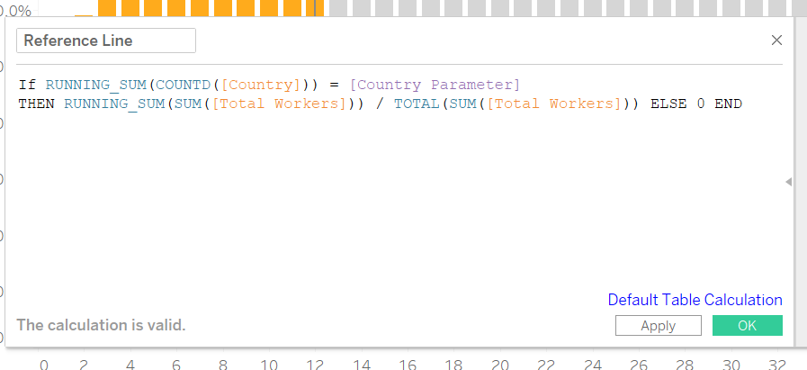
9. Drag this calculation onto detail.
10. Drag on a reference line, and compute it based upon the sum of the reference line calculation.
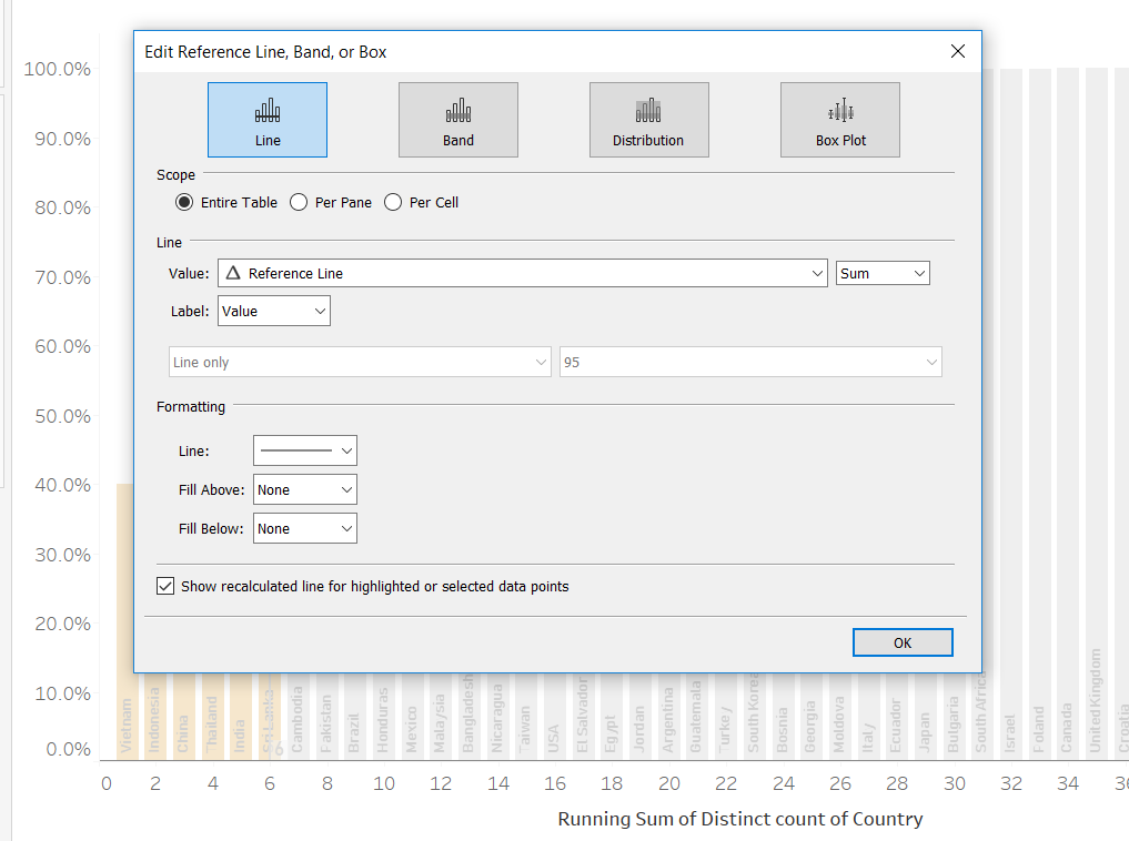
11. You’ll notice that your reference line doesn’t quite work, and will appear at the bottom of your chart with the value of 0. Again, this is down to our table calculations.
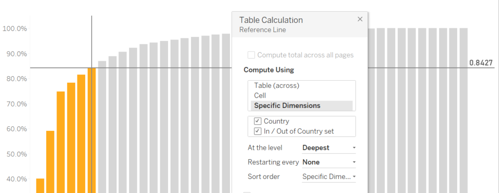
12. Go into the reference line calculation we dragged onto detail and tick both “Country” and our Country set within the table calculation. This will ensure that the value from the calculation is calculated across the countries and sets.
Now you’ll have a working reference line which reflects the running % of total.
13. With some formatting, your chart will be complete:
Data: Nike Inc