Sometimes data analysis is needed for row of data which has no data in. For example, finding out how many people are employed in a certain region on a certain date when all you have is the start and finish date of the employees. This is an ideal chance to use Tableau Prep to scaffold a data set to fill in the gaps so a more complete picture is shown.
The use case I’ll talk through below is for a made up data set that Emily Chen created about an infirmary of injured Pokemon, but it can also be applied to real-world hospital patients or staff.
Trying to do this pre-scaffolding
Initially we created a Gantt chart in Tableau, which was visually told us which Pokemon were in the infirmary at certain times. However, quantitatively it can’t tell us how many Pokemon are there on, for example, the 10th September.
This is because when you create a Gantt chart in Tableau, the bars are sized on the date difference between two date variables (using a DateDiff calculated field), rather than the actual ‘string’ of dates.
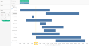
Gantt Chart in Tableau
Intro to Tableau Prep
During week 4 at the Data School, we experienced Tableau Prep for the first time! It was really fun and intuitive to use, with a great user interface. It allows you to explore the data within the table and mere fields/ rows very easily. The coloured data sets, steps and shelves, as well as the flow lines really help show the flow of data.
The flow is also described in a step-by-step panel that shows what changes you’ve made to the data.
This change panel feature is really useful as it allows you to modify changes quite easily, move the order in which the changes are applied or to delete changes you no longer want to make.
See Louise’s post here for tips on how to get started using it!
Using Tableau Prep
We therefore thought it would be good to practice using Tableau Prep and the below will explain how we used it to scaffold the Pokemon Infirmary data.
The first data set contains two dates – when the Pokemon were admitted and discharged from the infirmary. But, we want to know which dates they were patients inside the infirmary. So we joined another data set within Tableau Prep – a calendar/ column of dates.
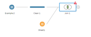
The initial join the data sets in Tableau Prep
However, you’ll notice in the above image that the join isn’t quite working – the red triangle never means anything good! This is because in Tableau Prep it automatically find fields with the same name to make the join easier for you. Yet, here we have no common fields! So, we will need to tell it which fields to look at by clicking ‘Add join’ in the Configuration Options pane.
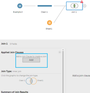
Adding join conditions
We want the data to infill from the calendar all of the dates that are between the two dates in the original data set. In Tableau Prep you can join using a calculation, in this case where the admitted date is equal or less than calendar date AND the date discharged is equal or greater than calendar date. Create one join to add the admitted date, then click the plus button to add the other join for the discharged date.

Three steps to creating a calculated join
As you can see, we’ve now expanded our dataset by 27 rows as it now tells us on each individual day who and how many Pokemon are in the infirmary.
We can then go directly from Tableau Prep to look at and explore the data in Tableau Desktop, by right clicking on the join and selecting ‘Preview in Tableau Desktop’.
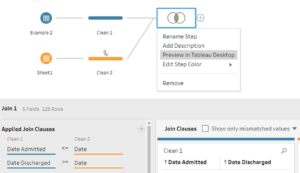
Previewing the data set from Tableau Prep to Tableau Desktop
Back to Tableau
Within Tableau we can then create a histogram to show how many people are in the infirmary on each specific date.
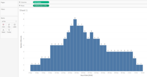
Histogram in Tableau
Additionally we can put‘count distinct’ on the colour shelf to create a view with additional information about when the Pokemon enter the ‘infirmary’.
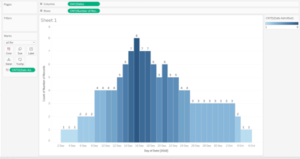
Histogram in Tableau with additional information
For more information on data scaffolding or Tableau Prep please see:
