DS11’s dashboard week day two started out well, as the data was relatively clean and could be viewed straight in Tableau. A good deal of my time today was working out what I wanted to say, as well as how. Then it was a ‘simple’ case of putting it all together in Tableau!
Yesterday, I ticked off transparent containers with a moving background (see my snowy, viz here), and before today I hadn’t ever created bump charts! Therefore, I think I may make it my mini-challenge this week to tackle something I’ve not done in Tableau before each day!! As if data prep and a viz-a-day wasn’t enough!
Another day survived in Dashboard week!
Today’s Challenges
The data we were using, as well as the additional tables I downloaded from the same website, were relatively clean so in terms of data prep there was very little to do. See Andy’s blog here for the full intro/ today’s rules!
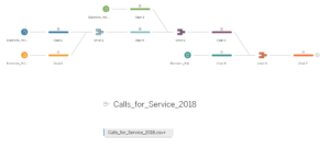
The most ‘labourious’ task was to filter out down the original file that Andy downloaded, but I did this in Tableau using a database filter. I filtered out some null values, which I saw using Tableau Prep’s cross field highlighter were related to nulls in the other columns. I also filtered out any videos that were labelled ‘Test’, ‘Training’ or ‘Accidental’ as these clearly were not actual use cases.
The other task was to format the date field which contained letters, so a REPLACE() formula was applied to convert the date field into a format that Tableau could recognise.
Additional Data Files
I found two extra data types to give more context about police activity in New Orleans:
- E-Reports: an electronic version of the number of reports submitted to NOPD – I used a count of the charge codes in the viz, as it also had victim data in. Each year was a separate file: 2015, 2016, 2017 and 2018.
- Service Calls: number of calls made to the NOPD section of 911. Each year was also in separate file: 2015, 2016, 2017 and 2018.
I joined the 4 yearly E-Reports in Tableau Prep, but later as Tableau Prep was crashing, I realised I could just union them in Tableau, which is what I did for the 4 yearly Service Call data files. Either way works, but union-ing in Tableau is probably quicker!

Data Prep in Tableau Prep and Union-ing in Tableau
Direction
This was a big challenge for me today, as the data was relatively descriptive and I struggled a little with the ‘So What?’ that every visualisation should have. I employed Caroline Bevon’s Data Visualisation techniques (see my write up of DS11’s session with her here).
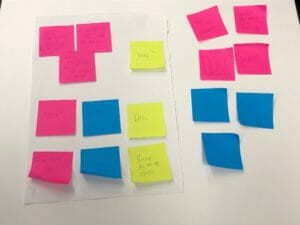
I first wrote out what data I had from my three data sources on three coloured post-it notes. I then organised these onto a sheet of paper, discarding some that were out of scope.

Post-it note story creation – BANs are Big Numbers
Next, I drew out more exactly how I wanted the data to look – complete with mini-bump charts!

Drawing out my dashboard before Tableau
Tableau
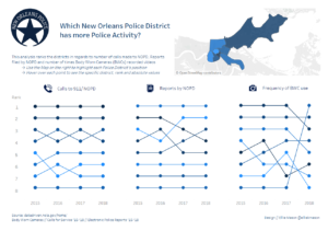
Finally it was a case of pulling it all together in Tableau. I used a blog by DS8’s Gauthier on Bump Chart’s to help me learn how to create them!
And voila, my final viz can be seen below or interactively here!

