When I first started using Tableau I found the concept of containers really tricky to get my head, and my mouse around! They seemed confusing and a little unnecessary. I didn’t understand what the difference between a vertical and a horizontal really was, even more so when Andy or Carl mentioned that they can be either if they don’t have more than one sheet or item in them….!
Having used Tableau almost every day for the last 4 months, I can now safely say that they are definitely necessary and so incredibly useful!
Harry, a fellow DS11er, has written an excellent blog explaining in greater details what they are, whereas here I will focus on some tips and use cases, as well as a quick how to approach dashboarding with containers, following a class with Andy.
Containers
There are two main types of containers – vertical and horizontal. Simply speaking, Vertical containers stack containers on top of each other and horizontal containers stack sheets side by side.
A confusing thing is that a container isn’t technically vertical or horizontal until there are two sheets in it. However, vertical containers can often be fixed to a specific height and horizontal ones to a specific width during formatting so sometimes it does matter which on you use.
Blank containers are another, less used type, but can be used for place holders during planning or spacing during formatting. See the next section of this post for more details on formatting/ container hacks
Container inception can also occur, where containers are nested inside containers, nested inside containers, etc. This is useful for formatting and organising your dashboard. See the last section of this post for more details about that.
Why use containers?
As I mentioned I used to find containers so confusing but having more experience with them they can be so useful, and in ways you might not have thought of!
Some example are:
Three words: pretty, formatted vizes. Containers help align everything on your dashboard. A neat way is to get it to equally distribute the sheets or containers within a container so everything is equally aligned – you can do this by right clicking on the container and selecting ‘Distribute evenly’ in the drop-down menu.

They can help create sections by adding lines to your dashboard. Oddly enough there isn’t a function to add lines to a dashboard in Tableau and so this hack is useful for formatting. In a container, insert another vertical or horizontal container and fill it with a colour. Then right click and select edit height in the drop-down menu and select a number of pixels under 5. This then shrinks and fixes the container height. In the example below I’ve created a horizontal line, but you can also create vertical lines.

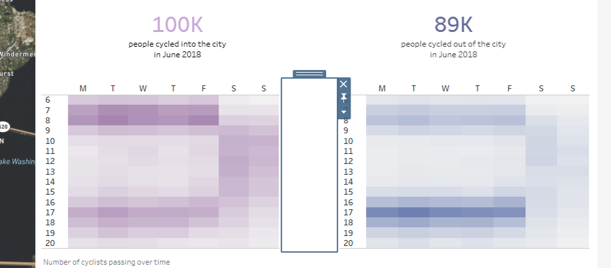
Blank containers can give your viz breathing space, either between charts or sections. This allows your dashboard to be less cluttered and for your data to really stand out. Below I used a blank container between two heat grids showing frequency of cyclists along two directions of a cycling route.
Containers are also extremely useful when comparing different layouts of a dashboard. They allow the movement of whole sections and swapping areas around is a lot easier than moving individual sheets.
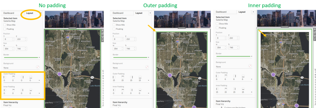
They can also be formatted using the outer and inner padding. These also work in pixels and can also give your data breathing space, as well as being incredibly useful for alignment across sheets/ containers. These are formatted using the Layout pane on the left of the dashboard.
It’s hard to see what this is doing unless your container has a border. An outer padding pushes the container and it’s content inwards, adding a border. Whereas, an inner padding pushes the contents but not the container inwards. See the image below for a visual example.
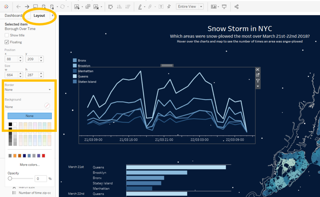
As Tableau constantly improves, so do the usefulness of its’ features. A new 2018.3 feature is transparent containers. This is great as it allows for cool overlapping and really pretty dashboards, as well as greater insights from overlapping charts of course!
I used these types of containers in my #VOTD about NYC Snow where I had a moving URL background for my viz, and everything else was simply floating, transparent containers or text. These are created using the Layout pane and setting the background and borders to ‘None’ (Tableau automatically sets these to white).
Approaching dashboarding with containers
One of the best ways to approach dashboarding, once you’ve mostly worked out the story you’re telling, is to sketch it out. Andy took us through his approach a few weeks ago and drew his out on a whiteboard.
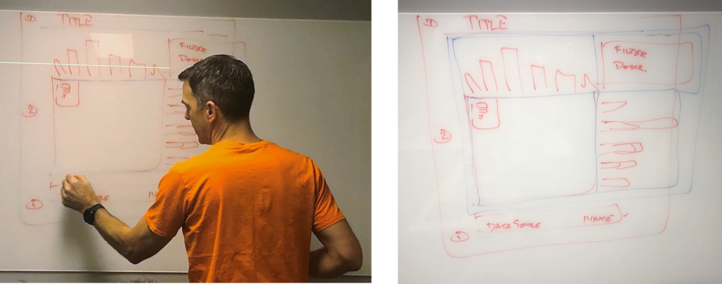
I’ve recreated this, colour coded, in PowerPoint to more clearly explain the approach:
- Have a header container for the title and maybe some descriptive text.
- Also have a footer container for the data source and your author details
- Then have a main container in the middle to contain your main content and extra sheets
These three sections work well in one large container, and within each one the various sheets can be displayed, either on their own or within more containers.
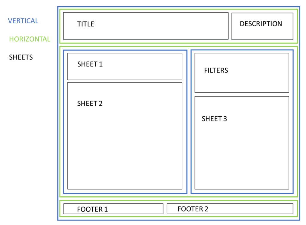
Drawing it out this way means that not only is your story clearer, the process of dashboarding is more efficient. This is both in terms of actually dropping the sheets and containers together, but also in the processing and rendering of the data.
It also enables you to realise which containers you need and if you need to work in special parameters to switch between sheets within a container ahead of suddenly realising you need to create a parameter. It also allows you to play around with the visual impact of the dashboard by dragging the higher-nested containers around, before you realise you want to. They save so much time!
Tableau tip
Containers can be confusing. However, double clicking on the tab at the top of a sheet or a container allows you to easily go up a level and determine how to format and control the sheets within that container. I use this a lot and I think I only learnt this part way through the Data School!

I hope you found this useful! I’ve used them in a few ways through dashboarding so explore my Tableau Public profile to see more examples.
https://public.tableau.com/profile/ellie.mason#!/
KPI – https://public.tableau.com/profile/ellie.mason#!/vizhome/ExampleKPIDashboard-WIP/Dashboard1
Seattle Cycles – https://public.tableau.com/profile/ellie.mason#!/vizhome/CyclingoverSeattleBridges-WIP/FinalViz
NYC snow ploughs – https://public.tableau.com/profile/ellie.mason#!/vizhome/NYCSnowPlowFreqMarch2018/FinalViz
