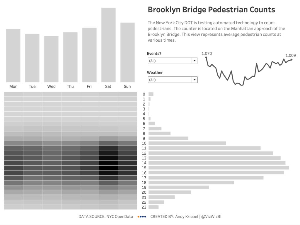
Today at the DS, Carl and I ran a session with DS11 covering our approach to:
- Investigating new data sets to find insights
- Laying out a dashboard and working with containers
To make the process as realistic as possible, we used a data set we hadn’t seen before. The data set is about pedestrians crossing Brooklyn Bridge from NYC OpenData. I came across this data set via the Data is Plural newsletter.
Let’s go through each of these approaches.
INVESTIGATING DATA
My recommended approach starts with:
- Examining the volume of the data so that I know how much I’m working with
- Looking at the values of each dimension to understand what they mean and if I need them. For example, in this data set, the Location field only contains one record. I don’t need that field, so I hid it from the data set. The idea being that I am simplifying the data.
- Looking at the range of values in each measure. In this data set, there were three fields that seemed similar (Pedestrians, Towards Manhattan, and Towards Brooklyn). The latter two add up to the Pedestrians and they are very close in value, so we decided to focus only on the pedestrians.
Now that we have simplified the data, we created five blank worksheets and answer five questions. These guide our analysis.
- When – time series analysis. This could involved line charts, heat maps, looking at different date levels, etc.
- Where – typically this involves creating maps. In our case, there was only one location, so this question was invalid. We hid the geographic fields as we no longer needed them. It was important that the team recognize that if the data doesn’t provide any insights, that’s analysis as well.
- What – Look at each of the dimensions. Are there any patterns, outliers, groupings you can do, etc.
- How – Think scatterplots and box plots. Compare measures. Add different levels of detail. Does anything stand out?
- Who – If the data includes “people” related data, explore it in the same method you use for “What”.
Coming out of this, Louise Le recommended that we look at the average pedestrian counts to normalize the data. You’ll end up throwing away nearly everything you build. Build lots of charts. Explore the data from as many angles as possible. Choose those that highlight the insights, format those, and then it’s on to step 2.
LAYING OUT A DASHBOARD AND WORKING WITH CONTAINERS
If you have a whiteboard handy, begin by drawing a big box that represents your dashboard.
- Add the title at the top.
- Add the footer at the bottom.
- Draw some pictures of the charts you want to include on the board in the middle section. Think about where they’re located. Do they flow well? If not, erase and redraw. Better yet, use some big sticky notes.
- Back up from the wall. Does the overall layout still work?
Now hop back to your computer and create a blank dashboard.
- Add a container.
- Place the title and a text box in the container and a blank object between them.
- Add a container in the middle and move the blank object into it.
- Add your sheets to the container and remove the blank object when you’re done.
- Add any sub-containers that you’ll need inside the middle container. For example, you might have two charts side-by-side and you need another two charts side-by-side below those. This means you would need a container for each of those sets of charts and then another container for those containers to sit in.
- Continue until the layout is just right.
- Clean up your tooltips.
- Format the charts. I recommend doing this last so that you don’t have to keep going back and re-doing it.
HOW DID IT GO
In the end, the team decided that a marginal histogram would be the best way to represent the patterns of the pedestrians. This whole process took us the morning. With experience, this could be done in 60-90 minutes.
Click on the image below to go to the interactive version.

