


Today I’ll share a tip I used on my ‘Road Accidents in the UK’ dashboards. This visualization was the one that eventually secured my place at the data school. As candidates to the data school 3 or DS3, we were given one common data set in order to build a visualization and present it to a panel of The Information Lab consultants at the final interview. During this process we were supported by Andy and the previous Data Schoolers, who provided help and feedback during our creative process.
After analysing the data and building many visual iterations unveiling numerous interesting stories, I decided on the story of the Road Accidents in London and in its deadliest borough, Croydon. During my analysis, I found myself looking for more information, with particular attention to the fatal accidents involving cyclists in London and Croydon. After reading countless news reports of London’s fatal accidents, it became apparent that the most common cause of road fatalities in London is due to road risky behaviours, especially during rush hour.
Being this the case, I was then certain that my visualization should be a call for action, where the shock factor would be created by the story I was telling through story points and not by the by the colour palettes effect or by my image choices. I wanted something simultaneously minimalist and powerful; a blank canvas ‘sprinkled’ with information important to retain. I was certain that the use an overlay page would not only created a natural division between maps and information, but would also lead the audience to interact with the additional information used in the map tooltips. A simple but striking design with lots of information in a dainty looking dashboard.
To date, I have been asked a few times to write a blog on how to create the overlay arc, reason why I choose it as my ‘Monday blog’ of the DS3 blogging week.
The technique it’s quite simple actually, but you’ll need something like Photoshop, gimp or as in my case Paint.net.
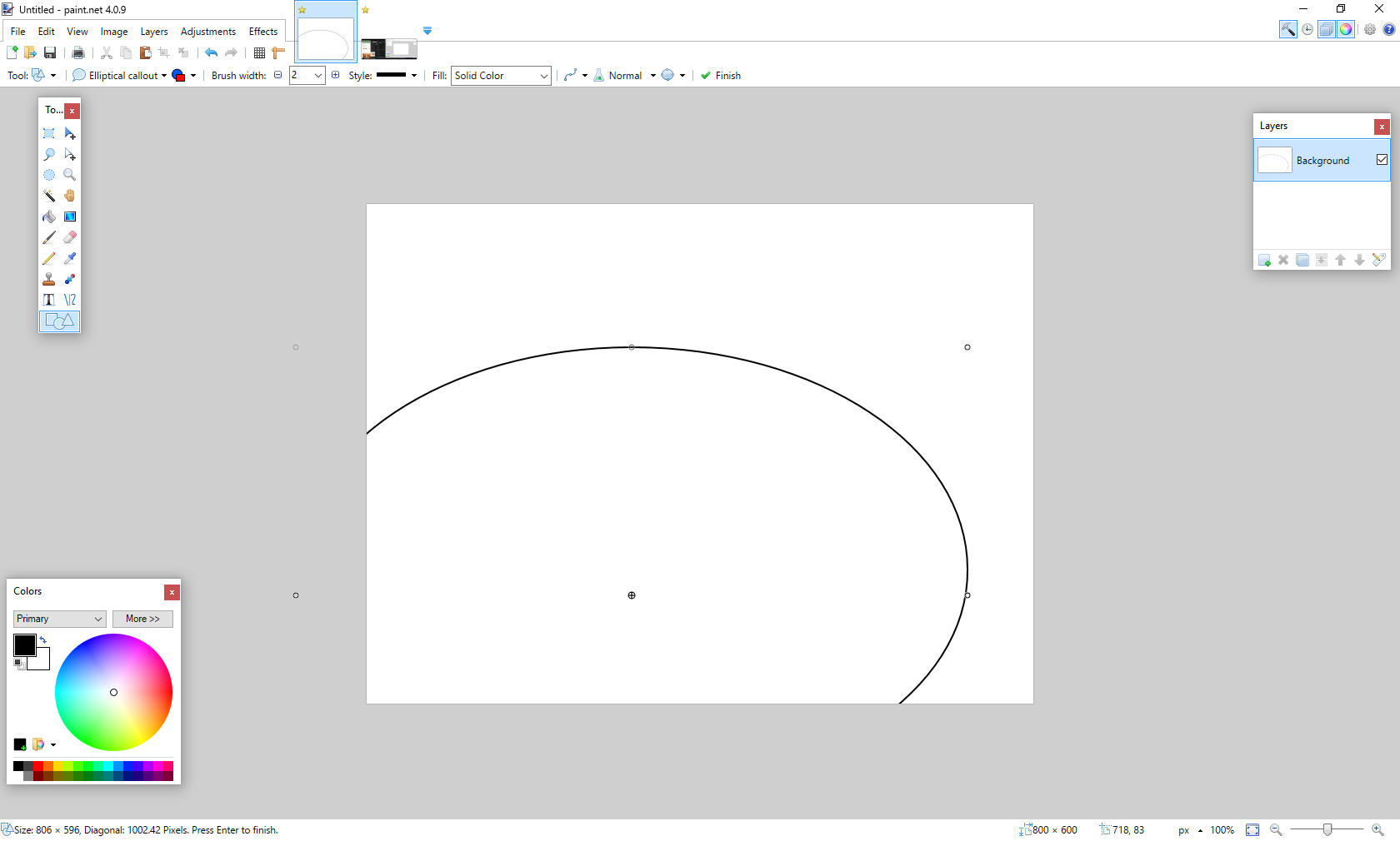
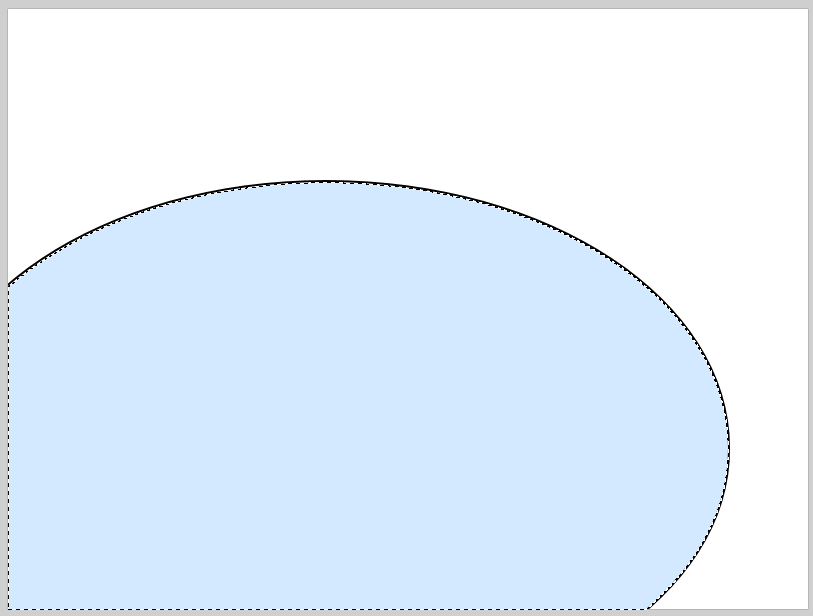
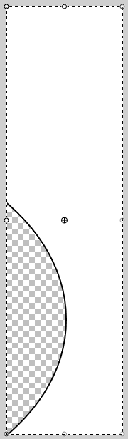
I started by creating an elliptical shape with whatever outline colour and width as I desired. Making sure the bottom left of the elliptical is sitting outside the canvas. After that I used the magic selector to highlight the inside of the elliptical shape and deleted it. If you don’t care about interactivity on your dashboard you could stop now and save the image as it is and overlay on top of your map in Tableau.
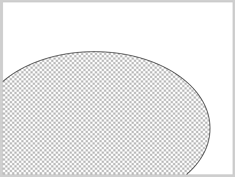
Because I wanted to be able to interact with the map I went a step further. I first selected the right-hand side of my picture and as I want to cover as little of the map as possible, I made sure the selection was as narrow as possible while keeping the arc intact. The same principle was applied to the top of the arc, but on this step I made sure the top selection met the previously selected area without superimposing it.
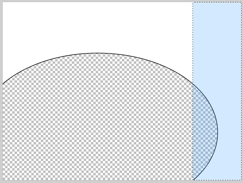
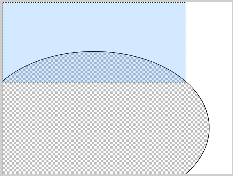
Saving both selections as PNG and importing them to Tableau as floating objects, I was able to puzzle them together over my previously built Tableau map. On this step, we need to spend a bit of time patiently aligning both ‘pieces of the arc’. Once that’s done we can then add the other elements of our dashboard on top of the overlay (the white canvas) as floating elements. This way we not only keep the maps’ interactivity, but also build a dashboard with multiple visualizations. As a final suggestion you’ll want to de-select the options to zoom and resize the map, so your map keeps all its interactivity properties in the focal points.
A simple but efficient way to add something different to your dashboards.