


As part of my Data Analytics training, I’ve been reading Storytelling with Data by Cole Nussbaumer Knaflic. In her book, she explains that just showing numbers or charts isn’t enough and shows how we can use data to tell clear stories that people actually understand. Below is a short summary of Chapters 1 and 4 to give you an introduction to the importance of context and how to focus your audience’s attention.
Chapter 1: The Importance of Context
Before you start building charts or dashboards, you need to think about the bigger picture. Knaflic reminds us that without context, even the best-looking graph can totally miss the point. There are a few key questions we should ask ourselves before doing anything with the data:
- Who is your audience?
A Managing Director probably wants to see the big picture, while a Team Leader may be more interested in the details. So it's important to adapt how much we show and how we show it. - What is your goal?
Are you just sharing information? Are you trying to convince someone to take action? Do you want to highlight a problem? Knowing the goal helps you to tell your story. - How do you communicate your main message?
Choosing the right type of chart and design can make all the difference. It helps your audience to focus on what’s important.
Usually, someone else will ask you to create a report or dashboard. Before jumping in, you should take the time to ask a few key questions to uncover information they haven’t shared yet: What’s the real problem they’re trying to solve? What data is available to support the analysis? Who will see the results? What would a successful outcome look like? People often think they know what they need, but a few more questions can reveal that they actually need something else.
Knaflic introduces two helpful concepts for communicating your most important message:
- The 3-Minute Story
Imagine you have just three minutes to explain the situation, the data, and the key takeaway. It forces you to focus on what really matters and structure your story clearly. - The Big Idea
This is the one key message you want your audience to remember. It should be short and clear. If you can’t say it in one sentence, you probably don´t understand the goal yet.
Before you create slides or visuals, map out the flow of your story. Each part should build on the last and lead clearly to your point. This helps you to structure your communication so that it’s easy to follow.
Chapter 4: Focus Your Audience’s Attention
This chapter is about helping your audience to see what matters. Just showing data isn’t enough. You have to guide people’s attention through your visual to help them understand the main message.
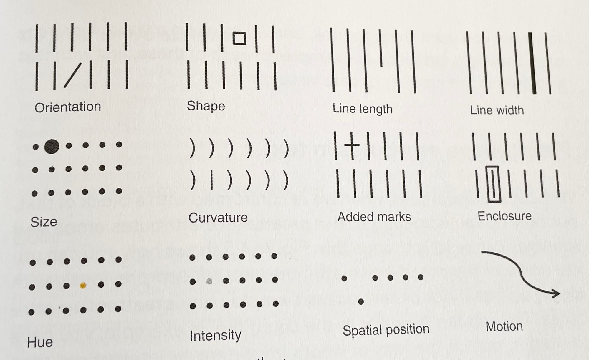
Preattentive attributes are visual features that our brains understand immediately. Things like color, size, position, boldness, or orientation naturally draw the eye. Knaflic explains how we can use these attributes on purpose to direct attention where it matters most. The key is to use them intentionally. Too many visual cues at once (like using bold, color, and size all over the place) just creates clutter and confusion. But if you apply one or two thoughtfully, you can highlight what really matters.
Here are a few tips from the book:
- Use color with purpose – only to highlight what’s important.
- Play with size and position – bigger elements and top-left position get noticed first.
- Keep it clean – remove clutter and unnecessary lines.
- Add white space – it helps structure your visual and makes it easier to read.
- Avoid legends if possible – label your data directly for faster understanding.
Figure 4.4 shows the various preattentive attributes:
Why This Matters for Data Analysts
Both chapters teach us something really important for anyone working with data: we’re not just analyzing, we’re communicating. That means thinking not only about what we want to show, but how we show it, and to whom. By starting with context and then using the right design choices to focus attention, we can communicate impactful insights.
And that fits perfectly with our mission at The Information Lab:
Helping people make sense of data.