


Lately at the Data School, we were working on a project involving flights data. This was the perfect opportunity to make use of the path function in maps. I came across two cool techniques that I am going to share with you. I am using data available from openflights.org I have downloaded a list of the world’s airports and the routes interconnecting them.
First let’s briefly explain how path works in Tableau. In order to compute a route, Tableau needs two different rows, one for origin, another one for destination, essentially two points with latitude and longitude. Additionally, you will need to create a Path field in both rows, which connects one point to the other. You can find detailed examples from Tableau’s online help, below is an example for creating the ‘spider map’ we are after.
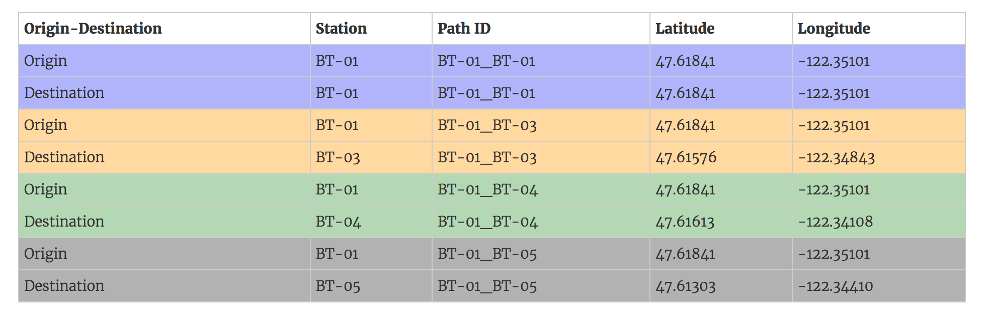
We will achieve a similar structure by doing a little bit of data prep. There are multiple ways of doing that, but I have found a quite efficient one that requires no work outside of Tableau.
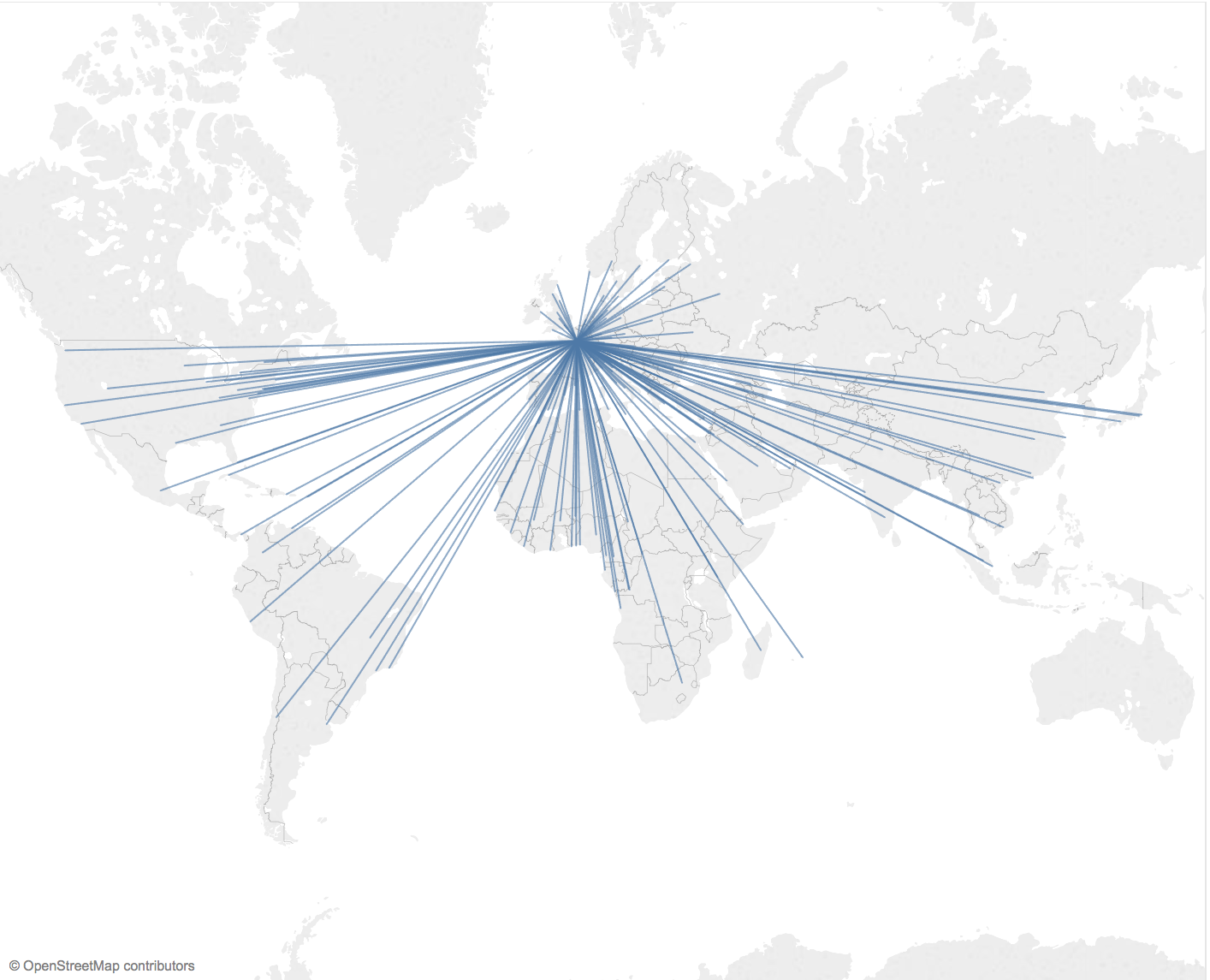
Simple straight lines from Origin to Destination
There is a blog post written by Konstantin Greger that explains it very well. I will not go into the details but you just need to union the route file to itself then join it to the airport one to retrieve the longitude/latitude for each airport.
When you union two files together, Tableau outputs a new field called ‘Table Name’. A calculated field will allow you to output 1 if it is the first file and 2 if it is the second one. Once you are joining (inner) the routes to the airport file, use a calculation as the join clause that basically says, if it is the first file then join on the source airport, otherwise join on the destination one. Tableau will draw a path from 1 (origin) to 2 (destination) for each route.
I invite you to have a look at Konstantin’s step by step post, it is very easy to follow. Below is an example mapping all the international routes leaving from Paris Charles de Gaulle airport. It’s simple and it looks pretty good.
Jazz it up with curves
Skies are really busy, with more than 35 million flights yearly, there are a lot of flying routes. The problem with mapping so much data with straight lines is huge overplotting. You can always adjust the transparency, but only up to a certain point I guess. Because of that, I searched for a way to curve the lines, but also because I felt it was more appropriate to map a flight with a curved path.
A quick search yielded a few tutorials using the great circle distances, or great arcs, to map curved trajectory in Tableau. They involve complex calculations to generate a series of dots that would draw a parabola from A to B. I invite you to have a look at the methods used by Chris DeMartini or David Taylor if you want to reproduce it.
In my case, I was lucky enough to stumble upon a cool Alteryx Macro, written by James Dunkerley, check out his blog! You just need to input the route file in the macro, with the latitude/longitude of each source and destination airports appended to every row, and it will do all the maths for you!
I have put together a quick viz to show you how it renders in Tableau. Hope you enjoyed the read!
