


Today we had a great session with Benedetta Tagliaferri who came to teach us about predictive analytics in Alteryx and Tableau. By the end of the day we had to compare the forecasts in both tools.
When generating forecasts in Tableau, a break is automatically generated between your forecasts and your actual data.
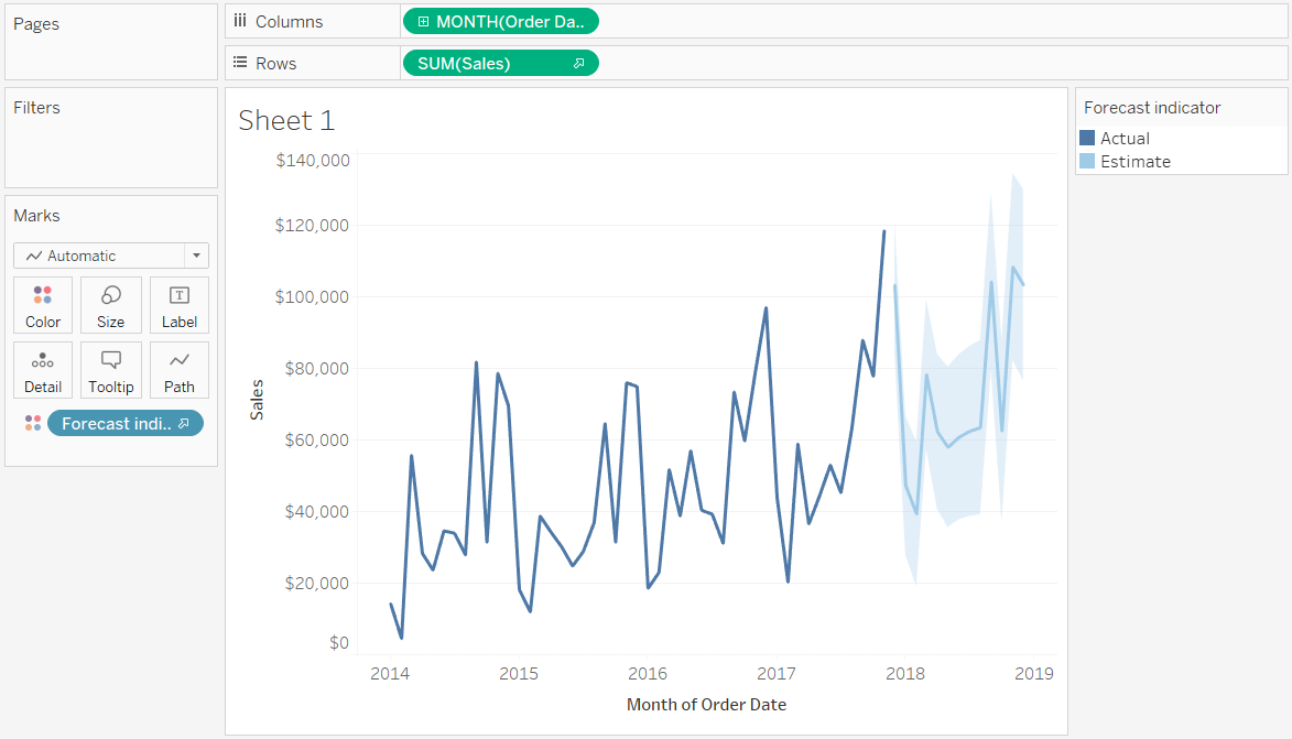
This was annoying as I could not find a way to join the lines. It turned out that the solution was pretty non logical (at least to me). Fixing the forecast color to an attribute solved the problem.
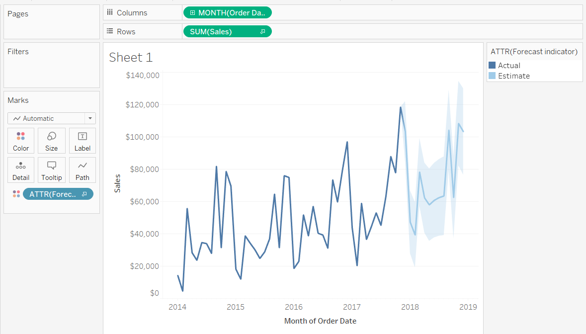
I could not understand why this worked, so if you have any explanation, please feel free to let me know in the comments or on Twitter!