In my last blog I cleaned up the data that we are going to use for my bump chart – now I’ll take you through how to make it.
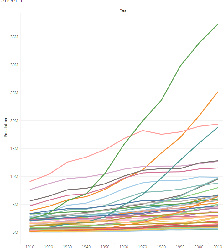
First lets create our initial view

This creates a nice initial graph of population over time – now we want to transform this into a bump chart

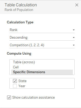
We need to create a table calculation to give us the rank (which is how we plot a bump chart). If you check out Joe’s blog on the language of table calcs you will quickly work that “for each year we want to calculate the rank by state” this translates to the below settings

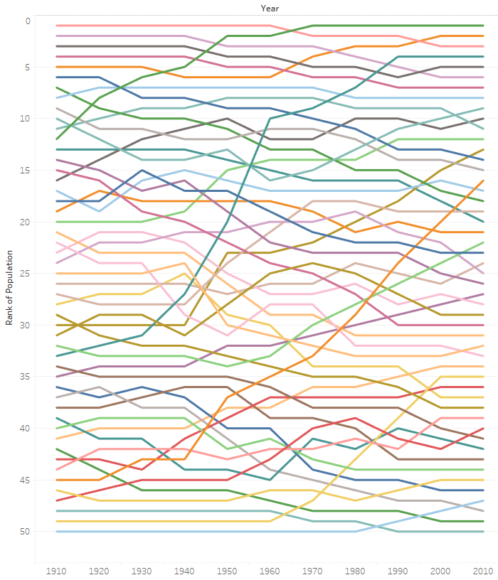
I’ve reversed the axis and now we have a bump chart that matches the basics of the Vox graph. In my next blog I’ll take you through the final formatting.

