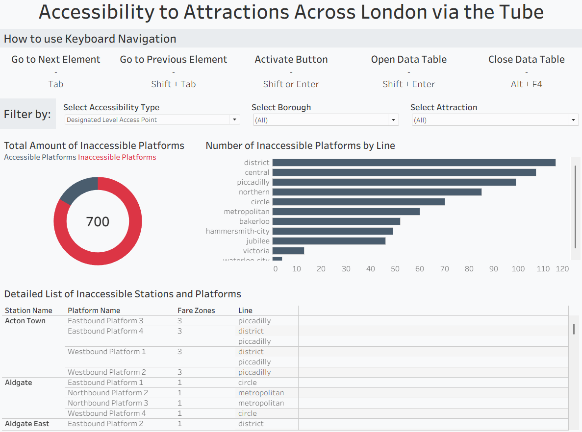
Day three of dashboard week was about building accessible dashboards. We covered what accessibility actually means in Tableau and Power BI, high contrast colors, colorblind-safe palettes, double encoding, bigger text, alt text, sensible keyboard focus order, and not relying on tooltips. The brief: build a dashboard for a user who navigates solely by keyboard and screen magnification, analyzing accessibility across London’s attractions and transport links.
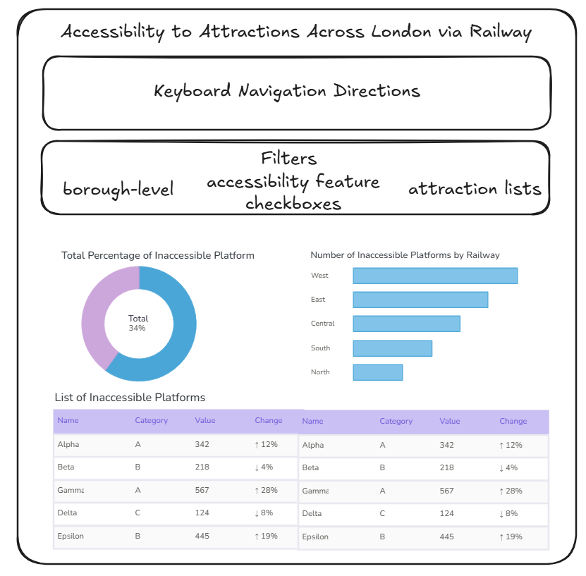
I focused my user story on identifying which tube lines and platforms offer the least accessibility for riders with mobile disabilities. My data model changed a few times along the way. I originally planned to include station points for a map, but reconsidered since navigating a map via keyboard would be a poor experience, so that got cut. I also had to partially rebuild the model after realizing boroughs and attractions weren’t filtering everything, fixed with a left join between the base station table and attractions. There was also a granularity mismatch, some accessibility metrics sit at the station level (~270 records) and others at the platform level (900+), which I handled with a calculated field to make chart titles dynamic depending on the level being shown.
The final dashboard reads top-down, left-right for keyboard users: a bar chart at the top explaining navigation, then the three required filters (borough, accessibility features, attractions), then a donut chart showing the percentage of inaccessible platforms, a bar chart breaking that down by line, and a table listing the actual inaccessible platforms with details like station, platform, fare zone, and accessibility notes. I leaned on a fellow consultant’s dashboard to learn keyboard navigation basics and added a few things I found on my own. It was a different kind of design challenge, less about what looks good and more about what actually works for someone who can’t use a mouse.