


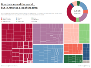
This week’s Makeover Monday used data concerning the televised travel of the late Anthony Bourdain. I learnt early on in my MM career that I need to pare my initial vision down to something that is possible to create within the allotted hour. I also like to try and make something a little different, that’s the one advantage of making my MM submission so late – I can see what everyone else has done! And almost everyone made maps!
Don’t get me wrong, I love maps, they give natural kind of context to the data you’re displaying. The map-based vizzes of this week were great, probably better than my final product. But I have experience with those maps – but not tree maps.
So, let’s look at the iterations of my #MM33 and see what feedback I got…
This one was shown to Carl Allchin (@Datajedininja), Ravi Mistry (@Scribblr_42) and Dan Raines (@Notontwitter?)
“Bold” – Carl
“Reminds me of the work of a child” – Ravi
You can click on the image to see the latest version; the functionality has remained almost unchanged.
So, let’s start at the top,
- underlined title – terrible, it’s gone.
- That text in grey doesn’t add anything and is difficult to see – goodbye.
- “The only thing worse than a donut chart is an unordered donut chart” – Ravi Mistry, 2018
- The key being above the treemap is a little pre-emptive and distracting – moved
- The colour scheme – too much colour? Yes, so focusing on North America and making everything fall into the background would be an improvement.
- The maths on the donut chart are just wrong. Plain wrong. We shall return to the theme of incorrect maths later.
- Oh and I linked in that colour of North America into the title without being prompted… so that’s something?
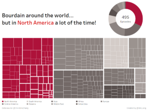
Okay now we’re getting somewhere…
But we are not done. Because the wonderful Gwilym pointed something out.
All of it is wrong. All the maths. Complete mess. Very stupid mistake on my part, check your maths kids. Stay in school.

TA DA!