


When I first started making vizzes I lacked direction. I didn’t really know to start and where to go or where to end up. In this blog I aim to give you a few tips that I have learned over the past few months that will generally improve the quality of your work and hopefully get you to that end point quicker!
Ask a Question – and then answer it
Your viz should present a question and then answer it… pretty simple? Yes, it is, if you know what that question is. When you first look at a data set you might not know what you can say with that data. Mess around with it, put some bars up, a line chart or two – look for those little correlations or surprising take-aways. Once you have that interesting little bit of a story, consider that the answer, then think of a question to that answer. Also it’s sometimes a good idea to make the title of the viz the question you just thought of, it leads your audience from A to B with less pressure on the viz itself. OH! And never ask a question you don’t answer in your viz… that’s just silly. (I bet you’re thinking no one does that, BUT THEY DO!)
Don’t try to say too much
It is tempting to try and put everything you’ve found, and every sheet you’ve made, into a single dashboard. This can make for a very overwhelming dashboard where the audience is unable to take away anything from your viz. It’s a much better idea to say less, so that what you do put across is better understood, than whack in loads of charts and get no message across at all. Less is more. Say it with me. Less is more.
Keep your data central
You don’t always need to put your data slap-bang in the middle of your dashboard, but honestly it’s very rarely the worst place to put it. Keep the data sheet big (in comparison to other components) and keep you title up at the top. Now these are just beginner tips, there are other places to put these vital pieces of the puzzle but frankly even I’m not experience enough to go off the beaten path on this one. Not keeping your data-message central can make it less impactful and harder to find.
Choose your colour scheme and font carefully
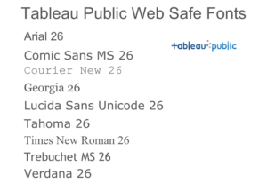
The colour scheme and font that you choose are surprisingly important and often difficult to make a decision on. Theming your viz well can be very effective and frankly if your viz doesn’t look good your audience will pay it less attention. But poor colour schemes and font choices can also be ones that make the viz harder to read or process – overly opulent font or data points that blend in with the background. Also try to keep the number of colours in your data to a minimum, more colours means more cognitive load. Coolors.co is great for colour schemes (you can even enter a colour and get complimenting ones). Remember that Tableau Public supports only a handle of fonts, your computer will load extra in automatically that will be defaulted to a compatible font upon publication. There’s a viz by Jeffrey Shaffer that has all the supported fonts (excluding the tableau default fonts, which are also supported).
Okay, so now a quick round up. Find that question —> cut out the fat, less is more —> make sure your data is central —> get those fonts and colours all nice and that.
Stick to these and you’ll be making better vizzes. You’ll realise that many good and informative visualisations follow these guidelines, it’s just something you pick up as you see what does and doesn’t work. I might be back with more tips… who knows?