


“Don’t think about it”, Andy says. “Just publish it”, Andy says.
Duly noted. Our first class assignment is at the end of our second day. It’s nothing big; we just have to take one of the most popular Makeover Monday datasets ever and try and match the submissions from Tableau experts. Simple.
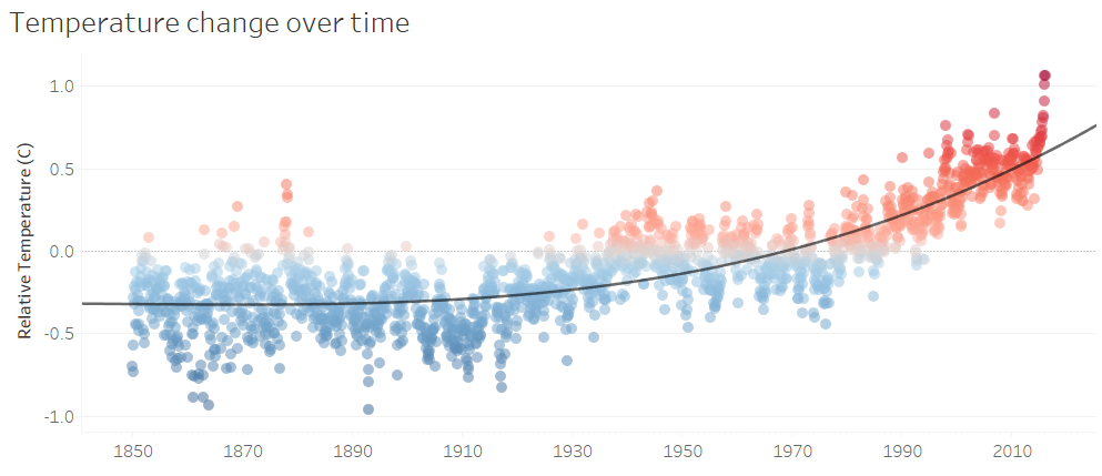
I’ve kept mine straightforward. I wanted a standard way of showing how temperature has increased over the last 150 years or so, and so I defaulted to one of my favourite plot types – a scatter plot with a trend line. Setting the colours to show blue for colder temperatures and red for hotter temperatures makes it a bit more striking, and voila:
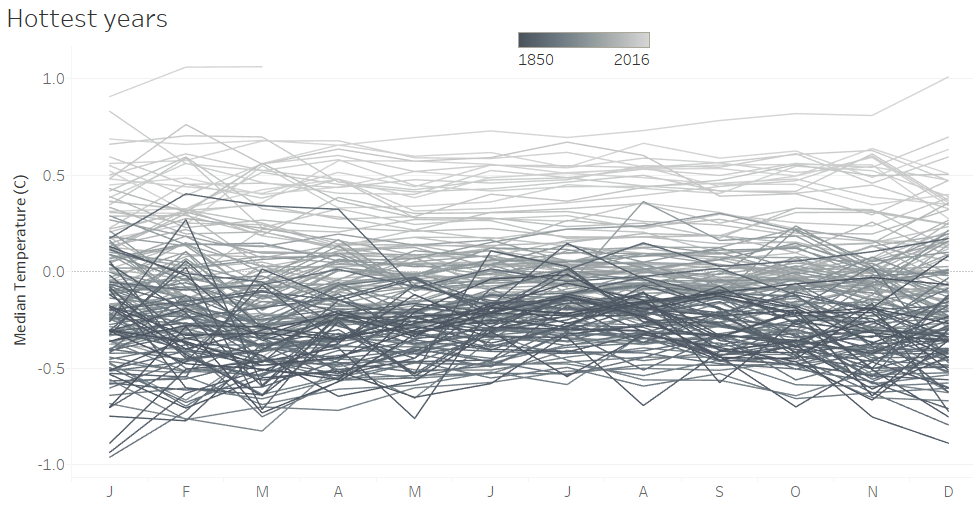
I also liked the idea in the original, spiral submission of showing the years as lines overlapping each other, which creates an effective way of showing the years creep up and up each year. I first colour coded it with the same blue-red scheme with blue representing older years and red representing more recent years, but this was misleading: blue-red colour schemes is so heavily associated with temperature that it made it harder to read. So, I opted for a simpler greyscale, with lighter shading representing older years and darker shading representing more recent years.

I actually experimented with both, but felt that having darker shading for more recent years was better for conveying how the problem is getting more serious. I feel like my eyes are drawn to the darker shading, so when that represents the older years, it creates the impression that your focus is supposed to be on how much colder it was then rather than how much hotter it is now.
I then put both of them into a dashboard, stuck a title on, and published it. I’ll be honest, I’m still really new to Tableau, and I find it quite confusing to put an appealing dashboard together. I spent a lot of time frustratedly playing with dashboard aesthetics during my Data School application, and kept forgetting that it’s the representation of the data that’s the most important thing. I’m definitely looking forward to learning how to add the impressive finishing touches to it!
Check out my first #MakeoverMonday submission, with all the interactive bits that don’t work with screenshots, here… or the embedded version below: