


After a few days of intense Tableau training, one of our first tasks was to take the viz we submitted as part of our first application to The Information Lab. This was a bit of an eye-opener for me. I’d only heard about the position about two days before the deadline, so it was a scramble to download “Tableau” (whatever that was), find a useful dataset, play around with it, and submit. But even though I knew it wasn’t the best piece of work, looking back on it after some proper data visualisation training felt embarrassing. Let me share that embarrassment with you:
If you’re wondering what it is, that’s fair enough. The dataset is all mixed state secondary schools in England with information about the 5 A*-C GCSE pass rate per school (for boys, girls, and all), the school’s Ofsted grade, and the percentage of pupils eligible for free school meals. The scatter plot at the top tries to show absolutely all of that, and in doing so, manages to show none of it. It needs a long paragraph of accompanying text to make sense of the viz, which rather defeats the point of a data visualisation. In the graphs underneath, I clearly got quite excited by mapping functions, and I’ve plotted each data measure as a colour-coded point of where each school is on the map. Thing is, it’s so messy that all it really shows is where the major population centres are.
All in all, not a good viz.
In the updated version, I simplified it a lot. I took out the Ofsted information and just focused on the gender gap. I sorted each school by the size of the gender gap, and put each school as a bar along the x-axis. What I like about this graph is that the extent of pink on the screen really shows how extensively girls outperform boys at GCSE level across England. Then, the two scatter plots below look at how consistent the gender gap is across school quality and school wealth. The original point of this data was to make a comparison with a finding from schools in Florida, where the gender gap is massive in underachieving schools but non-existent in good schools. In England, it’s there across the board, and this viz makes it much clearer than my first one:
One of the neat tricks I learned doing this was flipping the bar chart so that it was ordered in separate ways; from biggest boys’ advantage to smallest, then schools where there’s no difference, then from smallest girls’ advantage to largest. I first calculated the gender gap by looking at girls’ performance minus boys, then colour coding it. I also manually updated the y-axis to show 20 instead of -20.
That created a graph like this (with a slightly worse colour scheme that I later updated):
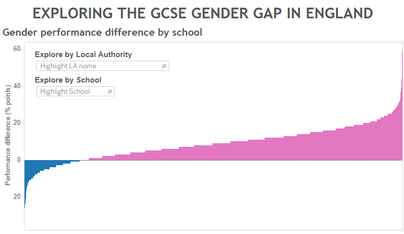
I then right clicked, formatted the number, and used the ABS function to turn the negative values into positive values. This kept the schools in the same order, but flipped the boys’ values so that all bars were above the x-axis. That removed the whitespace and made the viz a lot clearer. Definitely a lot better than the original application, but I’m looking forward to learning more ways to improve over the next few months.