


Day 10 was project day and my key takeaway from the task was if you want to deliver an effective and presentable dashboard within a limited time-frame; then it is essential you plan!
The Task
In the morning we were all provided a data set which we had to access via a database called Exasol. We were then instructed that we could not start creating our visualisations until we sketched out how we would present the data in Tableau. This was followed by a presentation in the afternoon explaining our thought process which was capped off with us revealing our visualisations.
The Initial Process/Sketch
The data set I was given was based on parking violations in Philadelphia and had over 7 million rows of data. In order to access the data, I had to connect to the Exasol database within Tableau using specific log-in details. Once I had access, I had to start thinking about the best ways I could visualise the data.
My first step was to head to the data source page and view the different fields that were within the data set. Once I looked at the different fields, I then started to note down the various relationships that could be constructed such as; the number of records (number of tickets) and issue date.
Upon noting down the relevant fields, I began sketching out my potential dashboard (peek below for some awful artistry!).

It was now time to head to Tableau and make an attempt to bring my sketch to reality.
The Tableau Process and Outcome
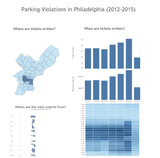
Firstly, I created the dual axis chart that was also in my sketch (bar and line chart) which depicted the days that tickets were mainly issued (bar) and the revenue generated from them (line). However, once I synchronized the axis for both marks (bar and line), the chart did not replicate what I originally sketched as the scale and metric were different for the measures, which left a massive gap between both marks. I could have left the dual axis unsynchronized, with the line relatively around the top end of the bars, but (with the advice of Andy) it was not necessarily the best way to visualise those measures together which led to me creating two separate bar charts.

The second sheet that I constructed was a heat map that displayed the number of tickets given within each hour, every day of the week. The colours were coded in regards to the number of tickets given (colour darkens with larger figures) and the tooltips also stated the specific hour and number of tickets.

Although it was not in my original sketch, after some experimentation with various charts and maps; I decided that a map of Philadelphia and the different zip codes within it will be beneficial for creating a dashboard with actions to filter the various charts. The map was colour coded in various shades of blue in regards to the number of tickets given within each zip code. The number of tickets and revenue generated for each zip code was also present within the tooltips.

Lastly, I created a chart that unveiled the top 10 culprits within the US that received tickets. This was to show the states that the main offenders were from, which unsurprisingly featured a great portion of Pennsylvania’s bordering states.

Final Dashboard
From the picture of my final dashboard it is evident that I also omitted the two tables that were at the bottom of my original sketch as I believed the final four sheets I constructed complemented each other well. Once I had implemented my four sheets onto the dashboard, I incorporated two filtering actions to build interactivity. These were a:
Map filter – if you clicked on a particular zip code, it will then filter the 3 other sheets in relation to that zip code.
Culprit filter – If you clicked on a state like New York, the other 3 sheets will filter in relation to figures for offenders from New York.
There were other things I wanted to do with my dashboard, including finding the best way to visualise the two bar charts for the days’ tickets were issued and revenue generated, however as time was running out, I had to ensure I delivered something worthy of presenting.
Conclusion
My experience from this project has truly provided me with an insight in regards to how important and beneficial it can be to sketch and plan your dashboard. If I had failed to plan, I believe I would not have delivered a finalised dashboard within the allocated 3 hours, as I could have spent numerous hours playing with various chart types and attempting to establish various relationships.
This has been an important lesson for me since joining The Data School, so please do not fail to prepare…because you will be preparing to fail!