This week’s data is all about spending. More precisely, it’s the spending breakdown by four demographic groups: Millennials, Gen X, Baby Boomers and Traditionalists. See the original visualisation below:
What doesn’t work
First of all, there’s too much colour. Everything is fighting for attention and so I don’t know what to look at. Second, I’m not a fan of stacked bars. I just find them hard to read, although I guess this chart may not be the worst choice for this data. The categories are not ordered or at least they don’t seem to be ordered. Another thing is that the graph is aligned to the left but the title is in the centre which makes it look slightly disorganised.
What work
I like the analysis of the graph that the article consists of. It would help to have some of these insights on the chart itself. Despite the disorder of categories, Restaurants and Groceries are next to each other which makes the food spending easy to assess.
How can I improve it
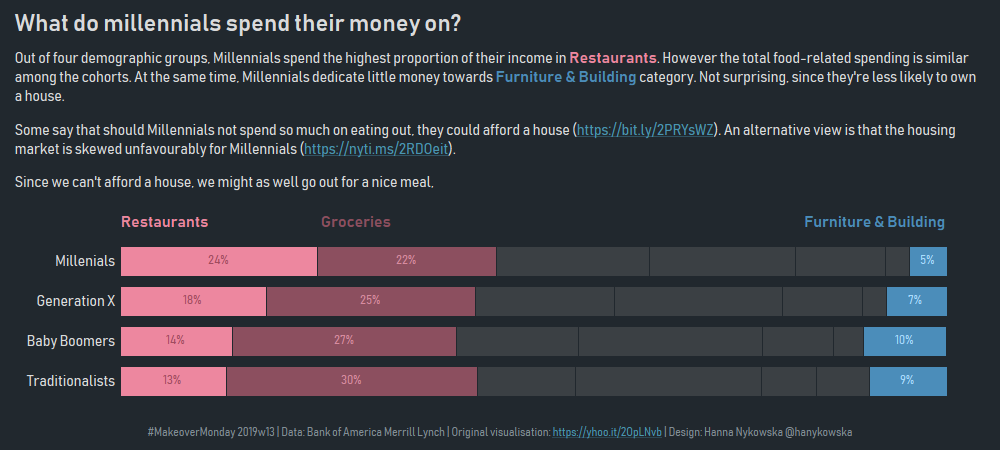
I decided to stick to the stacked bars but flip them to a horizontal position because I find it easier to compare the values that way. I decided to focus my viz on two (to three) categories: Restaurants (and Groceries) and Furniture/Building. To make them easier to analyse, I put them on the ends of the stacked bars: food-related on the left and the accommodation-related on the right. The categories in the middle are ordered decreasingly for Millennials.
To deal with the colour overload, I grouped four remaining categories together and assigned them the same colour, sending them to the background.
Additionally, I changed the style of the viz to give it a more modern and millennial feel (I’m a millennial after all):

