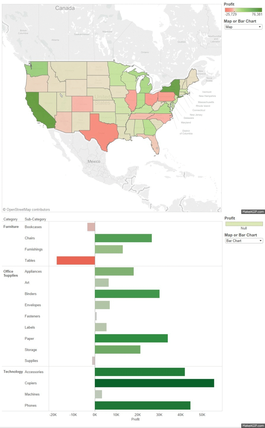
In this post I will be explaining how you can switch between different views on a dashboard using a parameter as taught by Coach Kriebel in our parameters class a couple of weeks ago. Trust me the end result will be MAGIC. This works by showing the view we want and hiding the view(s) we don’t want to see on our dashboard.
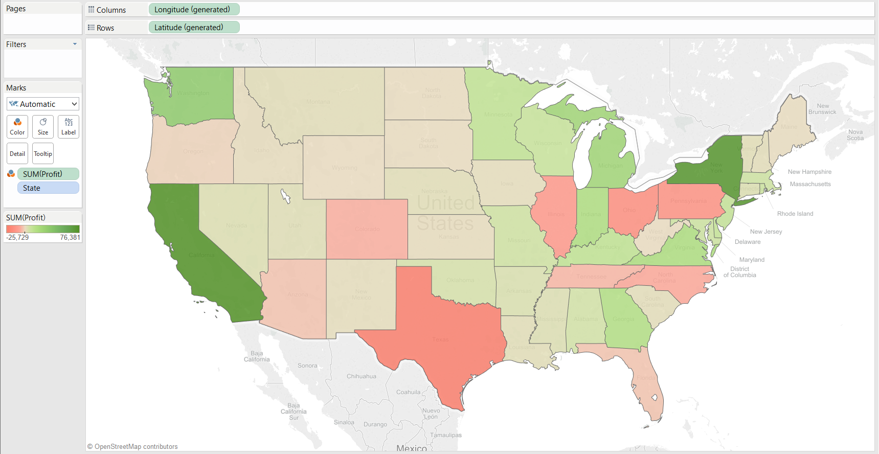
First of all we need to have at least two different views in our workbook. I have used the US Superstore Sales sample data-set that comes with Tableau to create two views, one showing profit by state on a map and one showing profit by category/sub-category using a bar chart. If you wish to follow along using my example, create the views below.
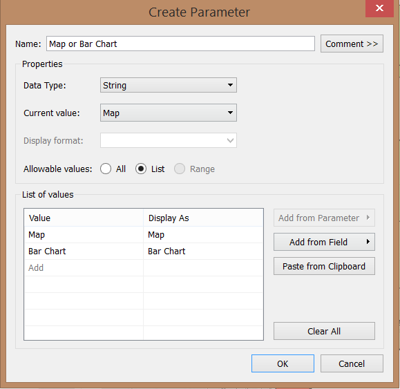
1) We must create a parameter with n number of values, where n represents the number of worksheets we want to switch between on our dashboard, in this case 2 (see below). I’ve named the parameter “Map or Bar Chart” but feel free to use any name you want. I’ve set both the the List of values and Display As text to Map and Bar Chart.
2) Navigate to the Map worksheet, right click on the Map or Bar Chart parameter in the data pane, click on Show Parameter Control and select Map from the drop-down list in the parameter which will appear on the top right hand side of your worksheet.
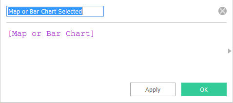
3) Now, in order for a parameter to work, we must use it in a calculated field since we want to add a filter to the worksheet based on the parameter selection. Create the calculated field and simply use the name of the parameter as the code so [Map or Bar Chart] in this case.
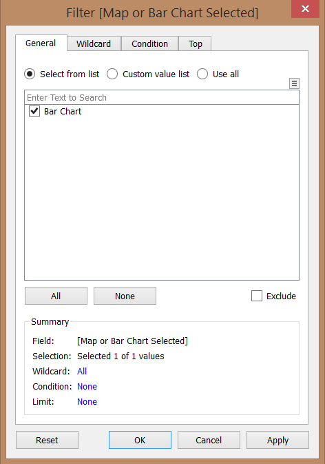
4) Drag and drop the Map or Bar Chart Selected calculated field on to the filters shelf in the Map worksheet and check the Map tick-box.
5) Navigate to the Bar chart worksheet, right click on the Map or Bar Chart parameter in the data pane, click on Show Parameter Control and select Bar Chart from the drop-down list in the parameter which will appear on the top right hand side of your worksheet.
6) Drag and drop the Map or Bar Chart Selected calculated field on to the filters shelf check the Bar chart tick-box.
Note: if we now change the parameter to Map while in the Bar Chart worksheet or Bar Chart while in the Map worksheet, we’ll see nothing in the view and this is what we want so don’t be alarmed!
7) Now we must create a Dashboard, I have named it Profit – Map or Bar Chart.
8) Next drag and drop a Horizontal layout container (located on the left of your screen) on to the blank Dashboard (we could also use a Vertical container – key is for each view to fill the entire container when relevant parameter is selected).
9) Drag and drop the Map and Bar Chart worksheets on to the Dashboard. The parameter control should automatically appear on screen since we made it visible in both views in the previous steps.
10) Hide the titles of both of the views.
11) VOILA! Now when you switch between Map and Bar Chart in your parameter, the visualisation you see changes dynamically!
Please note:
- if any of your views have no pills on Rows or Columns i.e. bubble chart, treemap or pie chart then you’ll need to add this additional step by Alexander Mou (thanks for the tip) for your charts to fill the entire view on your dashboard: http://vizdiff.blogspot.co.uk/2016/03/sheet-swapping-with-pie-tree-map.html
- the ‘only relevant values’ option from the quick filter menu will relate to the worksheet you added the quick filter from. A workaround for this would be to create a dummy worksheet that contains all allowable values from both worksheets, add this to your dashboard and use the quick filter from it. To hide the worksheet from your dashboard you could set it as floating and set it as 1×1 pixel.
Click here to see a great video by Andre of The Information Lab on how to do this if you prefer learning through video tutorials.

