


From seeing blogs from previous cohorts, I knew we should expect a non-Tableau day for Dashboard Week.
I guess a positive of today was that the data was clean, thank you coaches! Which led us to focus quite quickly on the BI tool to use. Judging from Andy’s blog we could use:
- Power BI
- Looker
- Google Data Studio
- Qlik
- Flourish
I tried Looker, Google Data Studio and Flourish at the start of the day. Looker wasn’t available for me as they had to give me access to a free trial which would take time to activate (and time was too precious for that). With Google Data and Flourish I found it hard to input the data that was not not from a server, I therefore chose Power BI as the tool of choice.
It brings me back to when I first used Tableau and the issues I faced, feeling so unfamiliar with the software.
My initial view of Power BI is that it isn’t as quickly insightful as Tableau. I don’t like that PowerBI automatically uses proportional brushing as a filter as I feel that doesn’t give good insights to look at in future interactions with the dashboard. Although it is only my first day using the software, I am convinced the level of insight that is possible on PowerBI is much lower in comparison to Tableau.
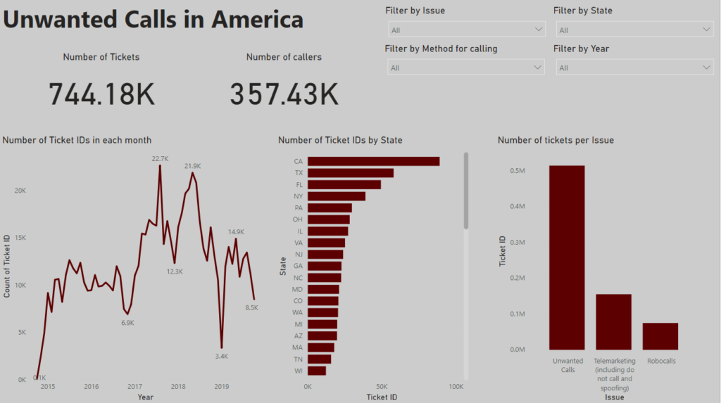
I kept it simple, mainly because I did not know how to do anything else. The viz shows the amount of tickets (complaints) per State, per month and per issue. Because clicking on the charts weren’t filtering for me (only using proportional brushing), I then created 4 filters at the top.
Here is the dashboard:
Link to my viz: https://app.powerbi.com/groups/me/reports/12aada67-244c-4275-a7e4-cbd41f5b55c0/ReportSection5539e4313988e4a981c7