


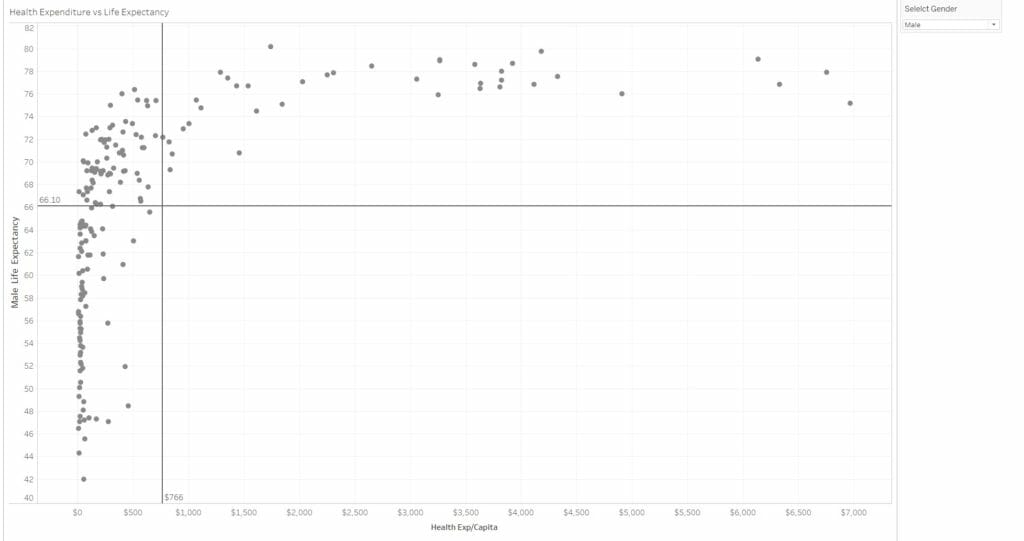
I produced a visualisation in one of last week’s training days which I thought was cool as I created a calculation which colour codes some regions of a scatter plot. It inspired some of the other members of DS8 to try to it out and because of that, I thought I ought to share how I did it. The chart I made came from last week’s training by Luke Stoughton which shows Health expenditure vs life expectancy for countries around the world. If you read my previous blog, you’ll know that I used something called preattentive visual attributes to make my charts and visualisations more effective. This is what I also tried doing in this visualisation.
Enclosure
I personally like segregating areas of a scatter plot so I can see which data points fall below and above average. This means that some of the points will be enclosed in visible quadrants and a anyone would be immediately be able to see that the quadrants are of some importance. These average lines shown below can be created using Tableau’s inbuilt feature in the analytics pane.
Colour
Now here comes the more exciting part. I wanted to colour code the points such that they are a different colour depending which quadrant there are in. To do this I had to create a calculated field:
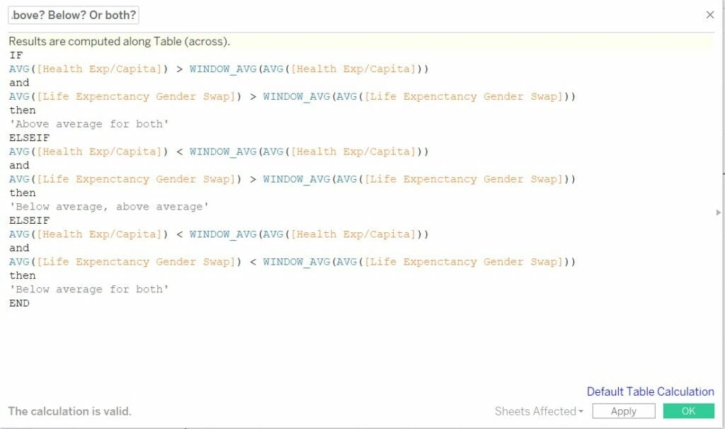
There are three (not four, as there are no countries in the lower right quadrant) conditions outlined in the calculation for Health expenditure (HE) and Life expectancy (LE):
- A country has its HE and LE above overall average
- A country has its HE below average, but LE above overall average
- A country has its HE and LE both below overall average
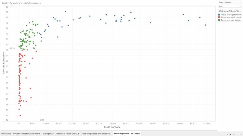
Dragging the calculation to the colour palette and editing the table calculation so that it’s calculated for each country will result will in three quadrants each with their own colour, it’s as simple as that!
This is just an example using a scatter plot and some averages. You can extend this to other chart types using different conditions, the possibilities are endless.
Summary
I enjoyed doing this was because I worked out how to colour charts the way I wanted to based on calculated fields, and now I’m more comfortable using calculations to add another level of customisation to my visualisations. As usual, if you need to get in touch with me, contact me here @JevonDaCosta and here Linkedin!