It is Day 3 of Dashboard week at The Data School and today we were using the analytics from this very site to build a viz.
There were a couple of different points I wanted to display in this:
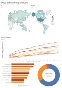
- How far spread an individuals reach is globally
- What devices people are viewing the blogs on (and possibly the tableau public vizzes)
- Running total of views per author / cohort weighted by the number of blogs posted
- Which hour of the day is the most popular for people reading the blogs
I managed to achieve most of these. I built the chart looking at popular hours of the day but I felt that this didnt fit too well with the story of the dashboard so I decided to leave it out.
I built in the option to look at an individual and compare this against their current or other cohort as well as the ability to compare cohorts against each other.
For the colouring I have assigned a separate colour palette to each data school cohort which shows the difference between each person (slightly) but exaggerate the difference in each cohort.
Below is what I have created, I have removed the numbers off of the majority of the charts.