


In some cases companies may be looking to compare and contrast how a set of products are selling across a number of regions or stores. Allowing the identification of individual products that stand out per region and thus take action accordingly. To create this we will be using a very simple LOD expression, but first let’s build out the basic framework. I will be creating this chart from the Tableau Superstore data set.
First, simply drop region and segment onto rows in order to give us the outline of the chart.
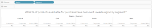
If we create a distinct count of Product ID (COUNTD [Product ID] ) and drag this to the columns shelf, subsequently turning on labels in the mark shelf the chart will display the number of unique products sold in each region broken down by segment. However we are looking to determine this as a percentage of the total products available. Therefore, we need to decrease our level of granularity to view determine the total number of unique products sold across all regions and segments. The best way to do this would be to combine our initial distinct count of Product ID with an LOD.
{ FIXED : COUNTD([Product ID]) }
We will however need to sum up our LOD expression to an aggregated level due to our distinct count of Product ID also being at an aggregated level, no calculated field can use both aggregated and non aggregated expressions in the same calculation. The final calculated field will therefore take the form of:
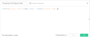
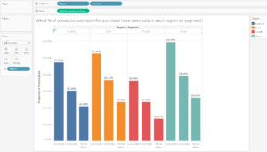
I have named this new calculated field “Proportion of Products Sold”, which can now be dropped into the rows shelf. Once region has also been placed on the colour marks card we will have created the chart as seen below:
If you have any questions simply comment below!