


So 71 days or 102,240 minutes after joining the data school as DS11 our time has arrived for first day of “Dashboard Week”. What is “Dashboard Week” i hear you ask? Well for each of 5 consecutive days the morning brings us a new data source, normally in a highly unstructured and unusable format. This must then be fixed, cleaned up and brought into tableau to create a visualization, with Andy throwing in multiple challenges along the way just to make sure it’s not too easy for us all before our 5pm deadline.
Before the day had even begun there were two new rules imposed:
- Setting a firm 5pm finish time
- Requiring us to leave our laptops at work
For our first day Andy gave us an intriguing set of data containing every single time a snow plough has been used in any New York street over the past 3 years. By working as a team we broke the tasks down into bit size chunks in order to make our workload easier. Ellie and myself went about extracting the two files needed, Andrew went about building the schema on RasorSQL for us to upload into and the rest of the team worked on how we could connect the two data sources together.
The Data Sources:
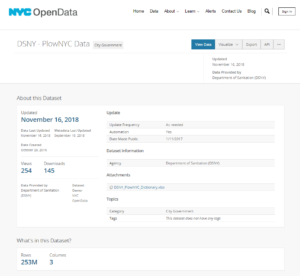
Ellie and myself went about extracting the two files we needed, the first being a shape file (.shp) of New York and the second the snow plough figures themselves. However, this is where we hit our first stumbling block…The second file took in excess of 2.5 hours to download, taking up 11.5GB of my hard-drive, containing more than 252,000,000 rows of data (or 252 million!) and thus we needed to be extremely wary of how we went about it. Just to put the sheer volume of data involved into perspective, excel has a maximum number of rows of 1,048,576 and would be able to hold 0.41% of this data set.
The Schema:
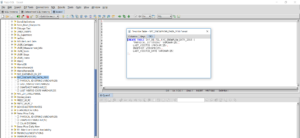
A schema is a collection of related database objects or fields collated together in one table or group. Andrew began by building an empty schema in our RasorSQL database for myself and Ellie to upload the cleaned data set into. However due to the sheer volume of data RasorSQL struggled to cope, at which point we had to turn to the ExAplus database.
The Visualization:
Finally at just gone 2:30pm , with little more than two hours before the deadline we got into Tableau where we discovered yet more issues with working with such a large data set. Every time we dragged a pill onto a shelf Tableau would refresh the data source and we would be stuck waiting, watching a circle spinning round and round, time after time. Finally after adding a data source filter, which sits second in the order of operations things suddenly started to look up for us. Tableau began to respond much faster allowing me to steam ahead and create the visualization i had envisaged hours earlier.
Looking forward to tomorrow for another equally challenging challenge from the Data School!
If you have any questions feel free to reach out to me on @VizMyData