


Day 4 of dashboard week has now arrived and we were greeted with a set of cycling traffic data for a number of routes in Seattle, the analysis of such data is extremely important due to the significant levels of investment to create new cycle lanes throughout Seattle with the aim of reducing pollution and congestion levels.
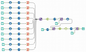
Since there were 10 files making up the full data set, each file needed importing and collating together into Alteryx. Meaning the first part of my morning was taken up by creating the workflow seen below. The main issue i found with these files was the schema not being the same, meaning each file needed columns transposed (pivoted) in order to create one column containing the values to be used. Once i had solved this issue and all files were in the same format and could simply be unioned together, whilst also joining on the longitude and latitude of each route to use later. Finally, the last section of the workflow was to convert the date time stamp into a readable format for Tableau since it came in the format of a 12 hour AM/PM stamp rather than a 24 hour stamp. Once i had got past the data parsing issues i could output the file and take it into Tableau.
.
My Approach:
I decided to take this project in two separate paths (a little ambitious now thinking about it), firstly taking a look at patterns in the levels of cyclists over time to determine whether there may have be any seasonality and secondly aiming to determine possible commuter routes within the 10 we downloaded.
My final visualization can be seen below:
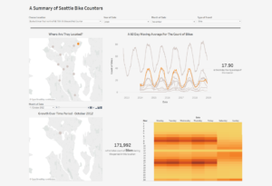
The line graph aims to answer my first question of seasonality, which can be seen extremely clearly. The line of route selected in the dashboard is automatically highlighted orange to make the view much clearer, whilst also using table calculations to create a 60 day moving average smooths out the line and gives the chart room to breathe. The second question I wanted to answer regarding commuters can clearly be seen in the heat map. Between 6am-8am and 4pm-6pm Monday to Friday we see a large surge in levels for this route, however other routes I looked into were much more sporadic and random in nature. However I am unable to understand nor explain the spike seen at midnight (24) for the route shown, can you?
I look forward to tomorrow when we will find out our next (and last) data set in dashboard week! I’m sure there will also be at least one curve ball thrown into the mix by Andy just to make sure we’re on our toes…