


Day 3 began (as per usual in dashboard week) by presenting the visualizations we created the previous day to Andy and the rest of our cohort for feedback. Once all presentations had been made the challenge for today was revealed.
With a wince we all read the list of requirements as posted by Andy, it was the first two that hit us the hardest (1) They must use Power BI and (2) They are not permitted to use Tableau at all…Gulp. Whilst those who train at the Data School specialize in Tableau and Alteryx it’s still important for us to understand how similar programs work, however up to this point we have had no interaction with the product. I decided the first and most logical step to be searching for tutorials on the Power BI website, the same as I had when creating my visualization for the Data School application process. Low and behold a number of well split out tutorials poped up and thus the learning began.
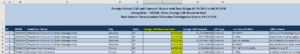
The data source we were given came from Foreign Gift and Contracts Report and contained all gifts received within the previous six years from any foreign source for institutions that offer a bachelor’s degree or higher where the total value of gifts in a given calendar year greater than $250,000 or the institution is owned by a foreign source. Upon opening the data source i was relived to see it was in a clean format and didn’t need any manipulation in order to take into Power BI. However since this article is designed to give you a overview of the differences between the two BI solutions i also imported into Tableau where i hit a stumbling block almost immediately. The excel file had converted Foreign Gift Received Date column into a numeric format rather than a date, Power BI converted this automatically into a date, whilst Tableau didn’t, instead returning null values.
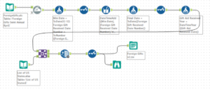
This meant in order to take the data into Tableau i needed to create a workflow in Alteryx to manipulate the field back into a date format as seen below.
Once I got over this initial hurdle it was time to delve into Power BI itself and understand the main differences between it and Tableau. I’ve summarized my key findings, both pros and cons of each for you below.
Differences Between Power BI and Tableau:
Pre-built and custom charts gallery:
In this respect Power BI and Tableau are very similar tools whilst simultaneously completely contrasting. Both have their own preset group of “show me” graphs which are extremely helpful for a beginner to start creating their own views quickly by identifying a graph of choice whilst simply dragging and dropping a dimension and value fields required to the relevant shelves. However Power BI forces you to choose your chart type from this preset group before moving forward and adding fields of your choice, whilst Tableau allows you the choice of using a preset “show me” graph or going straight to drag and drop your dimension and value fields onto shelves in order to create your view. I found this extremely frustrating when attempting to explore the data in Power BI as it meant i essentially needed to start from scratch each time when moving on to a new chart type.
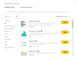
However my biggest surprise when using Power BI came in the form of their visual marketplace (seen below). Allowing you to choose, install and configure a vast range of custom visuals created by others in the community. Whilst some being a little difficult to configure it does make it much easier to create visuals far and above that of standard go to templates.
Dashboard actions:
What are they i hear you ask? Well when interacting with one part of your visualization, such as a chart, your other dashboard graphics are also affected in a way that supplements that of the initial interaction. In Tableau this is achieved by configuring and applying source and target sheets. In comparison Power BI has made the process much simpler and more intuitive, by automatically assuming charts on the same page should be linked. From there, if you wish they can be disconnected.
The ease of creating a dashboard:
Any user of Tableau will tell you how useful containers are when bringing together their final dashboard(s), allowing you to group together charts / figures and move all simultaneously. However they also can take some time to get your head round . When using Power BI I found a complete contrast, it was a simple drag and drop procedure, lining graphs, filters, titles up to create your final dashboard. In this respect Power BI is certainly streaks ahead when designing how to layout your dashboard, however I believe sometimes it is worth investing the time in order to create a more “stable” view.
Overall:
I loved how quickly and easily I managed to build my first few charts and must say I achieved a lot in my first hour of using Power BI. If you know what you want, how it should look and are happy with the chart types it offers then Power BI is certainly worth considering. However on balance, for me I missed the ability to delve deep into the data and explore the story it was telling. When it came to the more granular levels of detailed analysis i believe Tableau as the edge. However if looking to create a simple overview dashboard to display key metrics Power BI will certainly give you all the tools needed and more.