


In this blog, I will show how to make a bar chart that allows users to
- Select a year using a parameter
- View sales by product sub-category
- Automatically highlight categories performing above the yearly average
- Compare category performance against an average reference line
The dashboard helps users quickly identify top-performing product categories for any selected year.
Create a Bar Chart
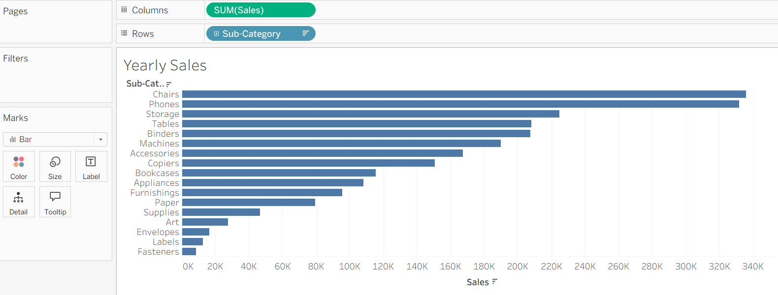
In this example, I use the Sample Superstore dataset.
Let's start by creating a simple bar chart to visualise sales across different product sub-categories.
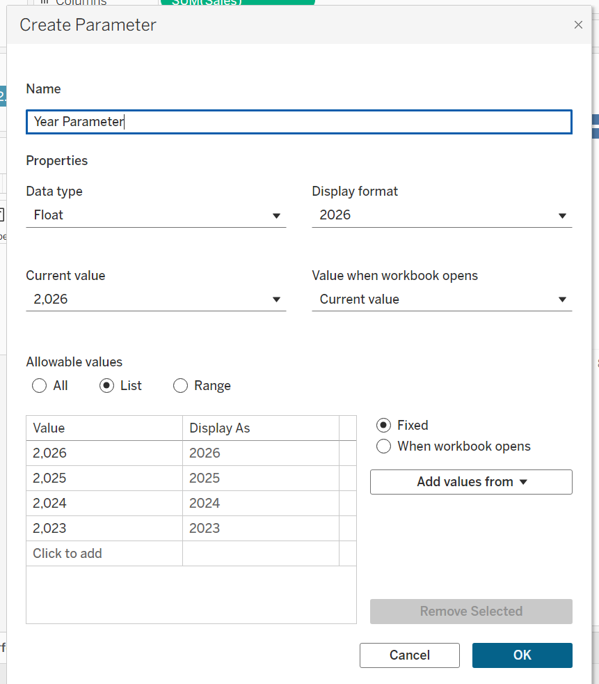
Create Year Parameter
Create a parameter that allows users to switch between years.
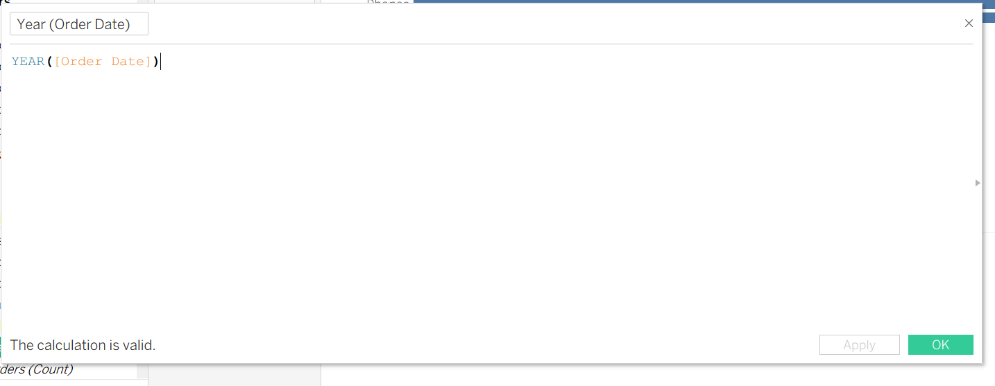
Currently, there is no Year field available in the dataset, so I'll create a new Year field from the Order Date.
A parameter alone does not automatically change the visualisation dynamic. To make it work with the bar chart, I'll create a calculated field that filters the data based on the year selected by the user.
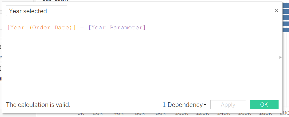
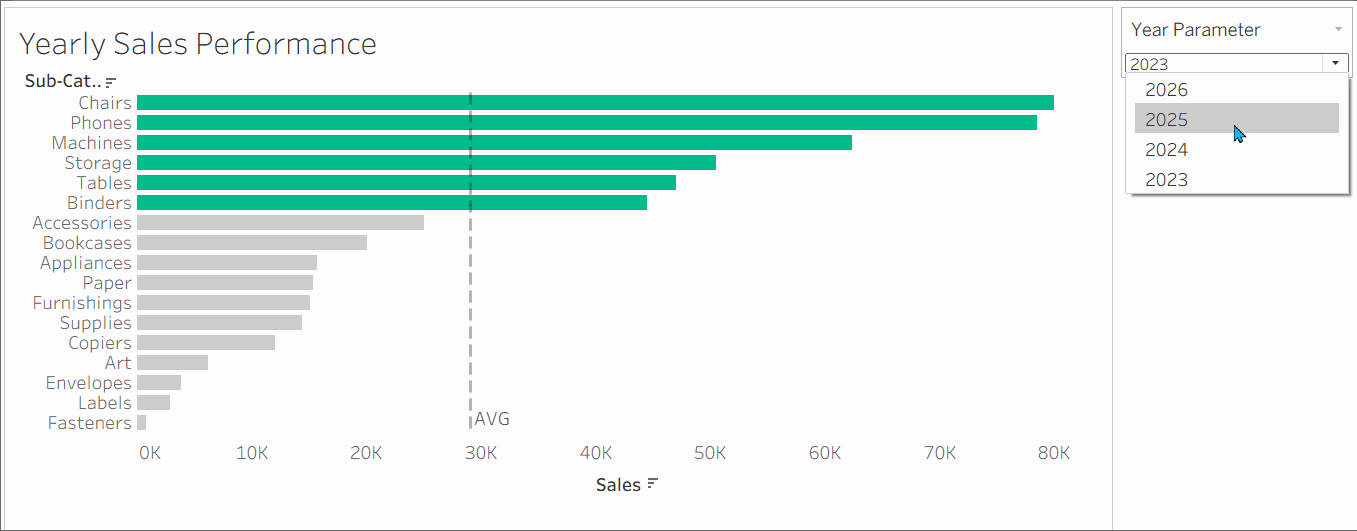
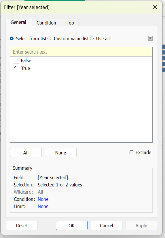
To apply the parameter function in the graph, place the calculated field on the Filters shelf. Select True and click OK. This filters the view to display only data for the year the user selected.
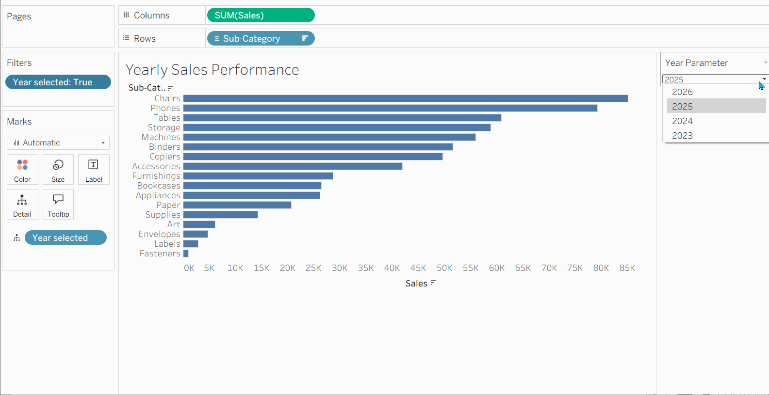
Right-click the Year Parameter and select Show Parameter. This will display a dropdown menu that allows users to choose a year and interact with the chart.
Try switching between different years to see the chart update automatically.
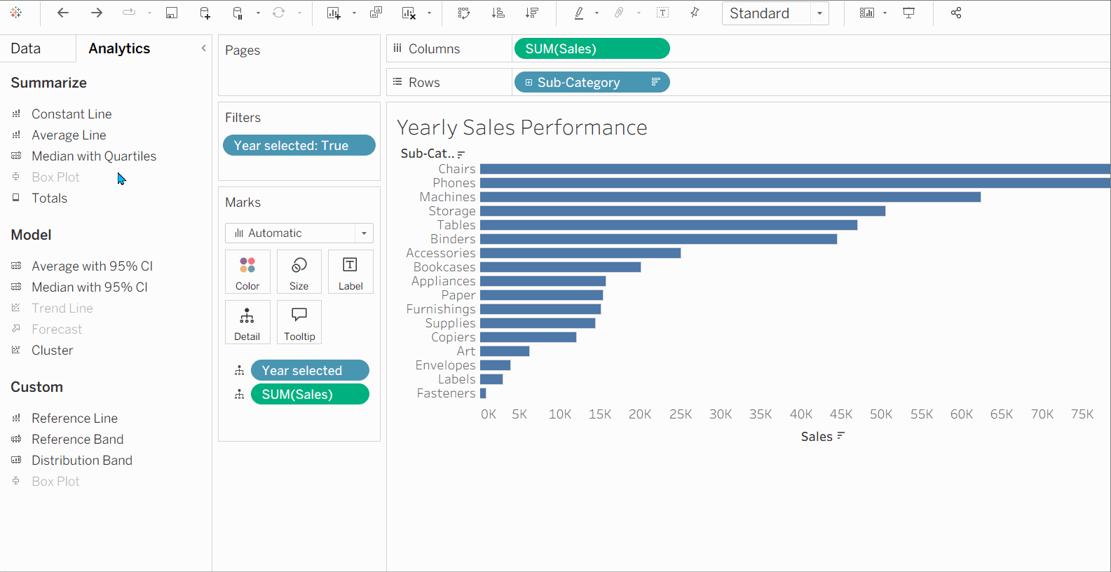
Create an Average Reference Line
Open the Analytics pane, drag Average Line into the chart, and drop it on Table to display the average sales across all sub-categories.
Create a Colour Logic Calculation
Create a new calculated field as shown below. This calculation returns a boolean indicating whether a sub-category's sales are above or below the average.
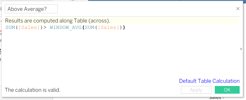
Drag the calculated field to the Colour shelf on the Marks card. Tableau will then colour the bars based on whether the sales value is above or below the average.
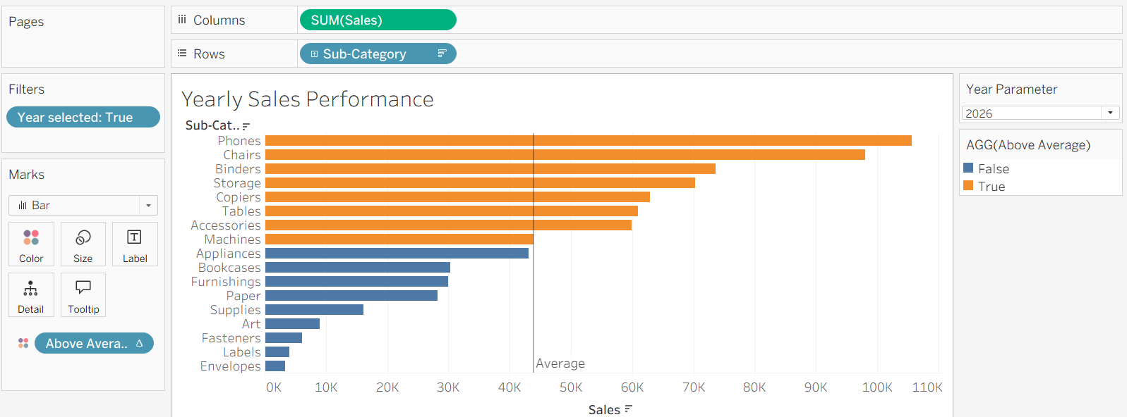
After adding a few finishing touches to the formatting, the dashboard is complete. Users can now select a year, compare sales across sub-categories, and instantly identify which categories are performing above average through dynamic colour highlighting.

The combination of parameters, reference lines, and conditional colouring can be used for much more than sales analysis.
For example:
- Profit Analysis: Highlight products or regions performing above average profit.
- Customer Performance: Identify customers who generate above-average revenue.
- Regional Comparison: Compare regions, cities, or countries against the overall average.
By applying these techniques, you can transform a simple chart into an interactive analytical tool that helps users quickly identify trends and top-performing segments within their data.
Thank you for reading!