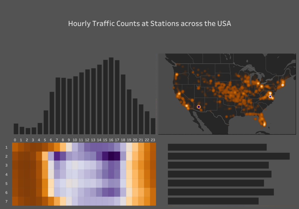
Today’s challenge was to visualise one month of hourly traffic counts at stations across the U.S in Tableau Prep.
Joining and prepping the data in Prep has reinforced my preference in Alteryx.
Every new action in Prep causes the workflow to run which leads to a lot of waiting around.

Unlike Alteryx there doesn’t seem to be the option to run the workflow when you want.
I made a pretty basic dashboard because of the time limit. It’s a general overview of traffic using a map with the density mark, a marginal histogram.

