


Using colour in your viz adds another dimension that can ascend your dashboard from average to amazing or burn your audience’s retinas.
Colour allows you to direct your audience’s attention or gloss over background information. It can be used to invoke emotion, set a tone or highlight a particular area.
When we see colours our minds react in a certain way and associate those colours with specific feelings.
Reds are associated with vibrancy, passion and stimulation.
Blues are seen as secure, trustworthy and responsible.
Greens are seen as peaceful, healthy and natural.
Yellows are seen as friendly, cheerful and warm.
Oranges are seen as energetic, enthusiastic and fun.
Purples are seen as successful, wise and loyal.
Pinks are seen as feminine, loving and calm.
Browns are seen as simple, dependable and earthy.
White is seen as practical, innocent and pure.
Black is seen as exclusive and prestigious.
However this is culture specific and could mean the complete opposite in a different country.
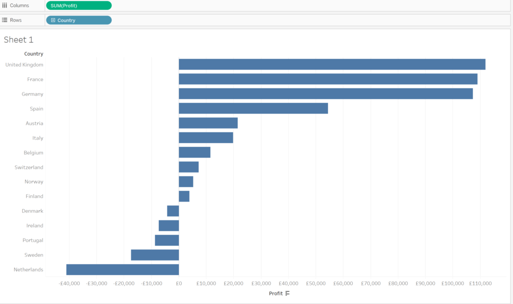
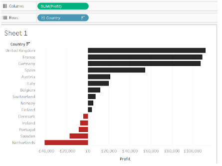
The bar chart above has been sorted by most profitable country to least profitable country with the default blue colour on the bars.
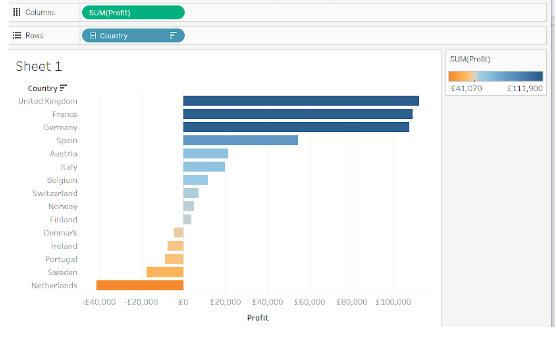
Adding profit to the colour mark adds a two colour gradient that should increase how quickly the audience is able to grasp what the chart shows. There is a clear difference between the colours that show negative and positive profit with the colour gradient which indicates how negative or positive a certain country.
In some cases it may be necessary to colour to the dimension value, such as using colour as a legend later on in a viz. It’s better to avoid colours that are bright and fluorescent as those colours look garish and not great to look at.
Duller colours (with the opacity lowered slightly) that look dissimilar enough so that they be followed in charts like line graphs.

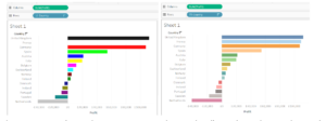
Picking a colour palette that doesn’t have enough separate colours causes there to be a repeat of colours used, which can give the impression that similarly coloured dimensions are related when that may not be the case. This has the potential to cause confusion to users.
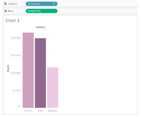
Using one colour with a gradient can give the impression that the darker colour is more important .
Using known color pairing or schemes such as red for negative aspects or green for positive ones (though not in the same chart), or red for losses and black for profit can increase the speed of which the audience can understand what the chart shows. This could be country/culture specific however.
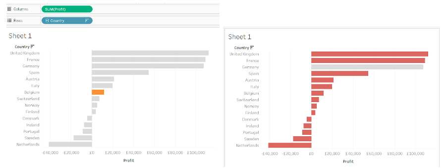
Using colours can be used to highlight specific areas of a viz that the author wants the user to focus on. A striking colour like orange or blue with a colour like light grey to contrast against works really well in achieving this.
Conversely, doing the opposite and coloring the dimension that isn’t important in a light, highly opaque colour causes the audience to pay less attention to it.