What are spark lines and why do we use them?
Spark lines are small line graphs with minimal text and labels. They allow the you to see a quick overview snapshot of the data in question. They help you see patterns such as seasonality or the general direction of a trend. Often, there are a series of spark lines displayed in one dashboard to allow comparisons between them or so that you can see all the data in one dashboard without the clutter.
Creating spark lines on tableau:
I’ll be using the Sample Superstore dataset in this example to look at sales value over time by region.
Step 1: Adding Order Date
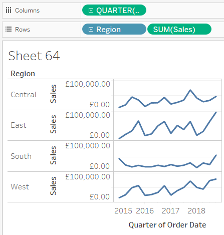
- Add a continuous field to your columns to form the X-axis for your line graph. In this example, I will be using Order Date. To do this, right-click and drag the field from your dimensions into your columns.
- The right-click and drag method lets you see a Drop Field pop-up where you should select QUARTER(Order Date) from the green section in the list. The green section is a Datetrunc which returns a continuous date field. You can choose other levels of dates such as MONTH(Order Date) instead if you wish.
Step 2: Adding Sales
- Add a measure to your rows to form the Y-axis. Simply drag Sales from your measures to do this. In this case we don’t need to right-click and drag as Tableau automatically uses SUM aggregation, which is the one I planned to use in this example anyway. Now you’ve formed a line graph, we are halfway there!
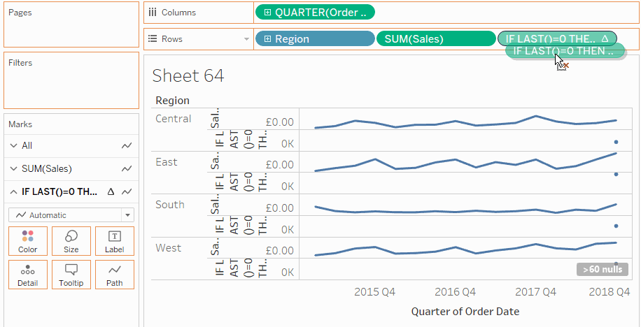
Step 3: Adding Regions
- We want a separate spark line for each region, so drag Regions from your dimensions into your Rows.
Step 4: Adding a line end mark
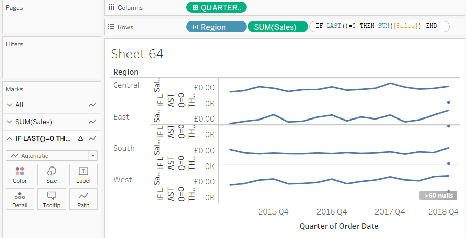
- To add the mark at the end of the line, we need a Last() function in a table calculation, which gives us the nth last value on the graph. As we want the very last point on each line, we use LAST()=0. The full calculation is
IF LAST()=0 THEN SUM([Sales]) END- This calculation is saying, if the point on our graph is 0 points away from the last point, then return the sum of sales.
- You can double-click on an empty space in the Rows shelf and type this calculation straight in there and hit enter.
- This will give you a little circle on each line graph, but on you marks shelf you will see that you now have a separate line graph for this calculation.
Step 5: Aligning the line end marks
- We want both line graphs to be on a dual axis. To do this, drag the LAST() pill onto the right edge of your chart space until you see a vertical ruler.
- Then, right-click on the new axis label and click synchronise axis.
Step 6: Cleaning and formatting
- This step can be customised to fit your needs.
- I have removed the Sales and Last() axis labels by right-clicking and deselecting Show Header.
- I have kept the years on the X-axis but removed the ‘Quarter of Order Date’ label by double-clicking and deleting the axis title.
- Right-click on the grey null indicator on the bottom-right of your chart and select Hide Indicator.
- You can double click on the Measure Names colour legend on the right to change the colours of the line and circle separately.
- You can use the size marks card on each mark shelf to change the thickness of the line and the size of the circle separately
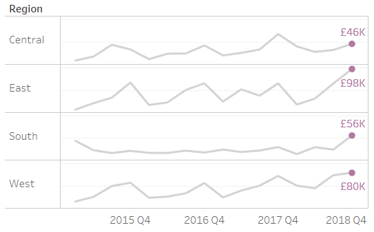
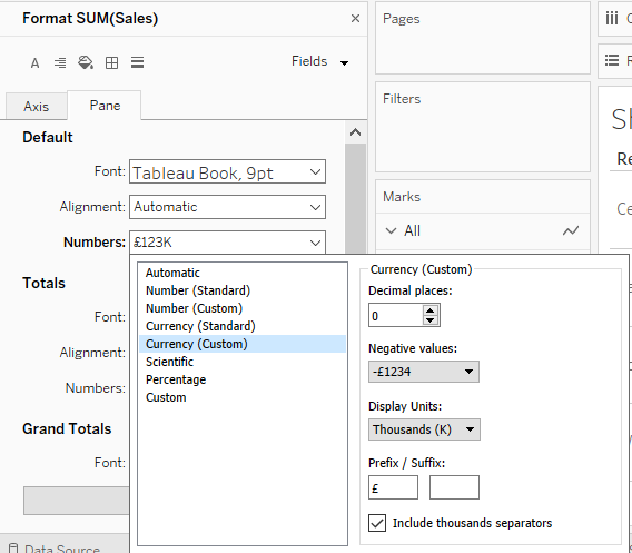
- You can add a line end label by holding Ctrl and dragging the SUM(Sales) pill from your rows to the label marks card in your LAST() marks shelf. You can also format the number format of this label by right-clicking on this pill on the marks shelf and selecting format (see image)
Final Product: