


Here’s part 2 for how I created my Makeover Monday viz last week. If you haven’t already checked out part 1, check it out here, or if you already know how to make basic donut charts, then just continue reading to find out how to really make them look like donuts.
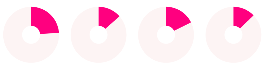
After completing part 1, you should be at this point:
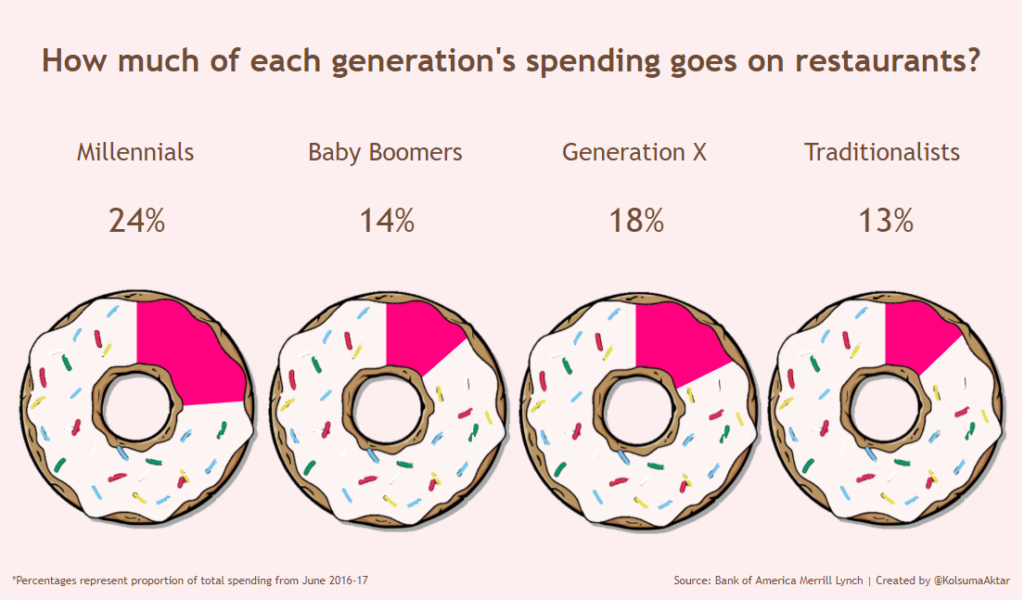
Step 1:
Find a cartoon image of a donut. The one I used can be found here.
Step 2:
Make sure to crop the donut image as much as possible with a square aspect ratio. I used Microsoft PowerPoint to edit my image but you can use any software you like. Another option is to use Paint 3D which is free on Microsoft Store.
Step 3:
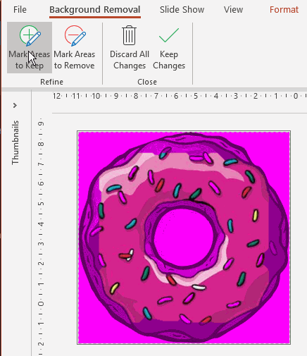
Use your image editing skills to make the background of the donut transparent. Here’s how I did this on PowerPoint. When you click on the image, you can see a Format tab show up at the top of the programme. In tab you will see a remove background button on the far left.

Step 4.
Powerpoint will add a hot pink overlay for any parts of the image it will make transparent. You want to use the Mark Areas to Keep and Mark Areas to Remove buttons at the top-left to ensure you are only remove the background of the image and the icing on the donut. (If you find it difficult to work around the sprinkles, you can make those transparent too, if you work on a touchscreen device it will be easier!)
Step 5.
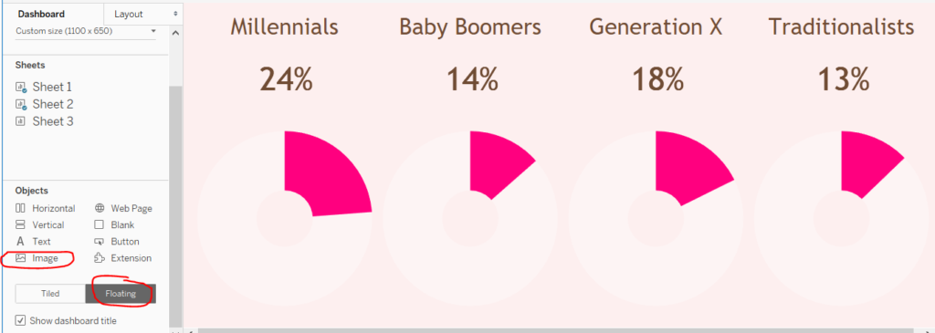
Once you’ve done this, open your Tableau workbook with the donut charts you made in part one of this blog post. Create a dashboard with the donut charts and insert your donut pictures as floating objects onto the dashboard.
Step 6.
Resize your images to fit exactly on top of your donut charts. You will have to do this for each donut. (Fingers crossed Tableau allows us to copy and paste images on dashboards soon!)
Step 7. (Optional)
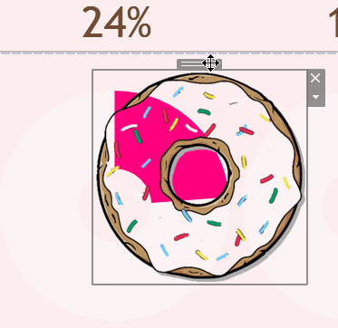
I wanted to remove the sprinkles for the areas where my donut charts were filled. To do this, I went back on PowerPoint and used ‘Mark Areas to Remove’ to remove the first quarter of sprinkles and saved this as a separate file. I didn’t have to do this for all four donut charts, as the other three donuts were pretty similar in percentage filled so I created two versions of sprinkled donuts in the end. As I only had four static donut charts, this method worked for me. If you wanted to do this for many donut charts or charts where interactivity on the dashboard makes the percentages change, then you may want to have a donut image with fully transparent background and icing, with no sprinkles visible.
I hope you enjoyed reading! If you use this method to create a viz, I’d love to see it! You can find me on Twitter @KolsumaAktar