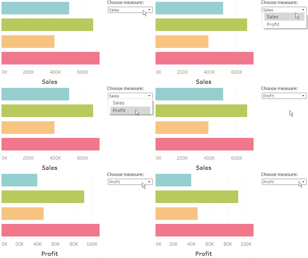
Hi all! During my first month at the dataschool we learned how to create parameters that allowed the user to switch between different measures on the the chart. I wrote a blog post which can be found here, which included changing the vertical axis label dynamically based on the selected parameter value.
You can follow the same steps to have a dynamic axis label for the horizontal axis but the problem is that the label is above the chart rather than below as you would normally have for a horizontal axis.
In this blog post I will show you how to get around this little problem!
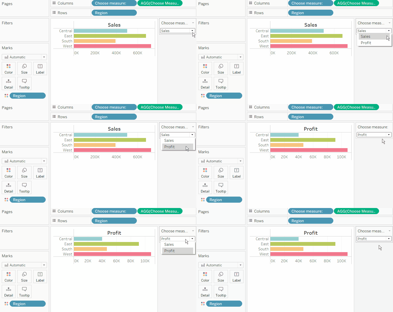
Use the first blog post to get to this stage. You can follow the same steps as before except swap everything on the Rows and Columns shelf to get a dynamic horizontal axis instead of a dynamic vertical axis. You should have something like the GIF below before you start following this blog post.
Step 1:
Continuing from the example shown above, you can get rid of the Choose measure: pill from your columns shelf as that adds the dynamic axis label above the bar chart.
To get the dynamic axis label underneath the chart, we need to create a new worksheet. In this worksheet put average number of records on the Columns shelf from your measures. Place the parameter on the Columns shelf also. Make sure the mark type is set to Text on the Mark shelf.
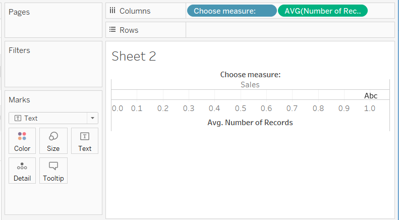
Step 2.
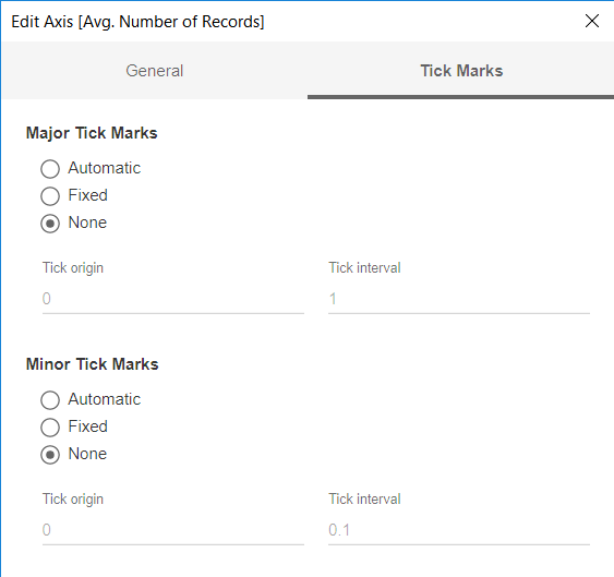
Double-click on the axis and make sure the Tick Marks are set to None. Right-click on the axis and deselect Show Header. Right-click on the parameter name label (in my case where it says ‘Choose measure:’) and select Hide Field Labels for Columns. You should be left with something like the image below.

Step 3.
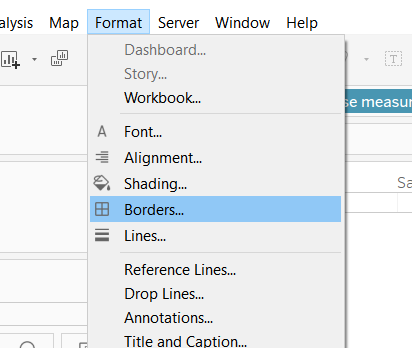
Click Format on the top banner and use the Borders… and Lines… options to remove all the borders and lines from the worksheet.

Step 4.
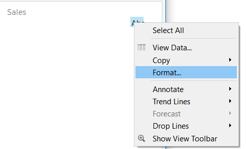
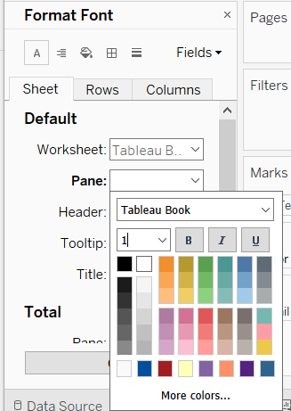
Right-click on the text value in the table and select format. Format the Pane text for the entire sheet to be coloured white (or whatever colour your dashboard background will be) and the smallest font size possible. In this section you can also format that Header text so that your axis label is bold and large.

Step 5.
Hover over where the table ended and reduce the height of the table as much as possible.

Step 6.
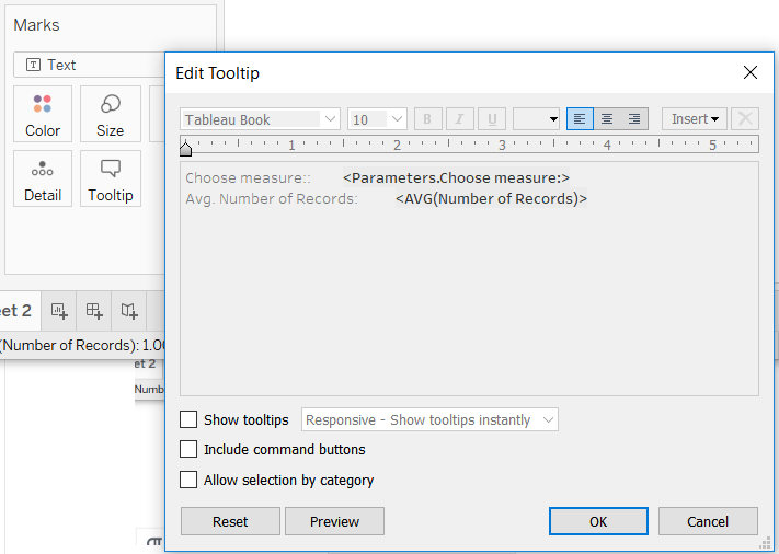
Turn off Tooltips for this worksheet from the Tooltips marks card. All you need to do is uncheck Show tooltips, Include command buttons, and Allow selection by category
Step 7.
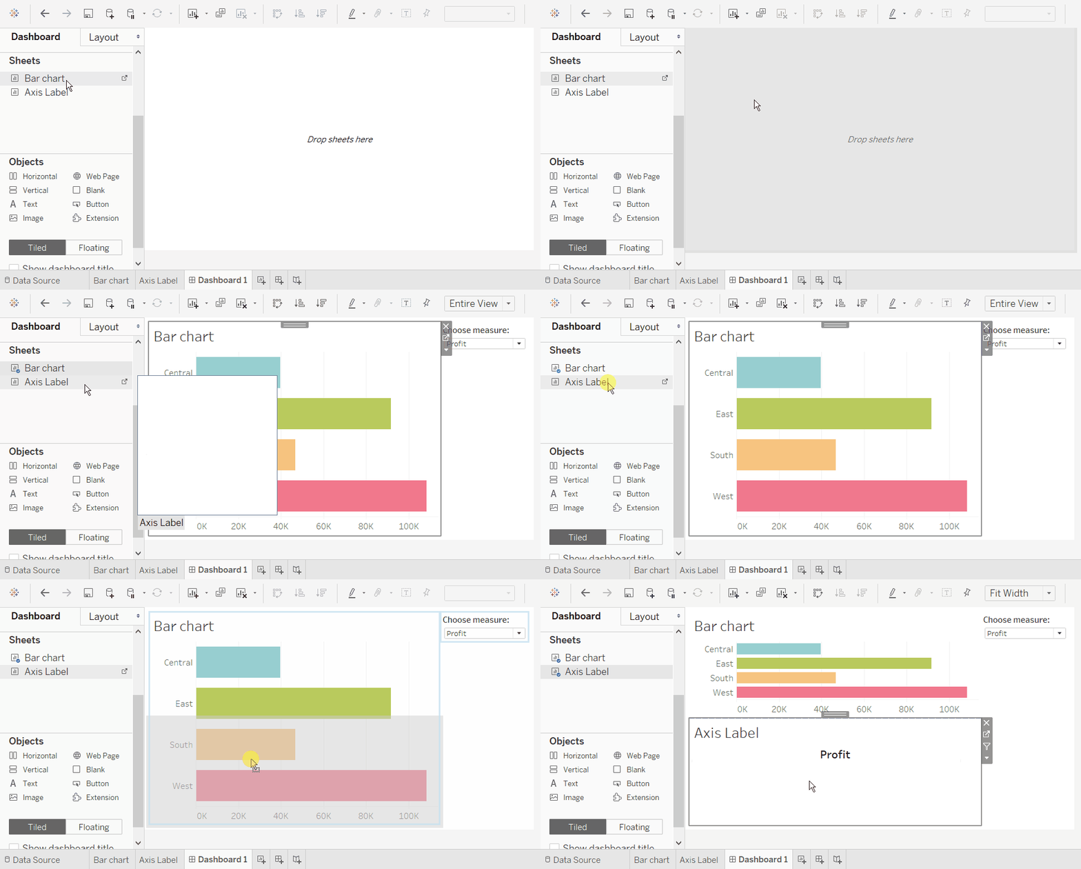
Create a new dashboard and drag the bar chart worksheet onto the dashboard. Drag the axis label worksheet underneath the bar chart.
Right click on the title for the axis label worksheet and select Hide Title.
Make sure the bar chart is set to fit entire view and the axis label worksheet is set to fit width.
Step 8.
This step is optional (this whole blog post is optional, having the axis label above the chart isn’t really a big problem!). I wanted to make the label be at the centre of the axis itself, rather than centre of the whole worksheet. To achieve this you can simply drag a blank object on the left side of the axis label worksheet.
And there you have it! A parameter with a dynamic horizontal axis title.
Thanks for reading!
