


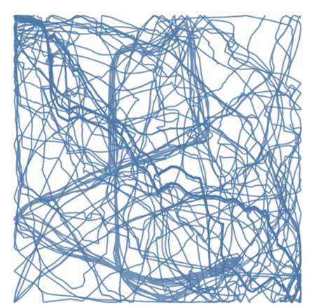
A few days ago, we had a great class from Andy on how to create this very cool view. This was the desired result:
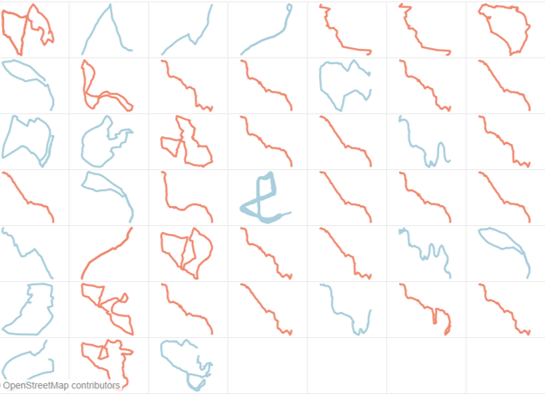
Each box shows a specific bike or run route made by Andy and one even shows a 4 hour run for his commute into work (he’s pretty crazy like that).
Andy also wrote a blog on this, which you can see here.
Building this view requires a bit of work in Alteryx and in Tableau.
The Alteryx part:
To see the routes spatially, you need to create spatial objects on Alteryx. Andy used an app called Strava, to collect data on each of his rides or runs. We imported the data collected in Strava to Alteryx and created this workflow:
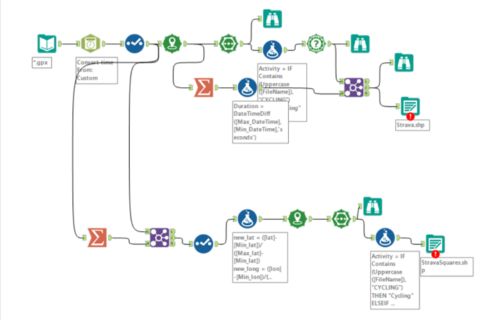
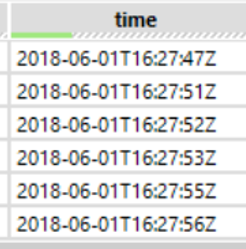
- We first had to clean the data which involved converting the data structure of the time field. This is because it came in a weird format, which included string data types. It looked like this:
- We then needed to create these routes into spatial objects. We did this by using the “Create Points” tool. We then used the ‘Poly-build’ tool to create the lines that connected all the long and lat values together. This enabled us to see the route of where Andy went.
- We then used a ‘Formula’ tool to create a new field called ‘Activity’. This allows us to differentiate whether it was a cycling route or a running route.
- The other tools, including those on the second line, were used to find out the time it took for Andy to finish each route.
The thing we are most interested in lies in the bottom line of the workflow.
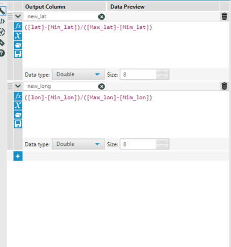
- We used the ‘summarize’ tool to get the min and max for both the long and lat values. This is very important as it is crucial to our calculation later on. See below:
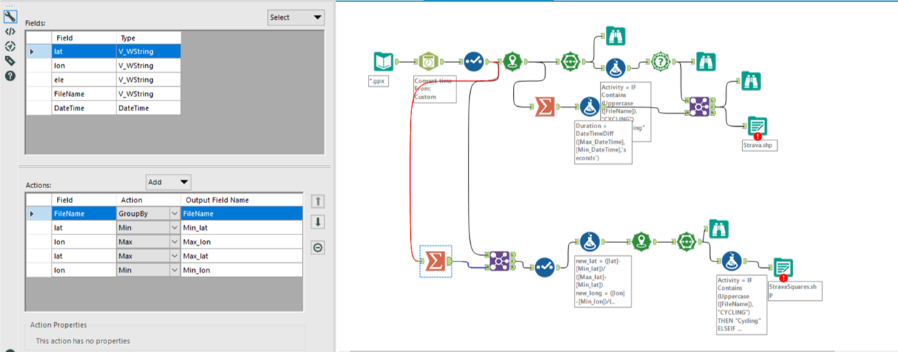
We then joined this together with the original data we still want the normal lat and long values.
- We used a ‘select’ tool to make sure all the fields had the right data types.
- We then used a ‘formula’ tool to create our new lat and long values. This calculation will ensure that each route, regardless of its length or width, will fill the entirety of the space inside one square. This essentially re-sizes the route to fit into the same square, regardless of its original length and width.
- We then copied and pasted the last 3 steps of the first line, which included the tools: ‘create points’, ‘poly-build’ and then the ‘formula’ tool to create the activity field.
- You then output the data as a shape file.
The Tableau Part:
Once you insert the newly created geometry for the squares, it should look something like this when you put it into the view (kind of like a million dollar piece of art).
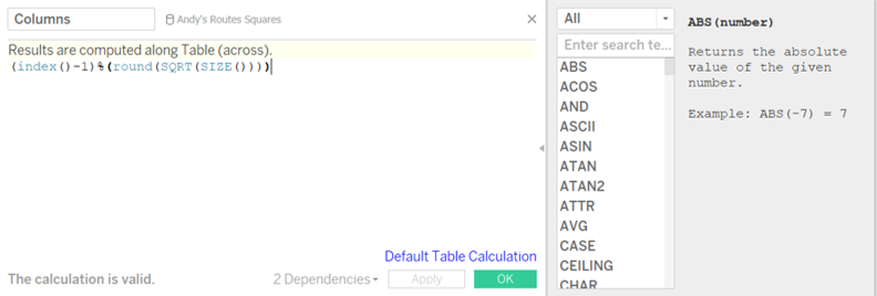
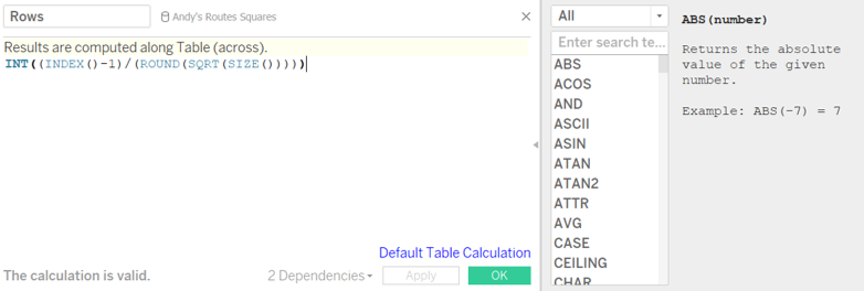
In order to split them up into squares, we have to create 2 calculated fields:
- Columns
- And the second calculated field should be called ‘Rows’
Next, you drag these newly created calculated fields onto the view. Drag the ‘column’ pill onto the columns shelf and the ‘row’ pill into the row shelf.
Then, drag ‘Activity’ onto colour.
You now need to edit the table calculation on both the column and row pill. Right click on the column and row pill and choose ‘edit table calculation’.
Make sure you select ‘Specific Dimensions’ and tick both ‘filename’ and ‘activity’. Also make sure that ‘filename’ is top of ‘activity’. If it isn’t, just drag things up or down.
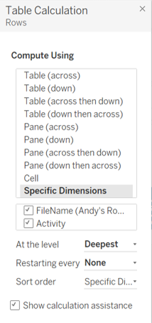
Do this for both the column and row pill.
You should then end up with this:
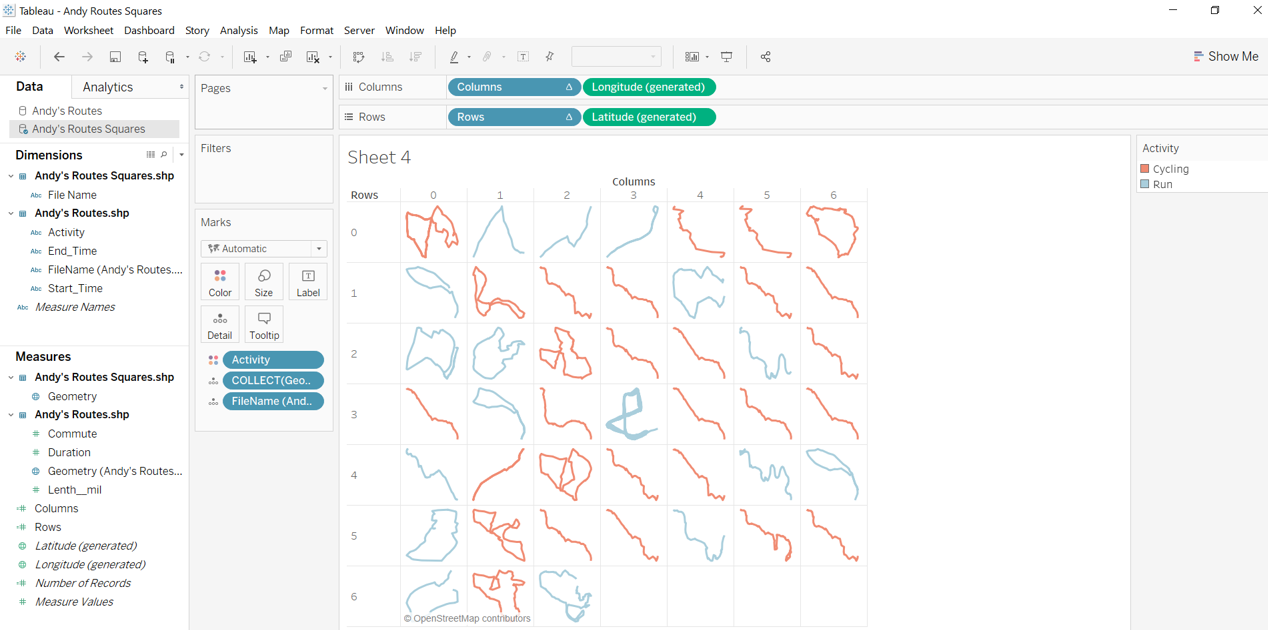
And there you go! You can see the shape of Andy’s routes in evenly sized squares!